Baseball Thank You Note

Baseball Thank You Note
Baseball Thank You Note DSCN8983

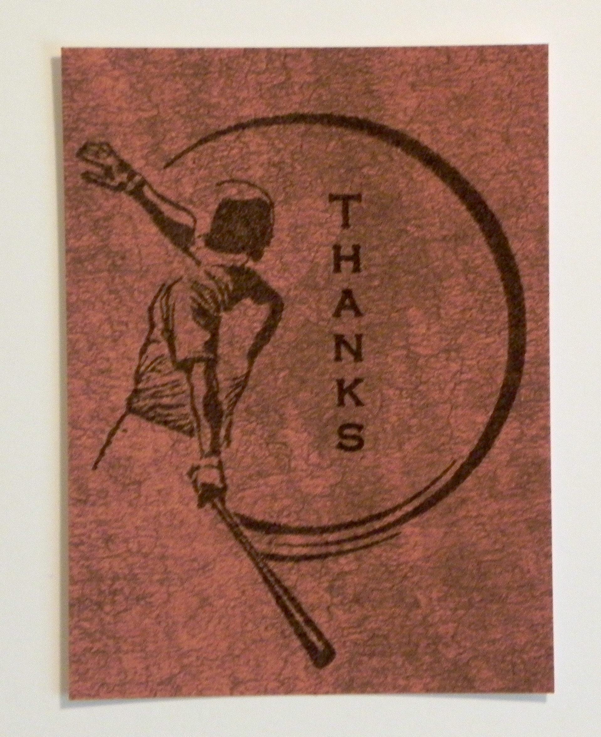
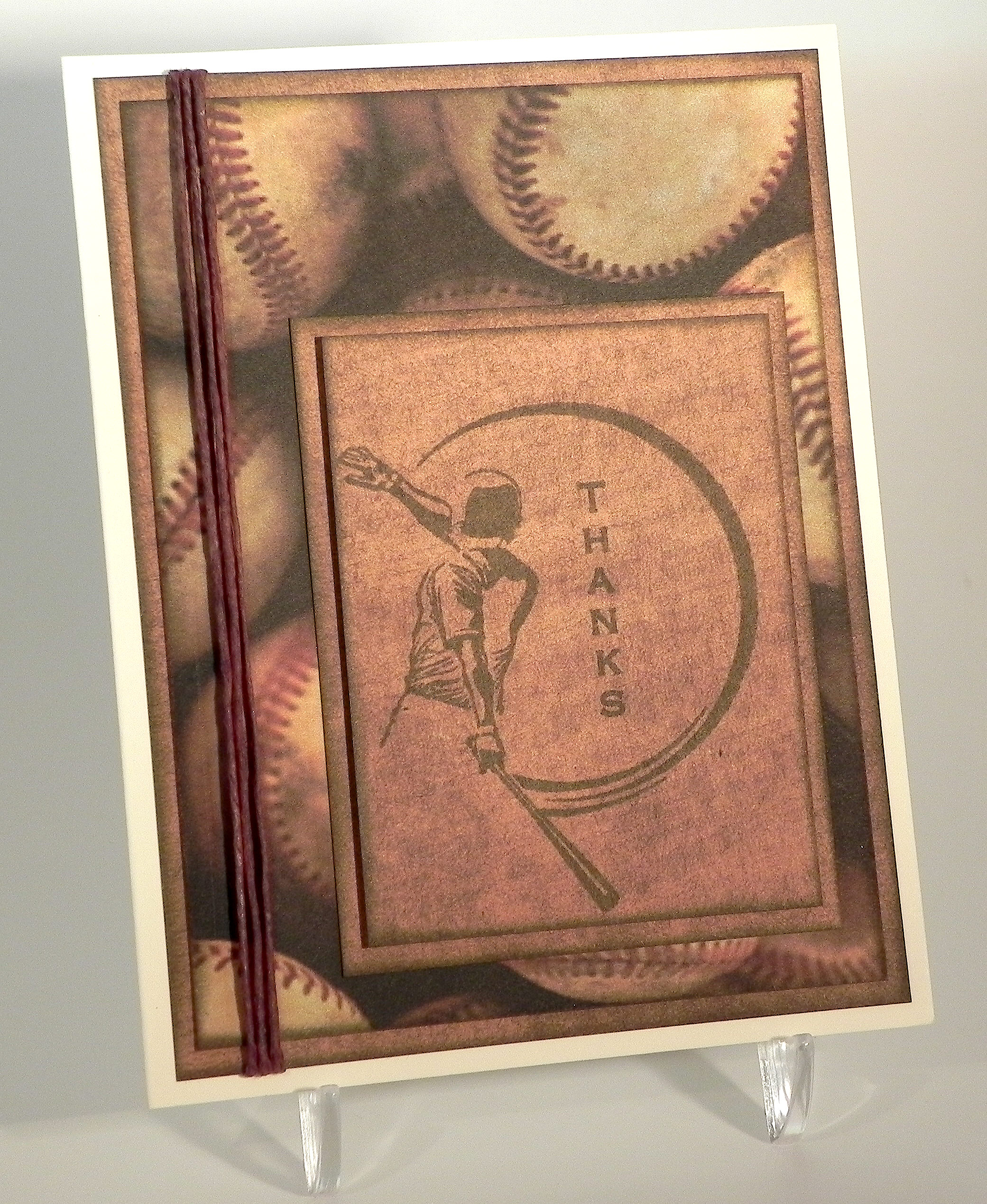
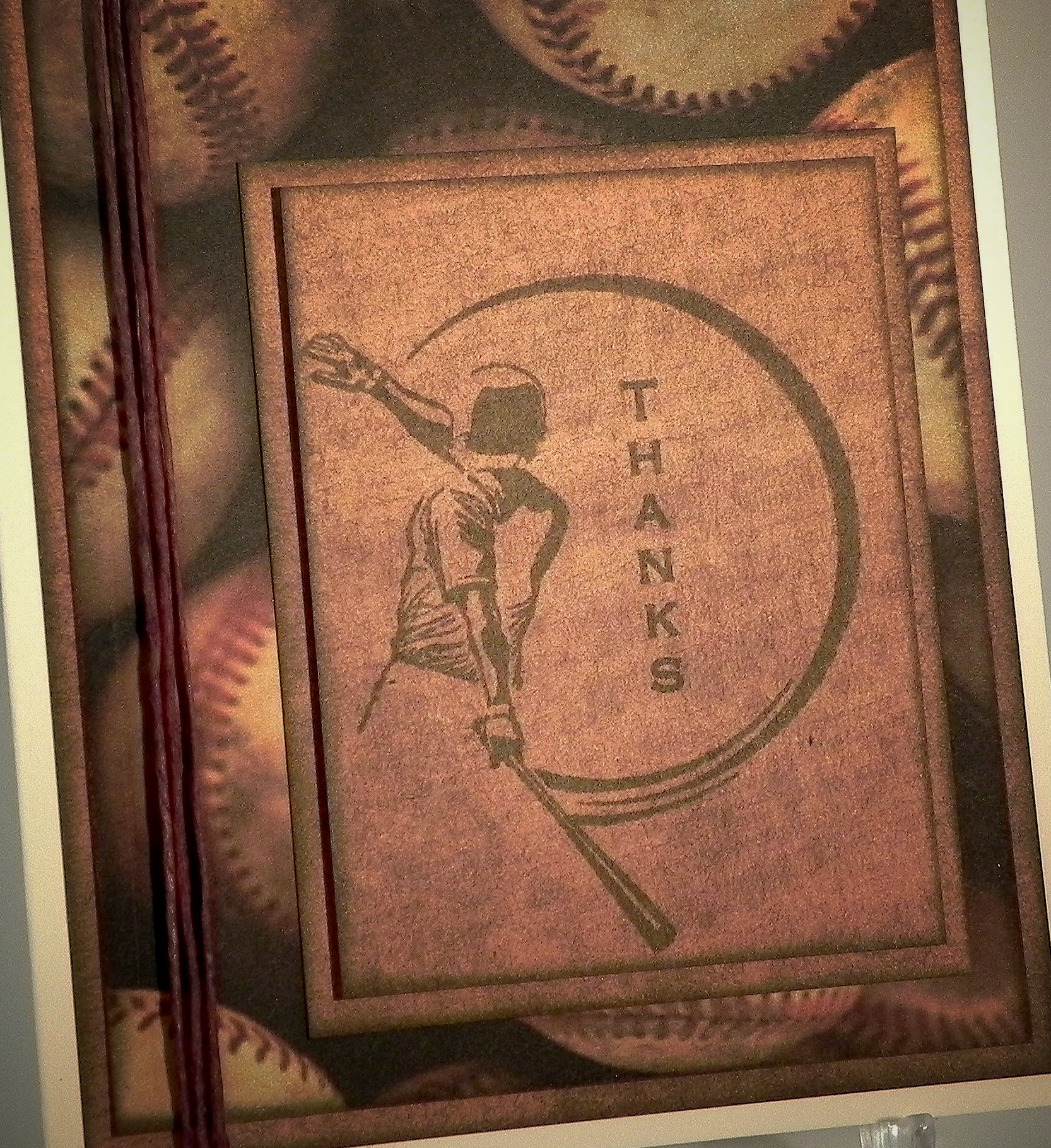
My son needed another baseball themed thank you note, so I created this card.

The baseball print was from an image I found on google and printed with permission (photo courtesy of Tennessee Home & Farm, tnhomeandfarm.com originally seen HERE) on white card stock.  The brown paper is a digital paper I purchased on Etsy from a store called Happy Place Art and is from a set called Watercolour Series Nautical Set. (You can see the listing HERE.)  The THANKS stamp is from the Gina K Designs Vertical Greetings stamp set. (I LOVE their vertical greeting stamps and wish they would make more!) The baseball stamp is from the Hampton Art Warehouse Baseball Rubber Stamp Set (as seen HERE). Both were stamped with Gina K dark chocolate ink. All the edges were sponged with the dark chocolate as well. The stamped panel was adhered with foam tape to raise it up slightly. I finished it off with a bit of thin twine and adhered the whole thing to a Gina K Pure Ivory card base.

The greeting stamp had to be positioned “just right” with the other stamp, and because I stamped brown ink onto a somewhat dark brown card stock, I needed to stamp the images multple times in order to make the images dark enough to see well. I also wanted to make several copies of this card. My MISTI was the perfect tool for the job! (I talk about the MISTI in a previous post which you can see HERE.) It allowed me to precisely place the two stamps exactly where I wanted them, and it allowed me to stamp and re-stamp the images in the exact spot each time.  I posted a demonstration of how I used this tool to make this card HERE.

This card is being entered in the “Use Your Stuff” Challenge where we are encouraged to use stuff that we’ve had in our stash but have not used yet, and this week – to “Make it Monochromatic.”  It can be a card or a layout, altered art or an ATC – as long as it is monochromatic.  I used shades of brown and a baseball stamp that I purchased but hadn’t gotten around to using before now. (http://useyourstuff.blogspot.com/2015/03/176-monochromatic.html)

Thanks for checking out my card project!

This content uses referral links as described in the disclosure policy on my sidebar.
How I use the MISTI to Stamp Multiple Images on My Project

How I use the MISTI to Stamp Multiple Images on My Project

MISTI DSCN8983 cropped

(Click HERE to see the original card post)

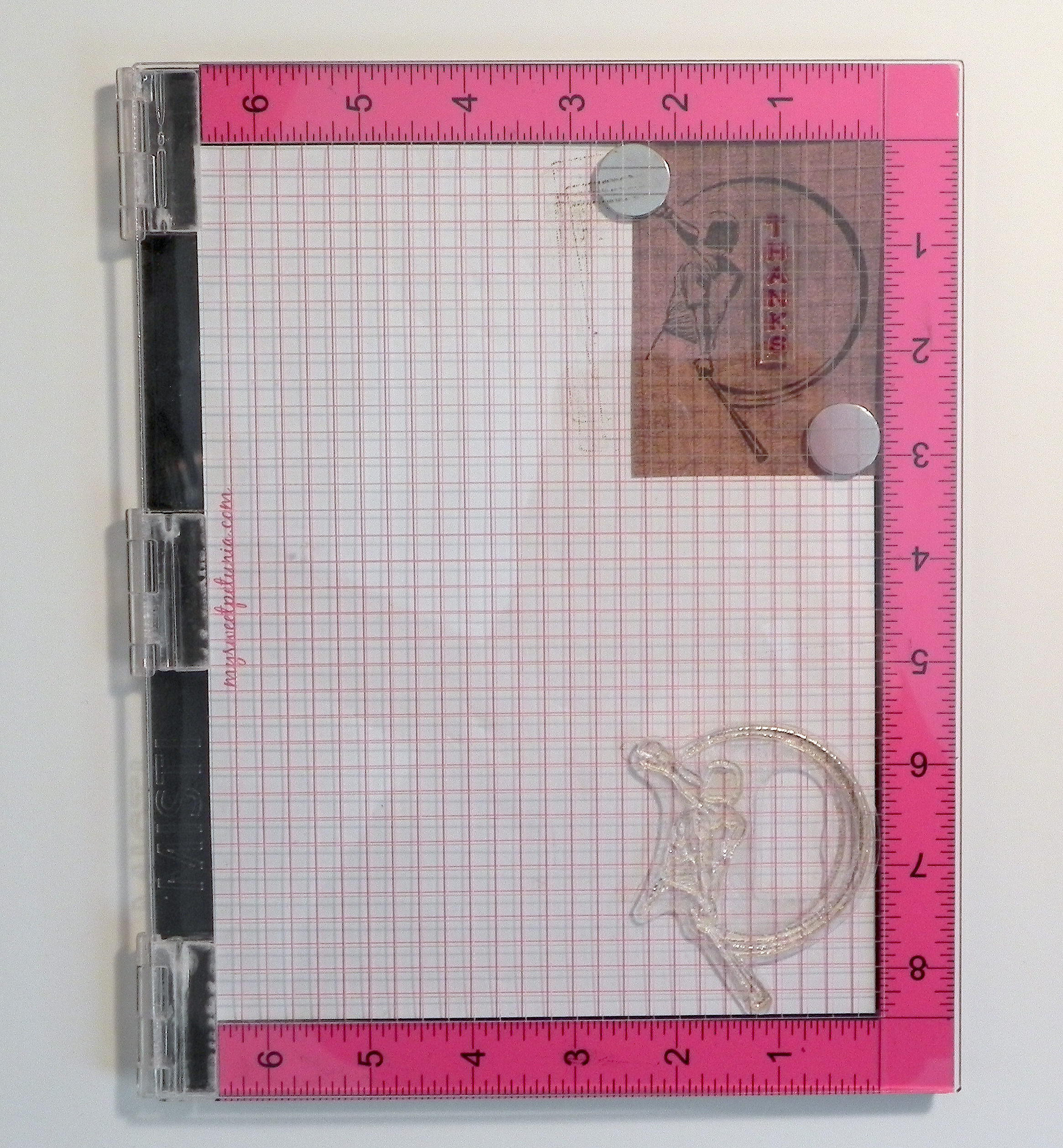
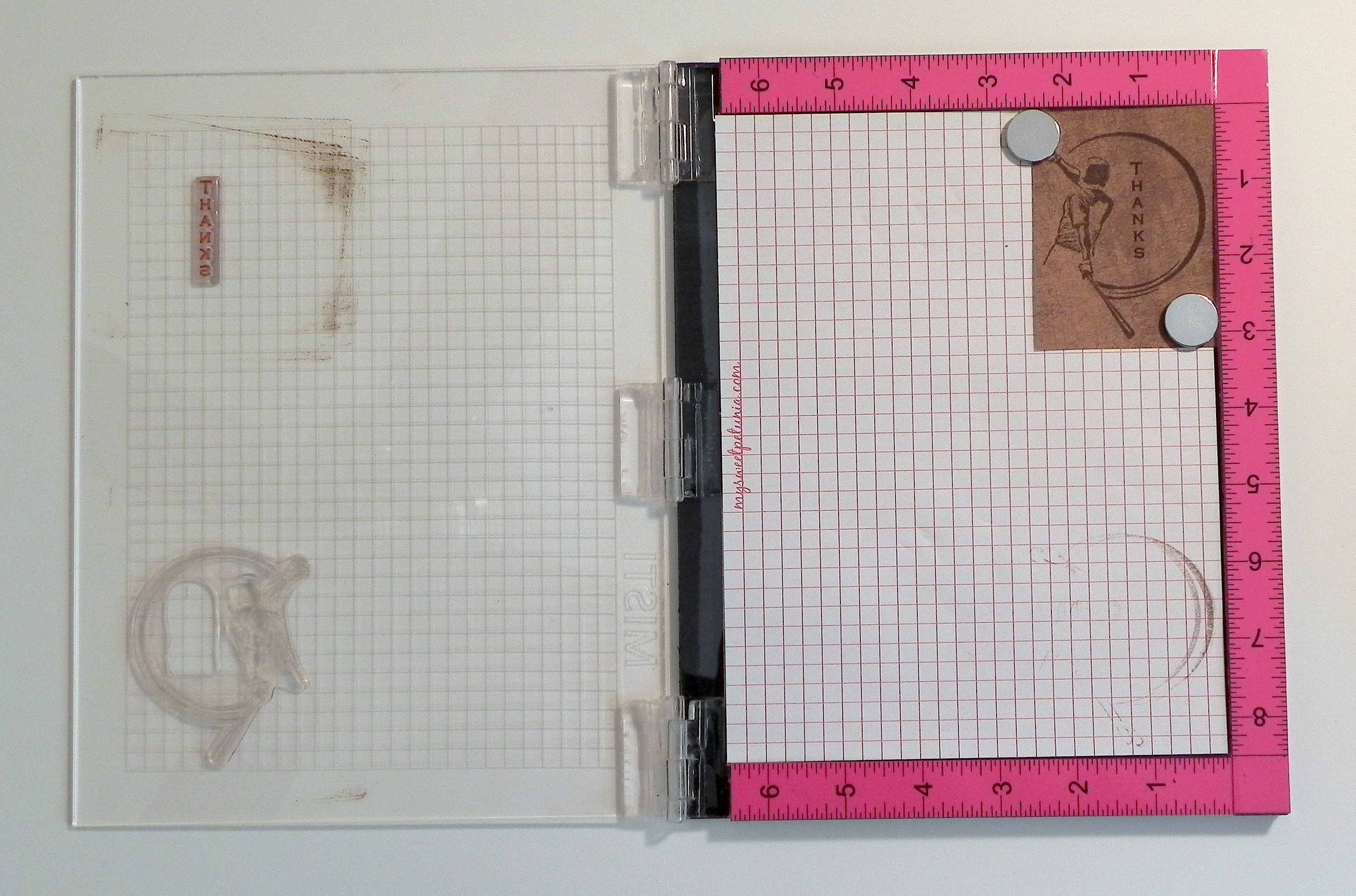
I recently created this Baseball Thank You Note which was to be part of a set.  The greeting stamp had to be positioned “just right” with the other stamp, and because I stamped brown ink onto a somewhat dark brown card stock, I needed to stamp the images multple times in order to make the images dark enough to see well.  Because it was to be a set, I needed to make several copies of this card. My MISTI was the perfect tool for the job!   (I talk about the MISTI in a previous post which you can see HERE.)  It allowed me to precisely place the two stamps exactly where I wanted them, and it allowed me to stamp and re-stamp the images in the exact spot each time.

Here’s how it’s done:

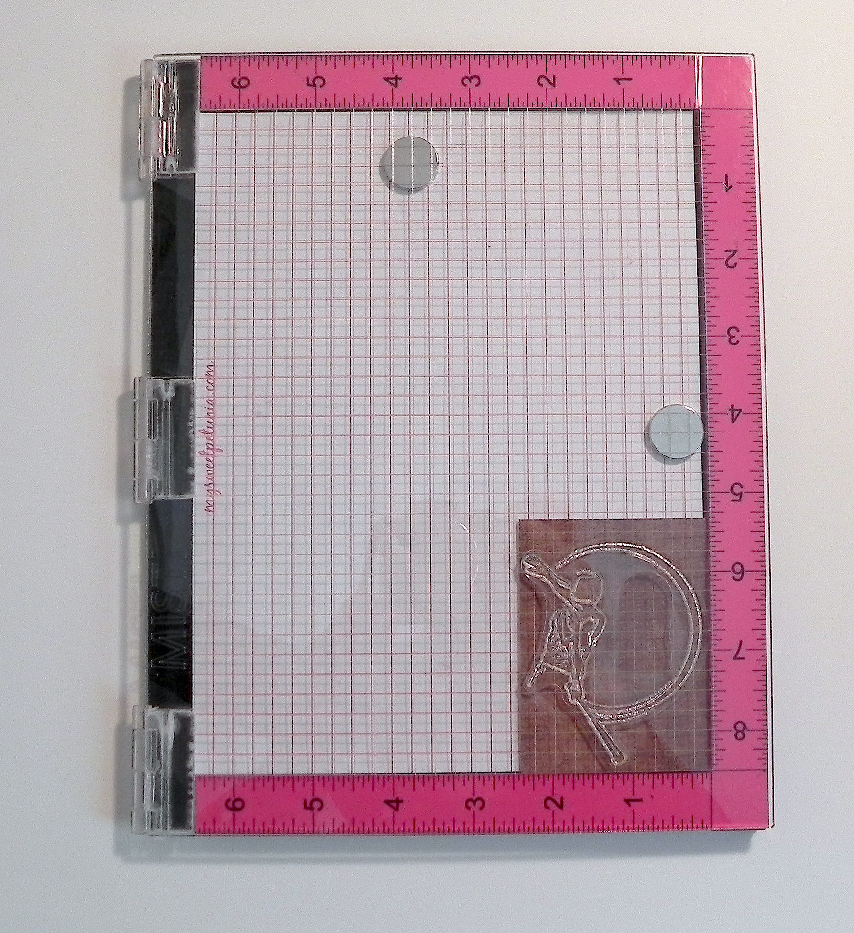
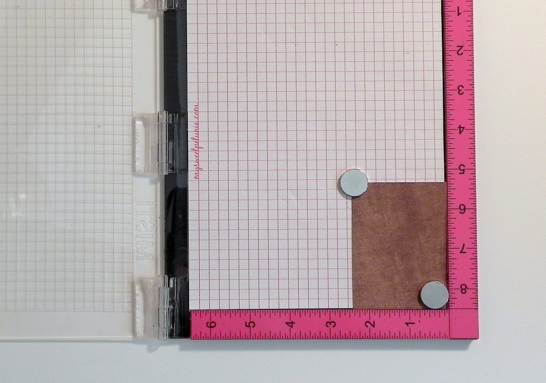
1)  Open the lid.  Start with your blank card stock in the bottom corner.  (I originally placed magnets in the corners to hold it in place but needed to move them for step 2.)  *Note:  If you are using an acrylic stamp, keep the foam panel under the grid paper.  If you are using a rubber stamp, remove the foam because those stamps are thicker.

010 DSCN8928

2)  Place your clean stamp on the card stock where you’d like the image to be.

020 DSCN8921

3)  Close the lid.

030 DSCN8923

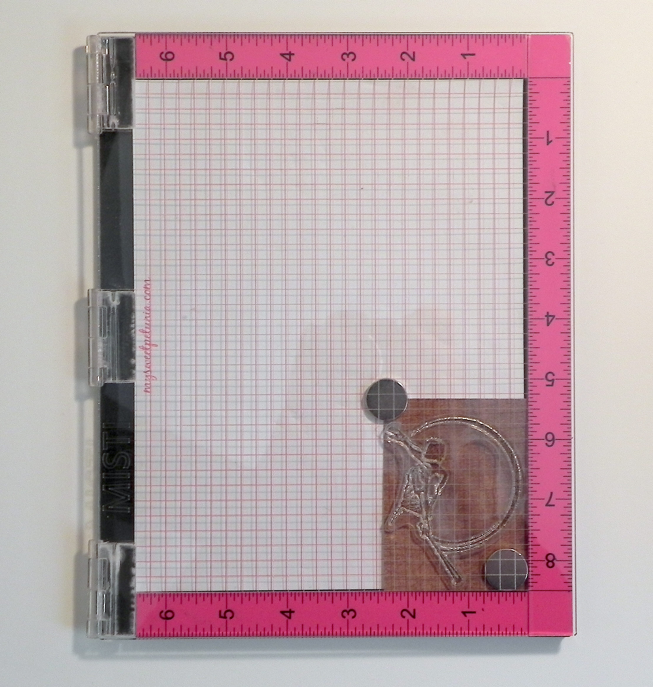
4)  When you open the lid again, the stamp is stuck to the lid in position to stamp the first image.  I use magnets to hold the card stock in place.

040 DSCN8928

5)  Ink up the stamp and close the lid.

060 DSCN8932

6)  Open it to see stamped image.  (I stamped the image 3 or 4 times to get a crisp, dark image.)

070 DSCN8934

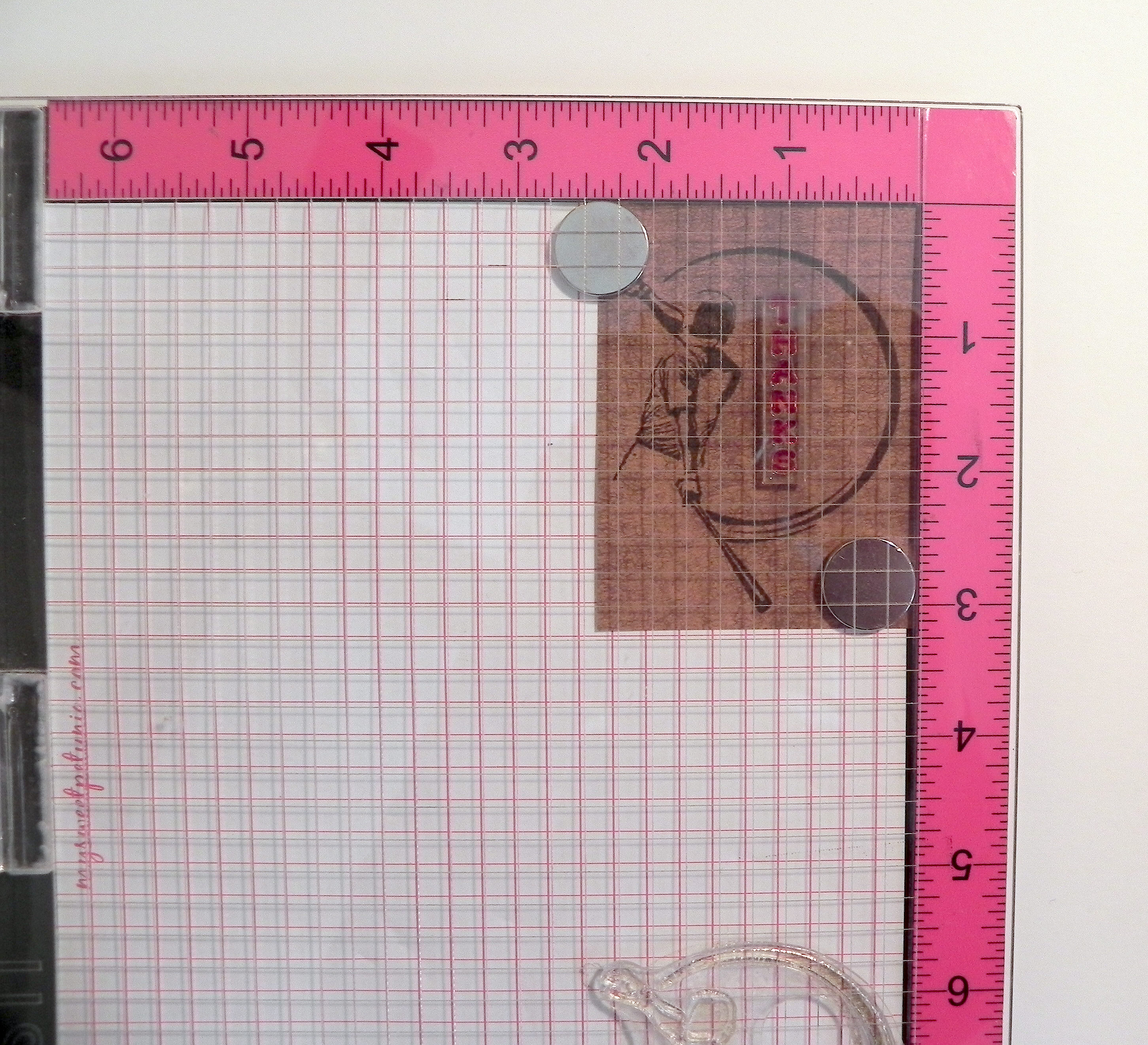
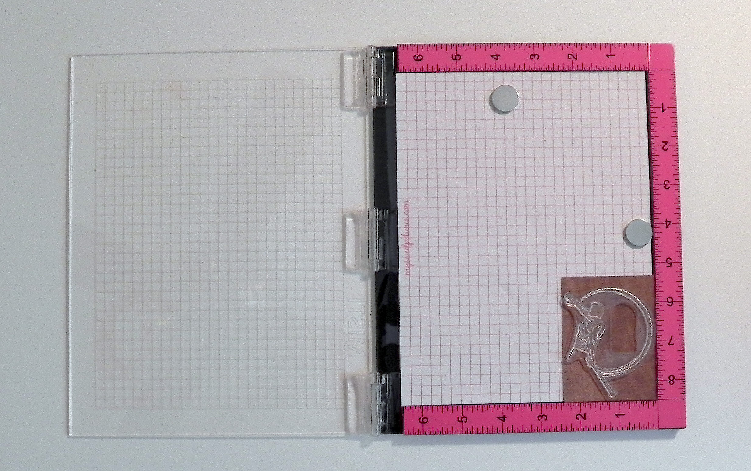
7)  Once you are satisfied with the quality of the image, move the card stock (with the image just stamped) to the upper corner.  Place the clean greeting stamp on the card stock where you want the image to be.  (My stamp is stained from repeated use, but it’s clean.)

080 DSCN8935

8)  As before, close the lid.

090 DSCN8937

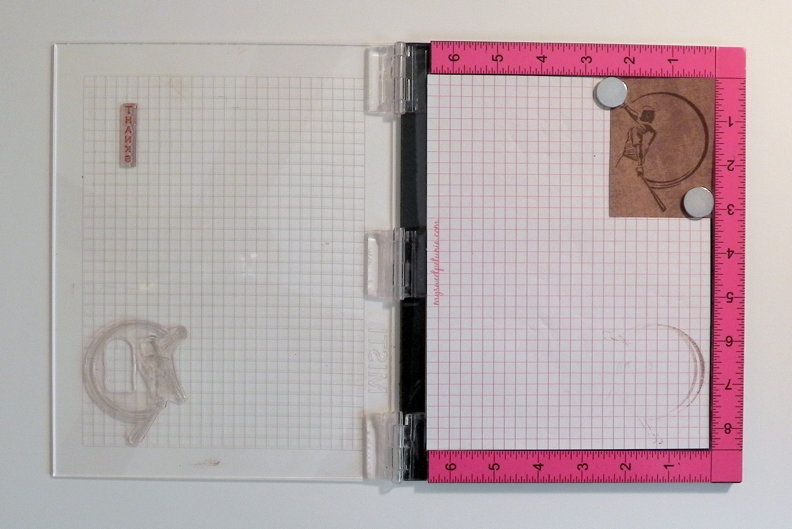
9)  When you open it, the second stamp is also stuck to the lid.

100 DSCN8939

10)  Ink the top stamp and closed the lid.

110 DSCN8940

11)  Open the lid; the second image is now stamped onto the card stock.  (Again, I repeated this 3 or 4 times to get a nice dark image.)

120 DSCN8941

Here is the finished panel.  Notice that even though I stamped the images several times, the images are crisp without the double lines you often get if you try to re-stamp an image without the tool.  If you use the same size card stock and don’t move the stamps from the lid, you can create an infinite number of these panels, and they will all be exactly the same!  Position the stamps once and just stamp away!! This is perfect when you are making duplicates of the same card.

130 DSCN8943

I use my MISTI all the time.  (I can’t remember the last time I stamped with a plain acrylic block!)  Even if perfect placement of my stamp(s) isn’t necessary, I usually re-stamp my images a few times to make them really dark.

To order or for more information, go to mysweetpetunia.com.

(I am not affiliated with My Sweet Petunia in any way; I’m just a happy customer!  Check it out for yourself, and decide if it would be good for you.)

Thanks for checking out my post!

Birthday Wishes

Birthday Wishes

Birthday Wishes www DSCN8660.jpg

This card was made with three challenges in mind:

1)  There is a color challenge over at The Paper Players.  Here is the color palette we are to use:

color challenge tiles

If we don’t have these exact colors, it’s ok. As long as the color scheme is similar, we are welcome to play along.  (http://thepaperplayers.blogspot.com/2015/03/pp235-anne-maries-color-challenge.html)

2)  For the Mod Squad “Make a Background” Challenge, we are encouraged to make a background where we can use ink, watercolor, markers, crayons, stencils, stamps….well you get the idea. Basically anything but pattern paper.  (Sadly, this site is no longer active.)

3)  Over at Pile it On, we are to incorporate their CURRENT challenge with at least one other CURRENT challenge .   We are encouraged to see how many challenges we could get into one project!  Their challenge this week is to use green. (http://pileitonchallenge.blogspot.com/2015/03/pile-it-on-59-green.html)

I created my background by applying Tim Holtz distress inks and water to my craft mat and then placing my card stock onto the ink.  The inks I used were peeled paint, scattered straw, frayed burlap, and tattered rose.  These colors closely matched the color palette above.  I trimmed the panel to fit my card base and then used a scrap of it to create the squares on the left as well.  I also used patterned paper from the Gina K Delicate Essentials 6×6 paper pack.  For card stock, I used white to create my background panel along with Stampin’ Up Crisp Cantaloupe, Gina K Sweet Corn and Grass Green, and Bazzill Basics Quick Sand.  To make the vase, I used the Spellbinders Filigree Vase set.  The Spellbinders Fantastic Flourish One die was used to cut the leafy flourish in green.  I cut additional pieces in sweet corn and crisp cantaloupe and cut off the flowers and a few sections of the flourishes for my accents.  I also used a Creative Memories square punch.  The greeting stamp came from the Gina K Designs “Elegant Florals” stamp set and was stamped with the peeled paint ink on a scrap of my hand-made background paper.  (To see how I easily adhered all the delicate flourishes to my project, check out my earlier post HERE.)

This was a fun card project to make.  I really like the color palette and would probably never have thought to use these colors together on my own.  It had been a while since I had made a background using distress inks.  And trying to combine challenges is always …well, a fun challenge!!

Thanks for checking out my card project!

This content uses referral links as described in the disclosure policy on my sidebar.
Potted Plant

Potted Plant

Potted Plant z DSCN8431.jpg

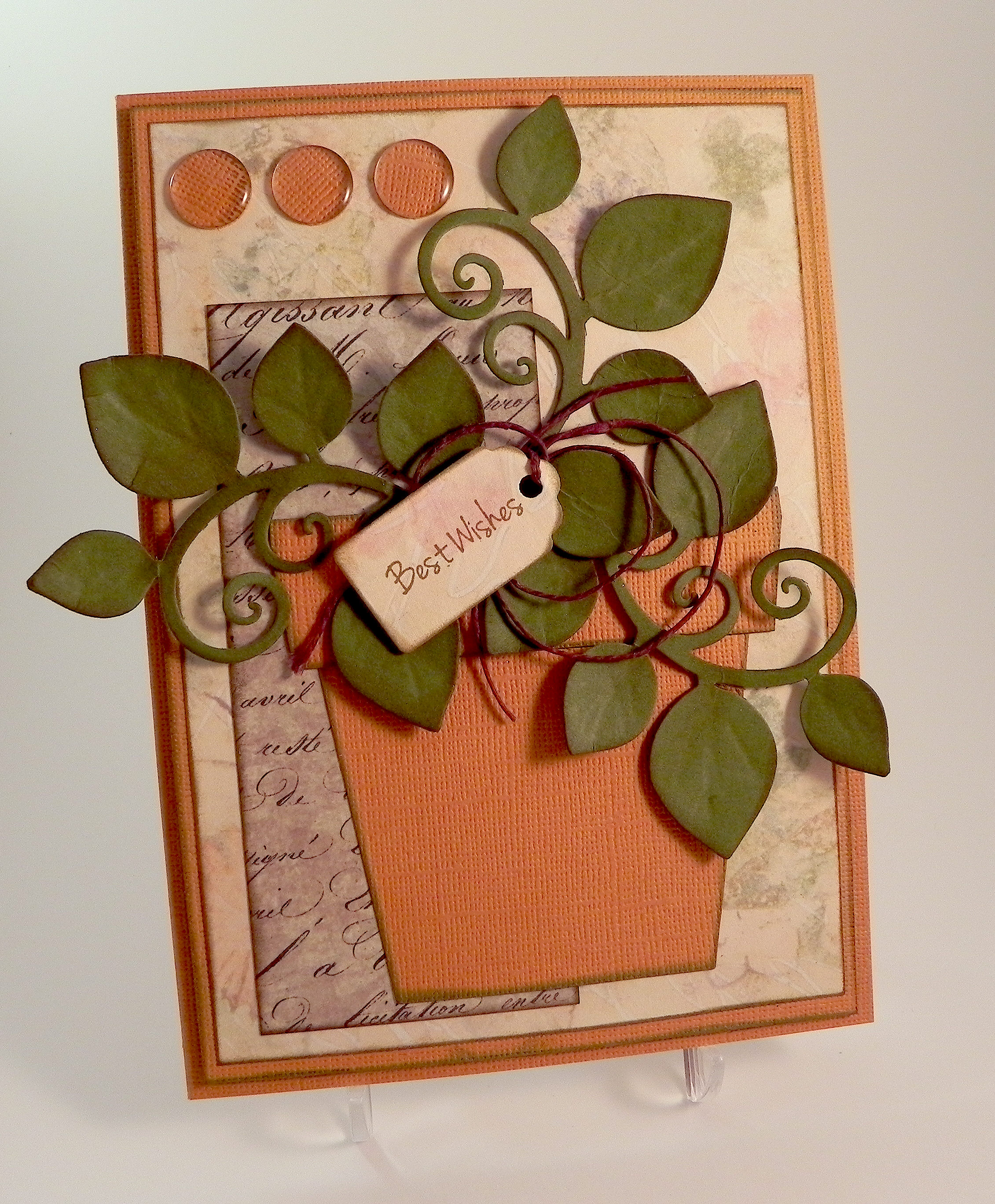
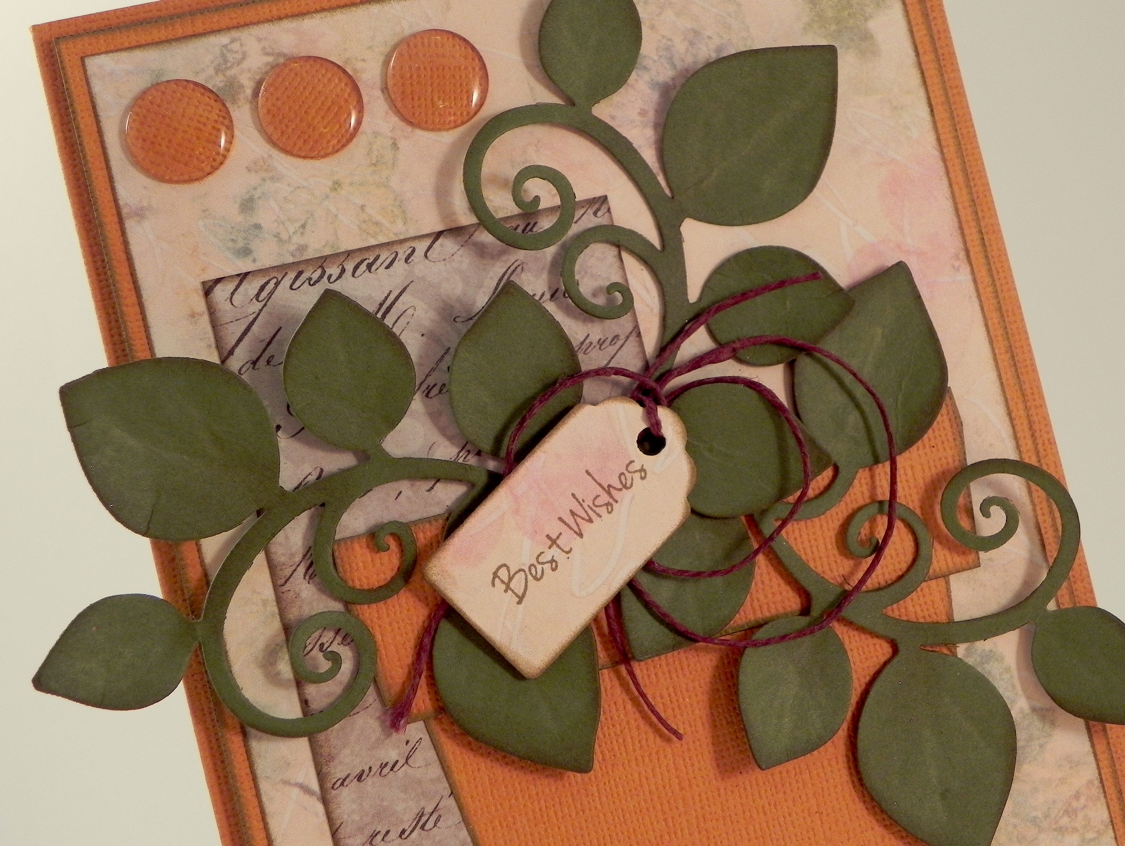
It’s amazing how some cards begin with an idea and you just need to execute the plan while other cards evolve so much throughout the process that they end up looking nothing like they were intended to look.  This card falls into the second group!  I originally envisioned this card with delicate flowers in a pot made with patterned paper.  The patterned pot was beautiful, but I couldn’t make the background work so I decided to use the patterned paper for the background instead.  I had a sentiment I intended to stamp on the pot, but it was too big.  I wanted to make flowers out of crepe paper, but I had trouble with that  so I redid them on paper and added 3D Stamp Paint that made them too bold and sparkly. Then I added the leafy flourishes, and when I moved the flowers to arrange the leaves, I liked the plain leaves better so I decided to go with a potted leafy plant instead.  My very feminine idea ended up being a card that is more gender neutral.  I’m still not sure if I like the solid colored pot and may try different patterned papers.  And I still may go back and re-try a version with flowers like I originally wanted, but I do like this evolved design as well!

The pot, tag, and leafy flourishes were all cut with Heartfelt Creations (Spellbinders) dies from the “Flower Pot” set.  (I hand-made the top part of the pot as the set did not include a die for that part.)  The greeting on the tag is a Gina K Designs stamp from the “A Wish For You” mini stamp set (retired?) that I received in a grab bag.  Gina K Warm Cocoa ink was used to stamp the greeting and to sponge all the edges.  Paper and card stock used:  Gina K Fresh Asparagus, Core-dinations Valentia, Paper Pizazz Tan Floral Tapestry (printed background), and Melissa Frances First Class Mail (gray script).

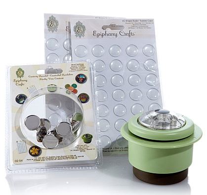
I used my Epiphany Crafts Shape Studio Bubble Cap maker and Clear Round (14) epoxy shapes to create the three orange embellishments in the upper left corner to match the flower pot.

zz DSCN8429

This tool is pretty cool because you can use whatever paper you want to create custom embellishments for your projects.  If I end up changing the paper for the flower pot, I will make new circles with matching paper.

EC Set

Just a note – this company makes tools to create embellishments in different shapes and sizes.  Each tool makes only one shape/size so you’d need to purchase multiple tools to create the different shapes.  (This is very much like a punch you might purchase.)  In addition to the tool itself, you need to purchase the corresponding epoxy shapes to create your embellishments.  These are consumable and need to be replenished when they are gone.  In addition to the epoxy shapes, they also have metal charms you can use to create your embellishments.  (The tool, epoxy shapes and charms are all sold separately.)

I previously made an anniversary card (called “Happy Anniversary” originally posted in my StampTV gallery which is no longer active.) where I used the square tool and a mini wedding photo to create a square shaped epoxy embellishment that fit inside a mini picture frame.

zzzz DSCN8591

Frame a DSCN8608

Thanks for checking out my card project!

This content uses referral links as described in the disclosure policy on my sidebar.
Don’t Lose Hope Card – “Make It Better”

Don’t Lose Hope Card – “Make It Better”

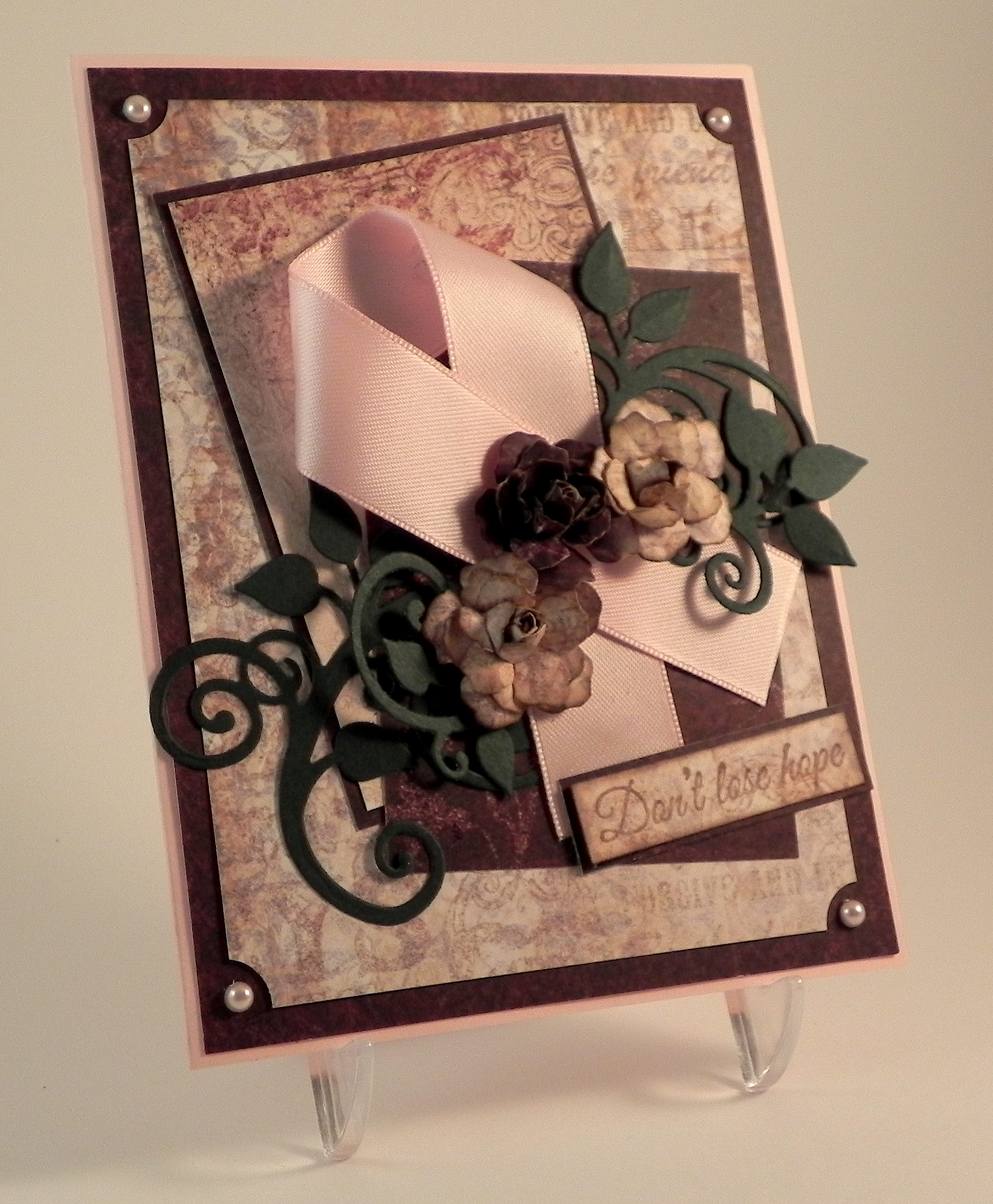
Don't Lose Hope Original and New 3

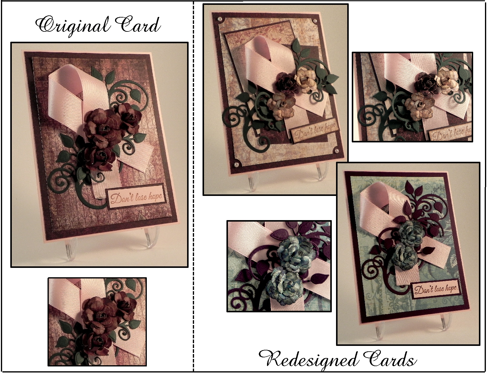
I am so excited to be sharing my first card project as a member of the Perfectly Rustics Design team! This fortnight, the challenge is called “Make It Better” (challenge no. 43) where we are to improve on a project that we have done in the past while making sure to keep some elements of the original project the same.  (See challenge post HERE.)  The card I chose to re-do is a card I did last October called “Don’t Lose Hope” which was a card of encouragement for someone battling breast cancer.  I like the layout of the original, but I was going for a vintage look, and I feel it ended up a bit dark.  Here is the original card:

uu DSCN7754

(click HERE to see original post)

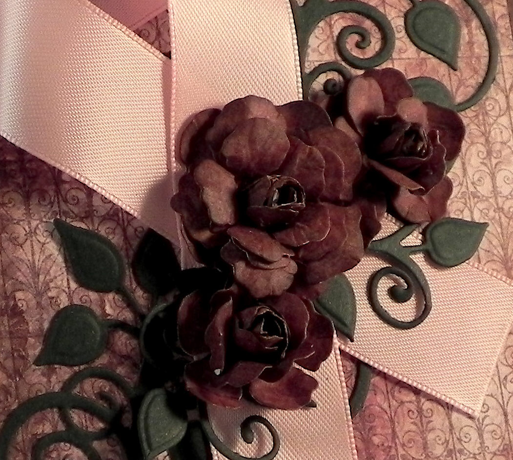
In addition to the background being on the dark side, I felt the flowers were much too dark.  I thought the paper I used was burgundy, but it really seemed dark brown once it was on the card.

uu DSCN7754 cropped

For my first attempt at a re-do, I decided to try it in lighter shades while still keeping the layout and vintage style similar.  Here is the card I came up with:

Don't Lose Hope Redo 1 v20d DSCN7756


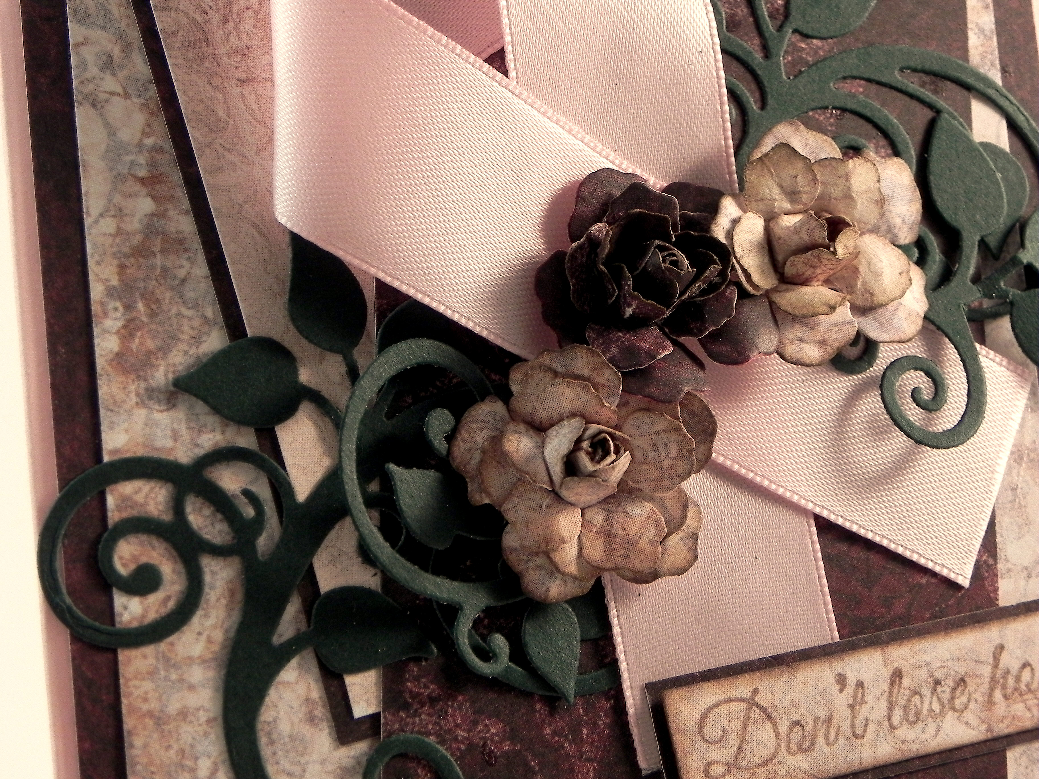
I changed the background paper, used a piece of the original, darker paper as an accent, added a smaller, light panel for added interest, and spruced up the corners with a ticket punch and pink pearls. I also made two of the three flowers lighter to match the new background.

w DSCN7726

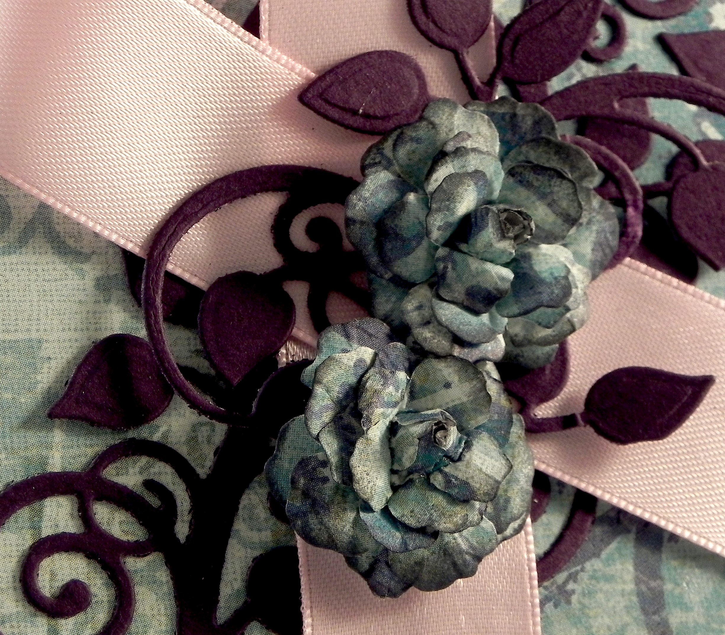
Personally, I like these new, lighter shades better, but I know brown tones aren’t for everyone!  So, just for fun, I thought I’d try a completely different color scheme and changed the background and flowers to a bright greenish-blue.  The leafy flourish now matches the eggplant mat.

Don't Lose Hope Redo 2 w20zx DSCN7758

This version has only two flowers.

ww DSCN7727

The two re-done cards are definitely not as dark, and I am happy with the results.  I probably like the first attempt with the warm tones better, but that should not surprise anyone who knows me! (I do like my browns!!!)  It was really neat to see how changing a few aspects of the card really changed the whole look of it.

Now it’s your turn!  Choose a project you did but are not crazy about.  While keeping some of the elements the same, change some of them to “Make it Better!”  (You only need to make one new version.)  Link your new version for the challenge, but be sure to include the “before” photo somewhere in your blog post along with your new version.  I can’t wait to see what you create!  (This challenge will close at 11:59 pm Saturday 21st March 2015 (AEST) Australian Eastern Standard time.  Here is a Time Zone Converter to figure out when they end wherever you happen to live!)

Thanks for checking out my card project!

[The greeting stamp for these cards came from the Gina K Designs “Don’t Lose Hope” duo and was stamped with Tim Holtz walnut stain distress ink. (Clear embossing powder was used on the original and greenish-blue cards.)  The flowers were handmade using dies from the Heartfelt Creations (Spellbinders) Vintage Floret set. The leaves were made using dies from the Heartfelt Creations (Spellbinders) Cut Mat Create 2A Die set.  Cardstock used was a pink from a Recollections paper pack, Recollections Evergreen, and Gina K Edible Eggplant. The printed card stock came from two Heartfelt Creations Paper pads: Floral Key Collection and Antiquity Collection.  The greenish-blue paper is K & Company Addison Blue Garden Swirls.  The ticket corners were made with a Tonic Ticket Punch.]

This content uses referral links as described in the disclosure policy on my sidebar.