Don’t Lose Hope Card – “Make It Better”
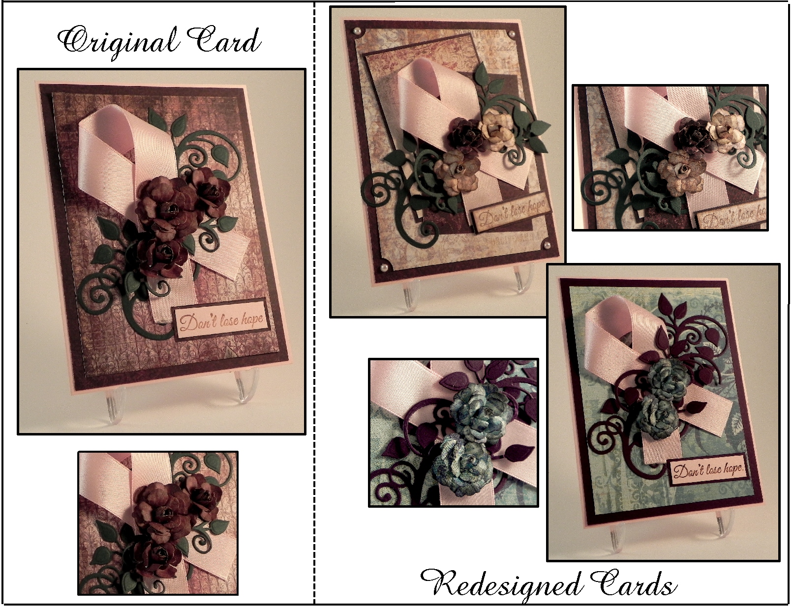
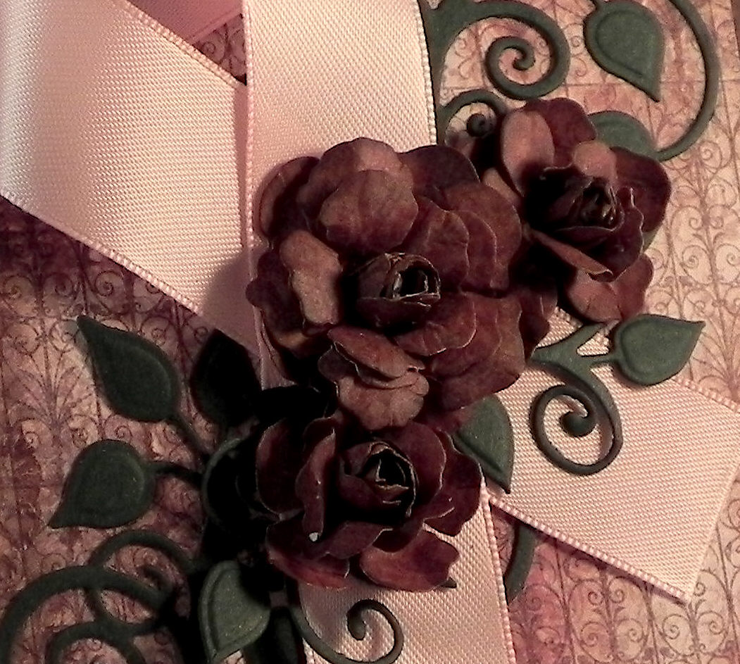
I am so excited to be sharing my first card project as a member of the Perfectly Rustics Design team! This fortnight, the challenge is called “Make It Better” (challenge no. 43) where we are to improve on a project that we have done in the past while making sure to keep some elements of the original project the same. (See challenge post HERE.) The card I chose to re-do is a card I did last October called “Don’t Lose Hope” which was a card of encouragement for someone battling breast cancer. I like the layout of the original, but I was going for a vintage look, and I feel it ended up a bit dark. Here is the original card:

(click HERE to see original post)
In addition to the background being on the dark side, I felt the flowers were much too dark. I thought the paper I used was burgundy, but it really seemed dark brown once it was on the card.
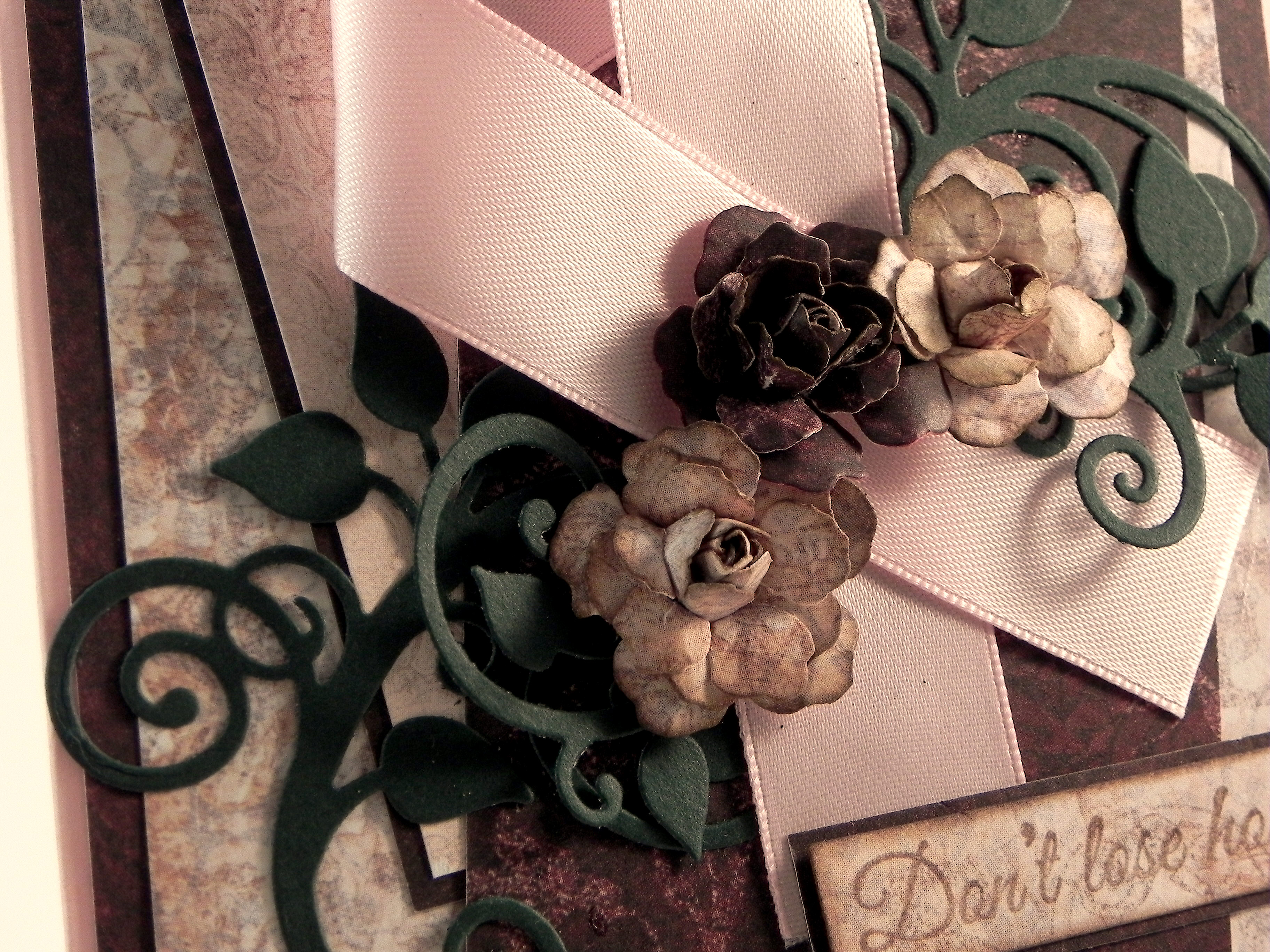
For my first attempt at a re-do, I decided to try it in lighter shades while still keeping the layout and vintage style similar. Here is the card I came up with:
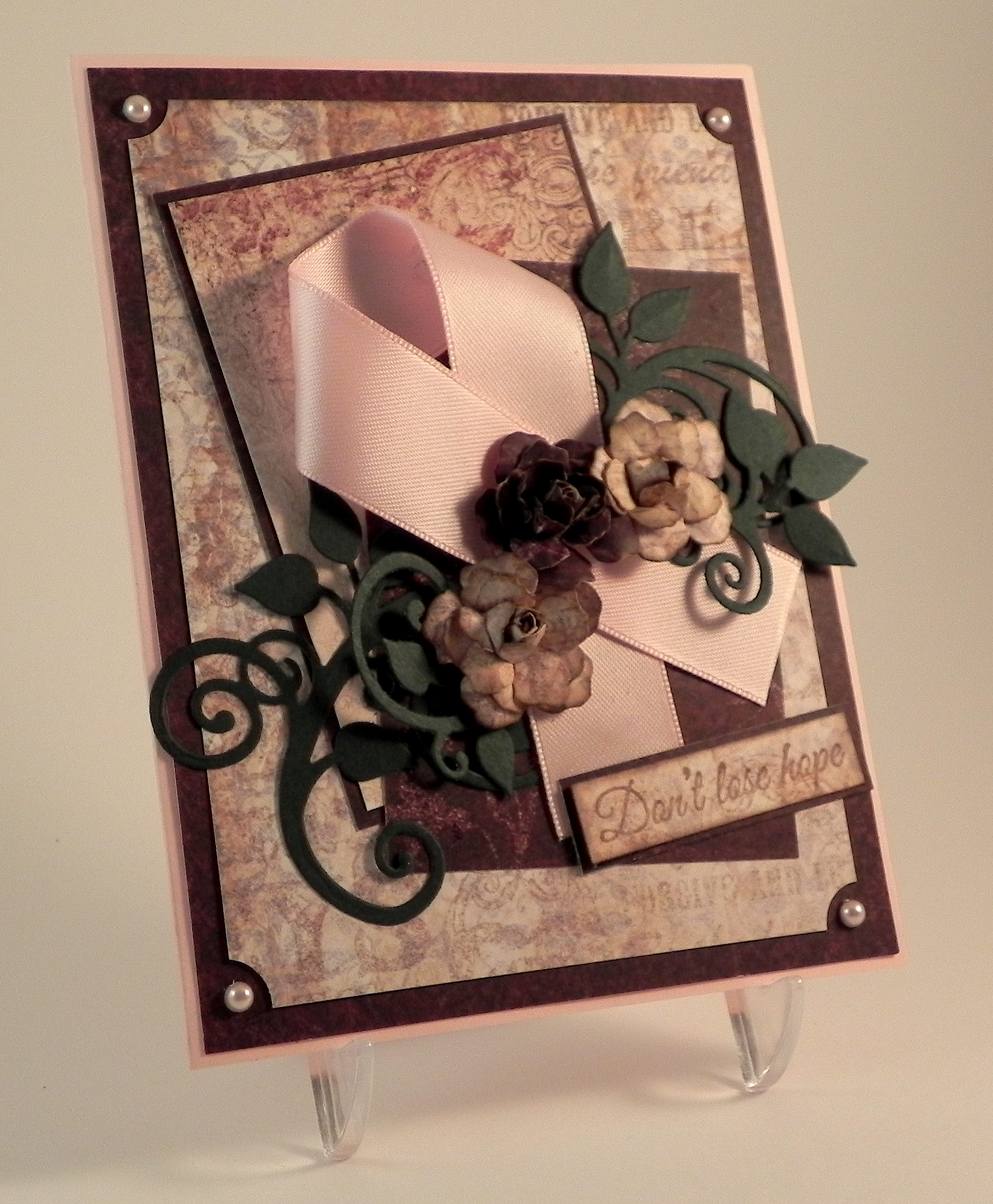
I changed the background paper, used a piece of the original, darker paper as an accent, added a smaller, light panel for added interest, and spruced up the corners with a ticket punch and pink pearls. I also made two of the three flowers lighter to match the new background.
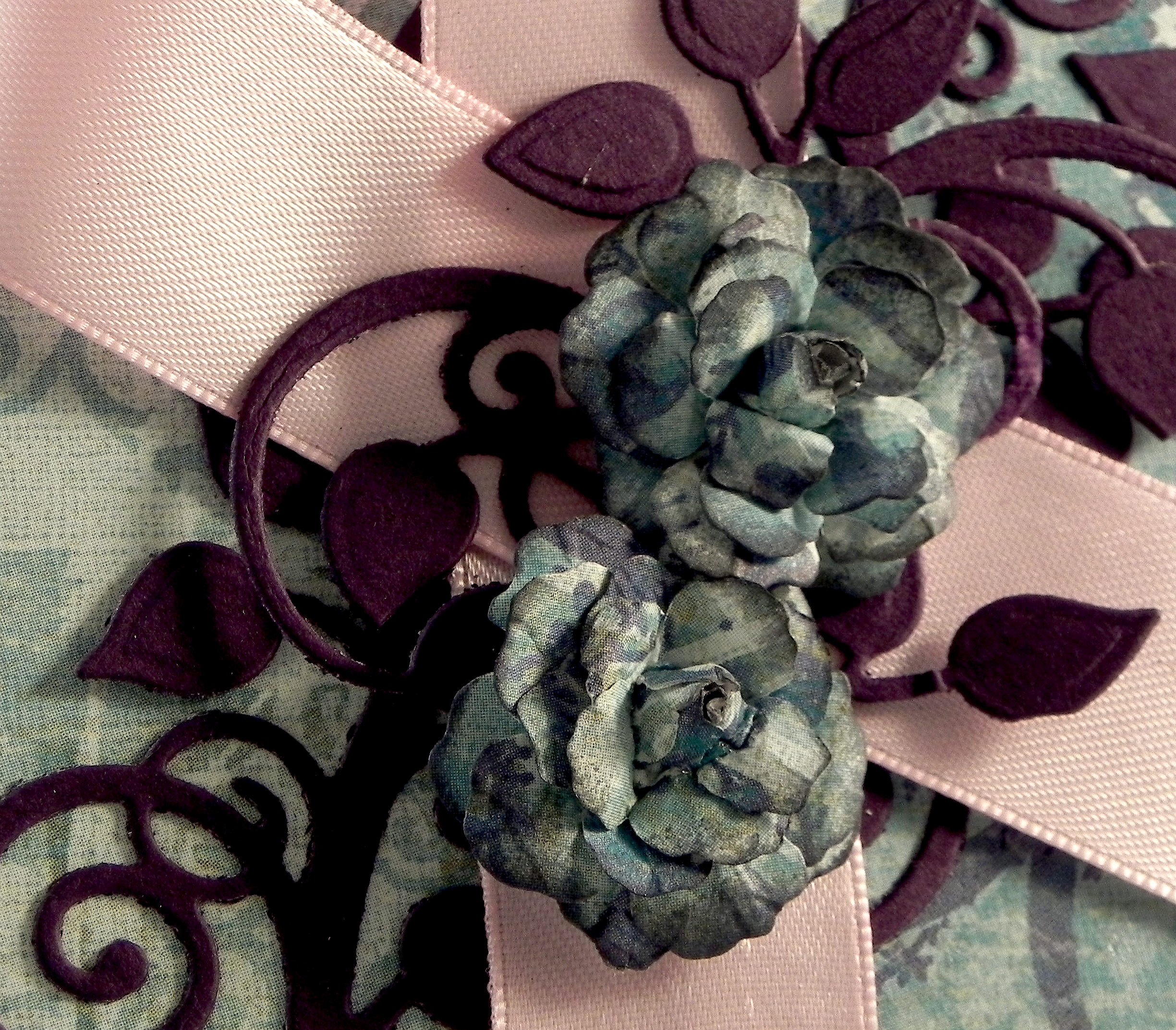
Personally, I like these new, lighter shades better, but I know brown tones aren’t for everyone! So, just for fun, I thought I’d try a completely different color scheme and changed the background and flowers to a bright greenish-blue. The leafy flourish now matches the eggplant mat.

This version has only two flowers.
The two re-done cards are definitely not as dark, and I am happy with the results. I probably like the first attempt with the warm tones better, but that should not surprise anyone who knows me! (I do like my browns!!!) It was really neat to see how changing a few aspects of the card really changed the whole look of it.
Now it’s your turn! Choose a project you did but are not crazy about. While keeping some of the elements the same, change some of them to “Make it Better!” (You only need to make one new version.) Link your new version for the challenge, but be sure to include the “before” photo somewhere in your blog post along with your new version. I can’t wait to see what you create! (This challenge will close at 11:59 pm Saturday 21st March 2015 (AEST) Australian Eastern Standard time. Here is a Time Zone Converter to figure out when they end wherever you happen to live!)
Thanks for checking out my card project!
[The greeting stamp for these cards came from the Gina K Designs “Don’t Lose Hope” duo and was stamped with Tim Holtz walnut stain distress ink. (Clear embossing powder was used on the original and greenish-blue cards.) The flowers were handmade using dies from the Heartfelt Creations (Spellbinders) Vintage Floret set. The leaves were made using dies from the Heartfelt Creations (Spellbinders) Cut Mat Create 2A Die set. Cardstock used was a pink from a Recollections paper pack, Recollections Evergreen, and Gina K Edible Eggplant. The printed card stock came from two Heartfelt Creations Paper pads: Floral Key Collection and Antiquity Collection. The greenish-blue paper is K & Company Addison Blue Garden Swirls. The ticket corners were made with a Tonic Ticket Punch.]
This content uses referral links as described in the disclosure policy on my sidebar.


I love them all. Wonderful card designs and great colors too!
LikeLike
Such a beautiful, dignified card that speaks courage and would be a fit for any situation requiring encouragement and hope umbrage face of adversity. The Perfectly Rustics Design team is very lucky to have you!
LikeLike
Pingback: Join us at Perfectly Rustics for the “Make It Better” Challenge | I Played With Paper Today!