Off to College!!

Off to College!

clipart-images-of-a-car-on-a-road-2

Boy, it’s been a while since I’ve posted anything!

Things got a bit busy around here with my triplets’ “End of Senior Year” stuff, and I decided to take a break to enjoy the last few months with them before they went off to college.   We survived senior trip, prom, exams, graduation, and summer jobs, and now that all four of my kids are away, I am able to begin catching up here.  I have quite a few projects that need to be photographed and posted, and hopefully I’ll have some stuff ready soon.

(“off to college” clipart above from google images)

blog welcome

Thanks for stopping by!

Stay as long as you like. Come back often. Comments are always appreciated.

(To view Data Protection and Privacy Policy, click HERE.)
This site uses referral links, at no cost to you, as described in the disclosure policy on my sidebar.

This slideshow requires JavaScript.

To visit the page for a specific card, pause the slide show (II) and type the card title in the search bar to the right.

(Started posting on September 25, 2014)

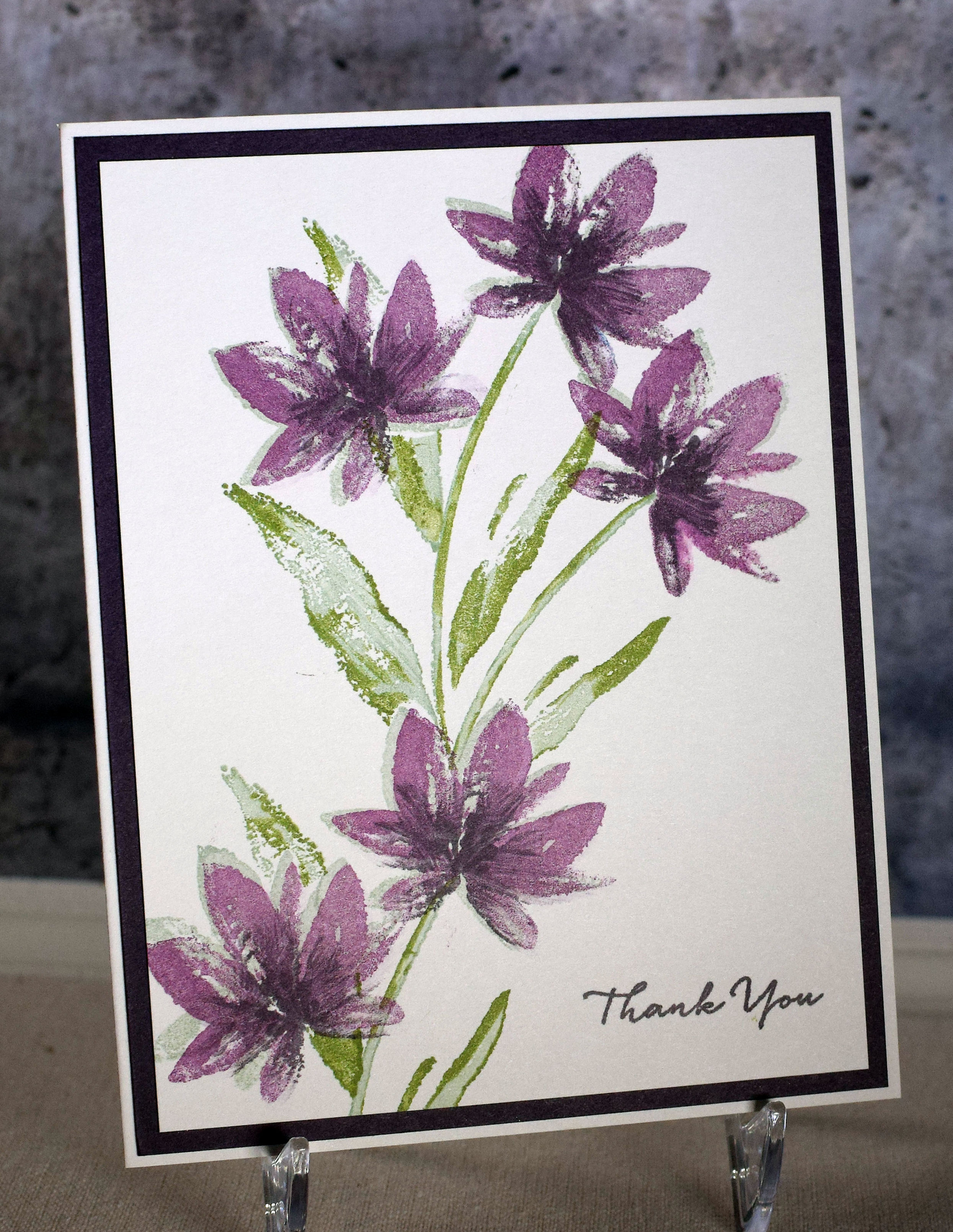
Floral Thank You Note

Floral Thank You Note

wwDSC_5759c lucky picasa.jpg

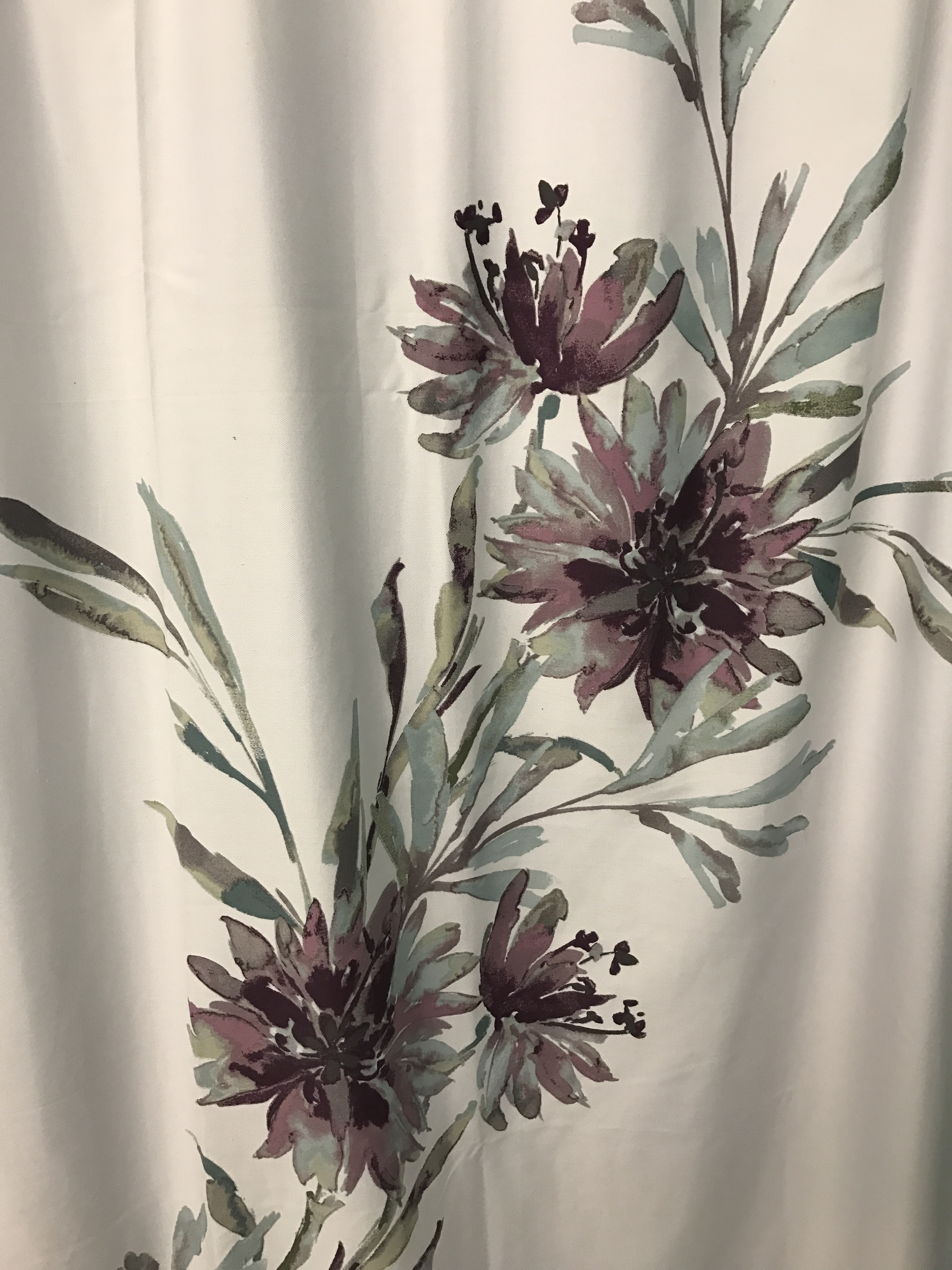
Inspiration comes from many places.  Even bathrooms!  I recently visited a friend who just moved into a new home, and when I was getting the tour, I fell in love with the color combination and design of her shower curtain!  (I took a photo of a portion of it.)

IMG_1082

The floral image from the Stampin’ Up “Avant-Garden” set as well as the SU Mint Macaron ink that I recently purchased immediately came to mind, and I used those to create my card.

The flowers were first stamped with the Mint Macaron ink and then stamped again (slightly off-set) with Stampin’ Up Blackberry Bliss.  To add the darker detail to the centers of each flower, I applied Gina K Edible Eggplant ink to the stamp by swiping the corner of the ink pad directly onto the stamp (as if I were drawing lines from the center and out a bit onto each petal.)  I would have used a water-based marker to add the darker shade, but I didn’t have a color that worked.  I used the Edible Eggplant for the stamen as well.  I created a mask of the flower and then went on to stamp the stems and leaves.

For the stems and leaves, I used stamps from the Stampin’ Up “Terrific Tulips” set.  (Of all the leaf stamps I have in my collection, I was surprised to find I had nothing similar to the ones on the shower curtain.  I didn’t even see anything online so I went with what I had!)  I inked up the stamps with the Mint Macaron ink and then randomly swiped my Spectrum Aqua “Moss” marker over parts of the inked stamp before stamping the images.  Again, my water-based marker colors are limited, and in hindsight, I probably chose a color that is more green than the color I was going for.  (It is really overpowering the mint color!)

The greeting is from the Stampin’ Up “What I Love” set and was stamped with GK Edible Eggplant ink. The card stock I used is “Soft Stone” from Papertrey Ink and “Edible Eggplant” from Gina K Designs.

DSC_5754 picasa

Thanks for checking out my card project!

I’m Freaking Out!!!!!

I’m Freaking Out!!!!!

pulling hair out

With one click, I somehow deleted a TON of photos from my site.  My slideshow is gone, and MANY of my posts are missing photos.  Ugh!!!!!!!

I am in the process of manually re-uploading them…one photo at a time.  (Hopefully someone from wordpress will have a magical solution for undoing whatever I did to cause this problem when they respond to my request for help!)

I apologize if you have taken the time to visit and are seeing a bunch of empty squares where photos should be.  (In some cases, the photo will pop up if you click on the square.)  I will hopefully have this fixed soon.

Thanks for your patience!

UPDATE:  WORDPRESS HAD NO SOLUTION TO THE PROBLEM AND TOLD ME TO CONTINUE MANUALLY RE-UPLOADING THE PHOTOS AS I HAVE BEEN.  SLOW AND TEDIOUS, BUT I FINALLY FINISHED!!!  (Please let me know if you notice anything I missed.)

(above photo from google images)

“I Do” Wedding Box Card (take 2…and 3!)

“I Do” Wedding Box Card (take 2…and 3!)

wDSC_5730c lucky picasa

(inside: Wishing you a beautiful life together)

I can be very stubborn and don’t give up easily on an idea that I am not thrilled with, even when it would be so much easier to just start over!  I thought I was done with the wedding box card I posted yesterday, but I ended up back in my craft room last night, (still trying to design a card base to hold it) and this morning (trying to improve on the stand-alone box card design – that I show towards the end of this post and have since added to yesterday’s post).  Sorry for the long post; it’s been a long few days!

First, the card base design…

zDSC_5724c lucky picasa

The first challenge was to make my new card base work with the “monochromatic-ness” of the piece I created yesterday.  I know I said I was determined to stick with one color, but it just wasn’t working for me with so much card around it.  Maybe next time!  I ended up using Karen Foster’s two-sided “Congratulations” card stock, more from the Recollections “Shimmer Champagne and Silver” pack, and some Gina K charcoal brown (for the front).

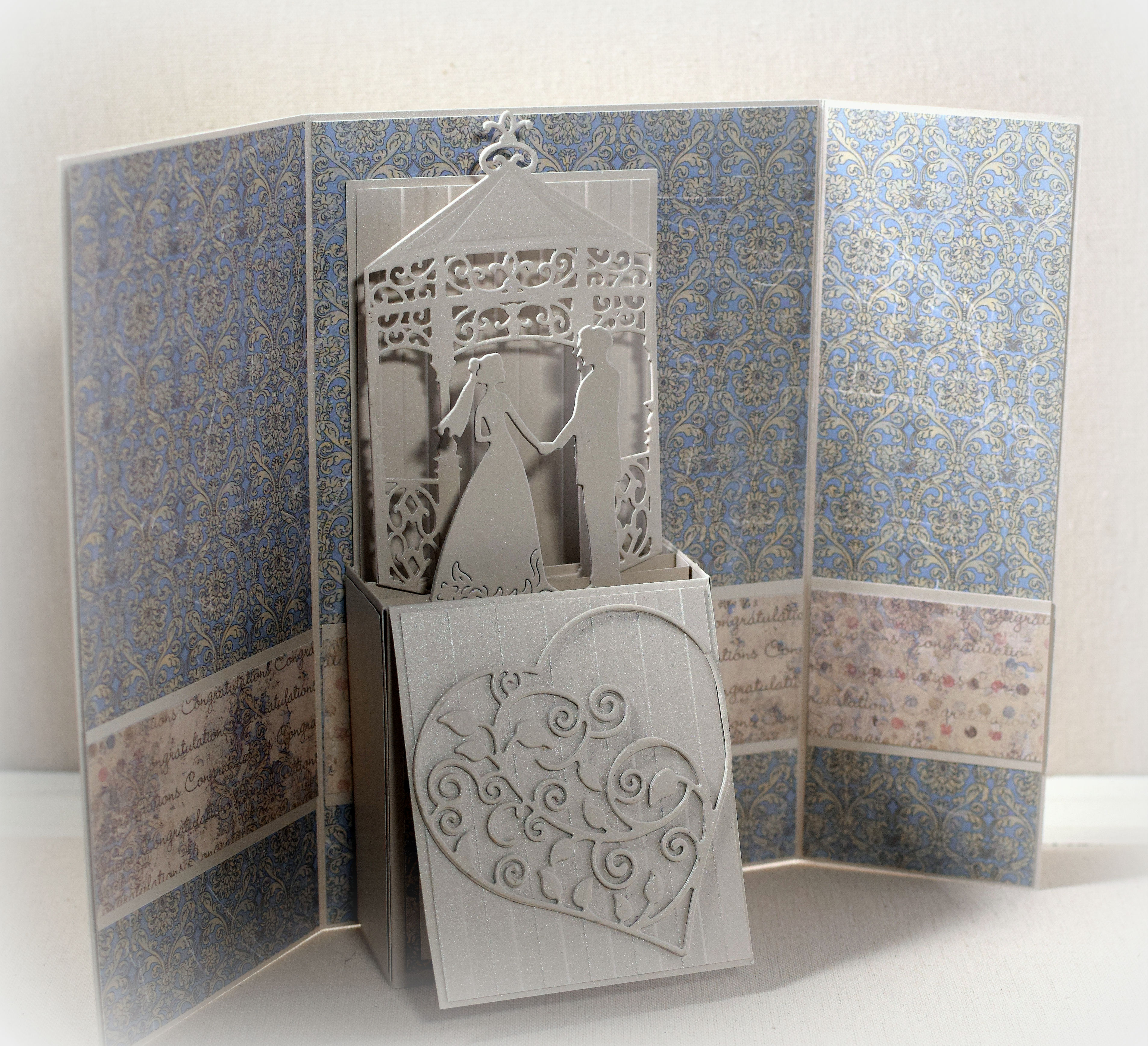
The second issue that needed to be addressed:  the whole box card portion shifts to the right when it is folded flat but shifts to the left when it opens which created a problem with making it fit (when closed) but also making it “appear” centered (when opened). After much playing around, I ended up making a gatefold card base with uneven front flaps.  The left flap is wider to compensate for the extra space created on the right when the box card portion opens and shifts to the left.  (It’s not perfect, but it’s better than when my side flaps were the same size.)

wDSC_5705c auto contrast picasa   wSC_5706c auto contrast picasa

I un-attached the front flap (of the box card) that I had tacked down yesterday, lined the top and bottom with some of the congratulations card stock (it was sticky without it!) and added a panel for my sentiment and signature.  The stamp used is from the Gina K Designs “A Beautiful Life” set and was stamped with Stampin’ Up Early Espresso ink.

wDSC_5728c lucky picasa

I originally wanted to center my greeting panel on the card front by attaching it directly to the left panel, but you could see some of the back of it hanging over the left side when the card was opened, and I wasn’t happy with the way that looked.  So I ended up adding the greeting panel to a belly band that slides on and off the card which worked out well because the thick card did not want to stay closed without it!  The stamp is by Hampton Arts (no name on it) and was stamped with Early Espresso ink.

wDSC_5731c lucky picasa

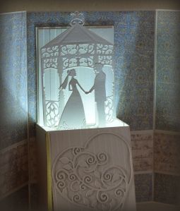
Just for fun, I decided to try adding a battery operated tealight under the box card portion….
wDSC_5736c picasa

While not exactly what I was going for, I could live with this base design which works with the skinny box structure.

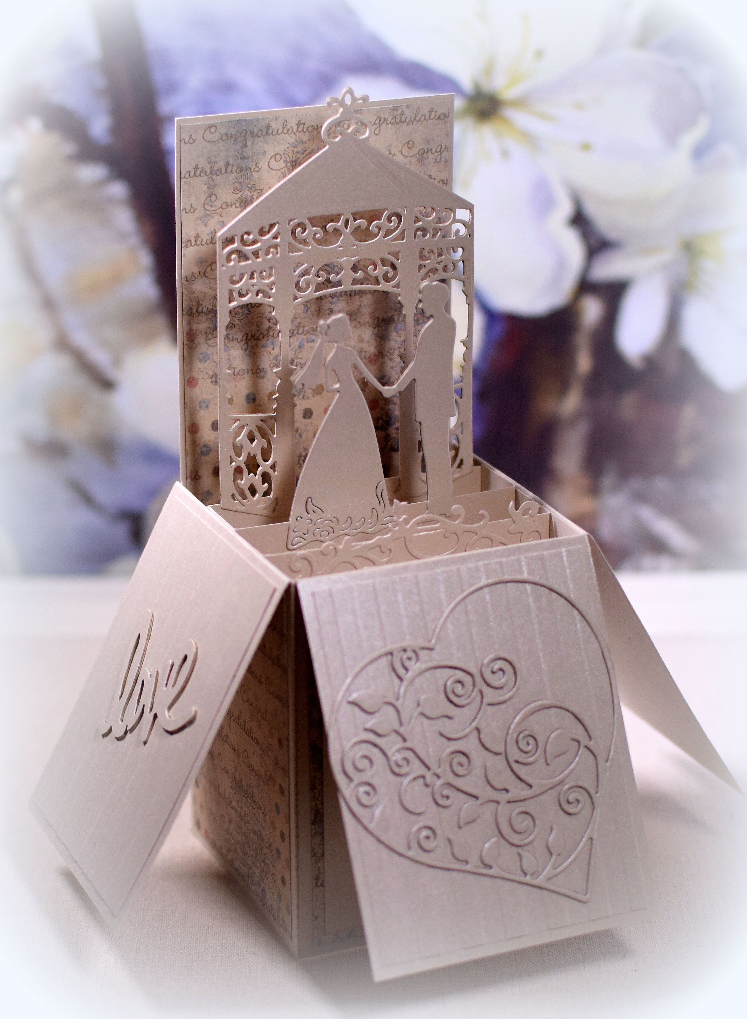
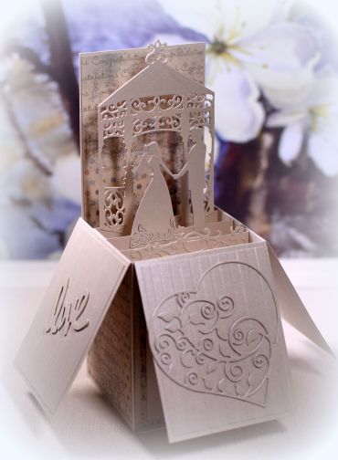
Once I finished with this card, I got to work re-doing the actual box card.  I changed the dimensions and added some patterned paper to spruce it up a bit.  Here’s my new design:
wDSC_5742c lucky plus picasa

I used all the same materials and elements that I used on yesterday’s card, but I needed to add a few additional things since the box was bigger.  I needed an extra “row” inside my box so I added a scrap of a die-cut that looked like it could be flowers, grass, etc.  (It is actually part of a tree die cut that I had planned to put behind the gazebo, but it was much too busy.)  I also added the love die cuts on both side flaps (made with my Fiskars Teresa Collins Love Punch); they just needed a little something.  The Karen Foster’s “Congratulations” card stock added a bit of interest while still keeping the card monochromatic – sort of!  (The sentiment is under the front flap as it was on the original card.)  I like this soooo much better as a stand-alone design!

Thanks for checking out my card projects…again!