“Courage” Tag with Card

“Courage” Tag with Card

bbDSCN0014 lighter

Courage Tag with Card b

This tag was made for the Mod Squad Challenge “Tag It!” where we were to create a tag. We could make just a tag, any size, or attach one by using a little pocket on the card.  (Sadly, this site is no longer active.)

I wasn’t sure if the tag had to be attached to the card using a pocket, or if it could be attached to a card in any way and the pocket was just how Cat decided to do it as an example. In any event, I included a picture of the tag by itself, and of it attached to a card base.

This is also being entered in the Perfectly Rustics Design Challenge No. 33 – Colour Combo.  For this challenge, we were to use three Stampin’ Up! colours (shown below) to create our project. Equivalent colours in different products are allowed! (http://perfectlyrustics.com/2014/10/06/prdc-no-33-colour-combo/)

color challenge 2

I did not have these stampin’ up products, so I used equivalent colors that I had on hand.


The inks I used to try to match the required colors are:

  • Pistachio Pudding – Copic Marker B72 in airbrush  (The B72 looks like pistachio pudding when airbrushed and more blue when just coloring.  A closer match to the pistachio pudding is G21 when writing/coloring straight from the marker.)
  • Soft Suede – Copic Marker E44 in airbrush and Gina K warm cocoa ink
  • Early Espresso – Copic Marker E79 and Gina K dark chocolate ink

The card stock I used was white (inked with varying amounts of Gina K warm cocoa ink), Gina K dark chocolate, and a manila tag.

I hope they are close enough matches.  I don’t know exactly what the colors are supposed to look like, and am trying to match them from my computer screen which is not always accurate when it comes to colors!


For the background, I sponged warm cocoa ink over the entire panel.  I then stamped the Hero Arts “Old Letter Writing” over it in warm cocoa ink.  The whole panel was sponged again with a Tim Holtz “Harlequin” stencil and warm cocoa ink.  This panel was mounted on a dark chocolate card base.

The center panel was sponged with warm cocoa ink and mounted on a dark chocolate base.

I used the ABS Monoprinting Technique to cover the whole tag with the “pistachio pudding” color.  This technique is done with the Copic Airbrush System (ABS) (or use gun with compressor) which creates a marbleized background.  The Copic Markers I used were B72 and E44, along with colorless blender solution in a mini mister (spritzer), and the manila tag.  The ink was airbrushed in spots on my craft mat and then spritzed (with a mini mister) with the colorless blender.  Once the ink started to pool or formed puddles, I put the tag, face-down, onto the craft mat into the ink puddles. I twisted the tag slightly when picking it up and then placed it in the ink again, and again until I covered my panel.  This works best with glossy card stock, and since I was using a plain tag, I got a lot of spots that weren’t covered when I was done.  I ended up airbrushing a light coat of the B72 directly over the whole thing to fill in the parts I missed before.

Next, I used a mask from the Tim Holtz Idea-Ology Masks-Borderline set and airbrushed over it using Copic E44.

I then stamped a bunch of images in dark chocolate using the Hero Arts “Musical Collage” stamp, the stems from the Tim Holtz “Flights of Fancy” set, and several images and the sentiment from the Tim Holtz “French Memories” set.

To make the leaves, I inked paper using warm cocoa ink and cut the leaves using the Tim Holtz tattered leaves die.  I used a stamp from the Tim Holtz “Falling Leaves” set with dark chocolate ink to add some detail to the leaves.  This stamp does not really fit these die cuts, but I stamped them somewhat randomly to cover them.  I inked the edges with dark chocolate ink and also used this to fill in areas that weren’t covered by the stamp.

The sheer ribbon was heated with my heat tool to crinkle it up a bit.

The tag was mounted on dark chocolate card stock and round clips were added.

Thanks for checking out my tag and card project!

This content uses referral links as described in the disclosure policy on my sidebar.

“With Love” Tag

“With Love” Tag

caaDSCN9985

This tag was made for the Mod Squad Challenge “Tag It!” where we were to create a tag. We could make just a tag, any size, or attach one by using a little pocket on the card.  (Sadly, this site is no longer active.)

cDSCN9996 - Copy

I wasn’t sure if the tag had to be attached to the card using a pocket, or if it could be attached to a card in any way and the pocket was just how Cat decided to do it as an example. In any event, I included a picture of the tag by itself, and of it attached to a card base. (I couldn’t get it in a pocket; it was too thick.)

This card is also being entered in the Simon Says Stamp Monday Challenge – Falling in Love With … where we are to create a card to show what inspires us this fall. I am inspired by and love the warm, fall colors! (http://www.simonsaysstampblog.com/mondaychallenge/?p=1955)


I had gotten a few new things from the Heartfelt Creations booth at the Scrapbook Expo I went to in September, and thought I’d use them for this tag project.

The cardstock I used for this tag was Gina K dark chocolate and 2 sheets from the Heartfelt Creations Classic Sunflower Collection paper pack. I cut the tag using the Tim Holtz alterations Moves & Shapers Bigz Die – Tags and Bookplates. I really like this die because it makes a nice size tag with plenty of room to work.

I used the Heartfelt Creations (Spellbinders) Classic Sunflower die for the flowers, and the Heartfelt Creations (Spellbinders) Ornamental Add On die set for the leaves. The flowers were stamped with the coordinating stamp called Classic Sunflower Pre Cut Set to add detail.

The flowers were colored with Copic Markers (YR24, YR31, E39, and E29). Viva 3D stamp paint in copper was sponged on the petals to add shimmer. Barbara Trombley’s Elements – Earth Textures was added to the centers of the flowers.

The greeting came from the Gina K Designs “A Year of Flowers 2” set and was stamped with Gina K dark chocolate ink.

The flowers ended up a lot more orange than I expected, so I inked Tim Holtz Rusty Hinge, Vintage Photo and Walnut Stain distress inks onto the tag to get the color a litttle closer.

I added a Tim Holtz Ideology wire pin to the ribbon to keep it from falling off of the tag. The greeting is in a Tim Holtz Ideology ornate plate. And K & Company metal art stickers were added to the card base.

Thanks for checking out my tag and card project!

This content uses referral links as described in the disclosure policy on my sidebar.

Scrap & Stamp

Scrap & Stamp

I bought my first pile of stamping supplies around the same time I started scrapping (1999). My neighbor hosted a Stampin’ Up demonstration, and the projects shown by the consultant were gorgeous. Besides thinking it might be fun to start making cards, I had the brilliant idea that I could do some stamping on my scrapbook layouts as well. I ended up spending a not-so-small fortune on stamps, inks, and supplies. When my supplies finally arrived, I attempted my first card and was EXTREMELY disappointed! It looked nothing like what had been shown at the demonstration! (I basically stamped an image onto the card base, colored it in with colored pencils, and wondered why it looked so boring!) I had no idea what I was doing, no knowledge of the many cool techniques that were out there, and quite frankly, I stunk at stamping! I couldn’t get a clean image consistently so I was petrified to bring my stamps and inks anywhere near my scrapbooks!

For my early attempts, and there were not many of them, I stamped letters or words from alphabet stamps on separate sheets of paper and cut them out to attach to my pages. If I messed up, and I did often, I could just re-stamp it since it wasn’t on the layout yet. I posted one of these examples yesterday. It was my daughters “Watch Me Grow” page. (Click HERE to see it.)

Another example was on my “A Magical Birthday” and “Happy New Millenium” layouts.  The letters were stamped on scrap paper and individually cut out. I liked the look, but that’s as much as I was comfortable doing early on!

cDSCN9952

cDSCN9773

After these early attempts, my stamps ended up in the basement in a box, pretty much forgotten.  A few years ago, my neighbor decided to get rid of a bunch of her stamps (I guess hers had ended up in her basement as well!) and asked me if I wanted them.  I decided to take them and give it another try! Now, I was determined to figure out how to use them, discovered You Tube videos and StampTV, and learned that I love stamping!  I’ve gotten better with practice and have learned a lot since I first started out, but I will admit I am still a little scared of stamping directly on the page!


Here are a few more recent examples of where I’ve incorporated stamping in my scrapping:

On this Easter layout, I created the bunny scenes in the corners by masking and stamping the elements on cardstock and matting the panels before adhering them to my layout.

cDSCN9956

caDSCN9958


For this spring layout, I used stamps for the border blocks.

cDSCN9961

cDSCN9963


I used a distressing technique on the journal box to give it a spookier look and to make it match the patterned paper used on this Halloween layout.

cDSCN9971

cDSCN9971 text box


This layout was ALL stamped and inked!  I am not going to tell you how many times I had to start over for these pages; there were a lot of opportunities to mess up!  (And I had to duplicate this layout 4 times for each of my 4 children!!)  I really like how it came out, though, so it was worth it!

The Beach


Thanks for checking out my post!

What A Difference A Year Makes!

What A Difference A Year Makes!

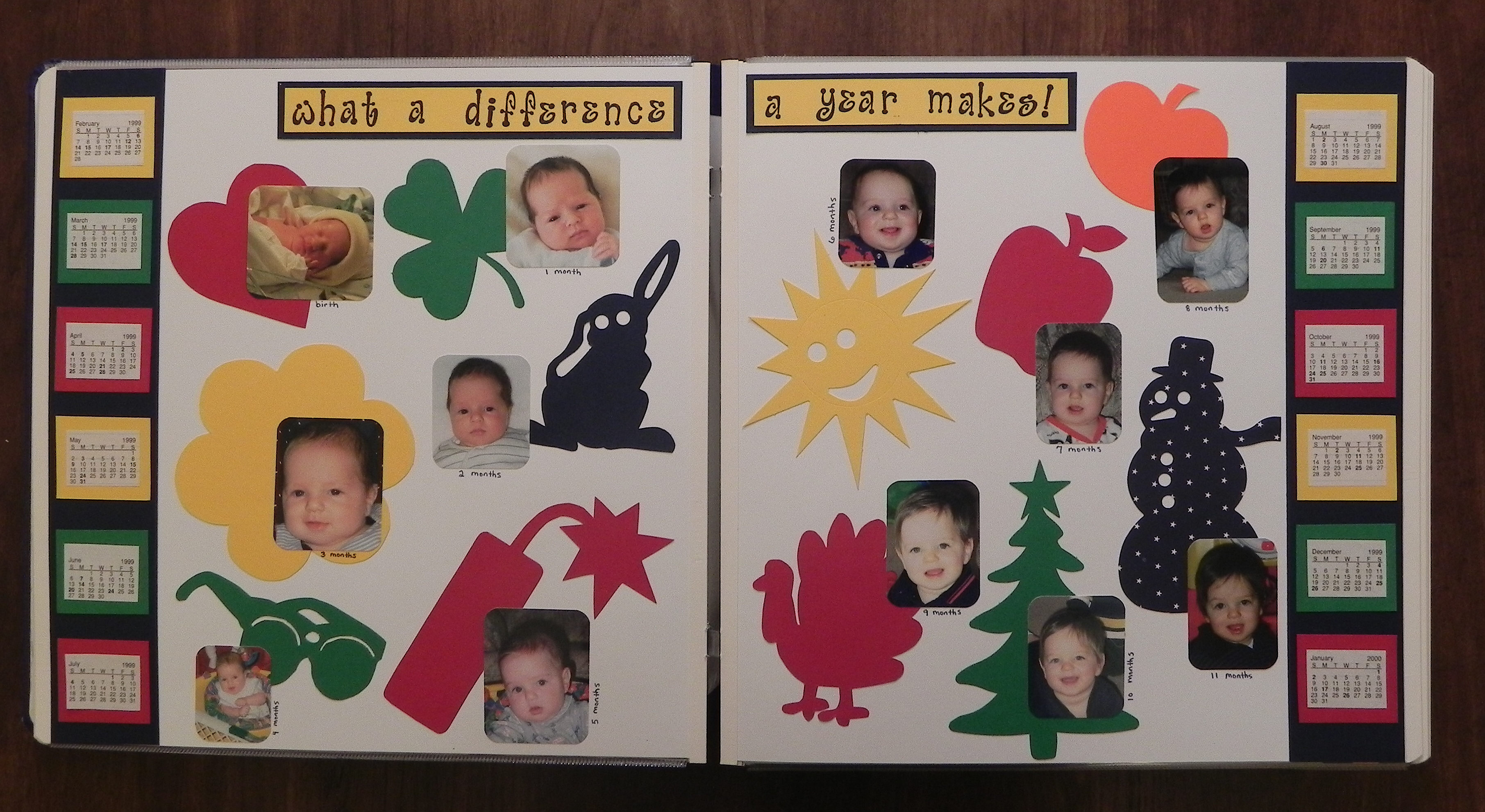
The following 4 layouts were among the first ones I did, about a year after I started scrapbooking.  I took a photo of each of my children every month on their month-iversay, at birth, 1 month, 2 months, etc. After 12 months, I did a layout with all of their photos to show how much they grew and changed during their first year.  (Click on a photo to get a closer look.)

cDSCN9902

cDSCN9922

cDSCN9906

cDSCN9934

Thanks for checking out my post!

Thinking “Inside the Box”

Thinking “Inside the Box”

Usually we are encouraged to be creative and think outside the box.  However, I worked “inside the box” for these layouts!  (Click on a photo for a closer look.)


This fall page has several photos cut to fit inside fall-shaped dies.

cDSCN9766


The collage of photos is inside the barn on this field trip page.

cDSCN9806


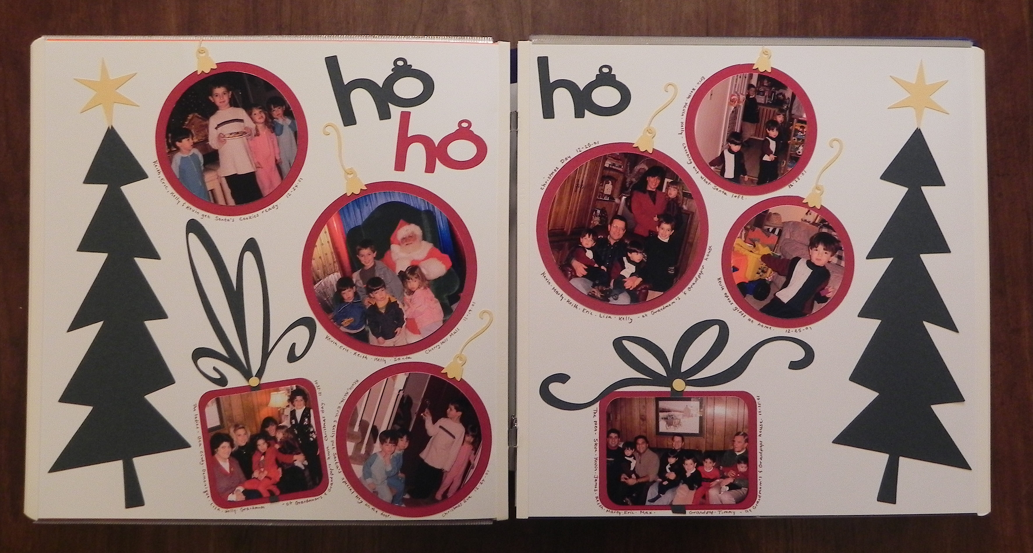
Photos are cut to fit inside the ornaments and packages on this Christmas layout.

cDSCN9932


Look inside the mittens and snowmen on this winter page.

cDSCN9943


The insides of the water splashes contain the photos on this summer layout.

cDSCN9925


On this school page, the large schoolhouse die contains the individual and class portraits.

cDSCN9939


There are photos in the tent die on this camping page.

cDSCN9897


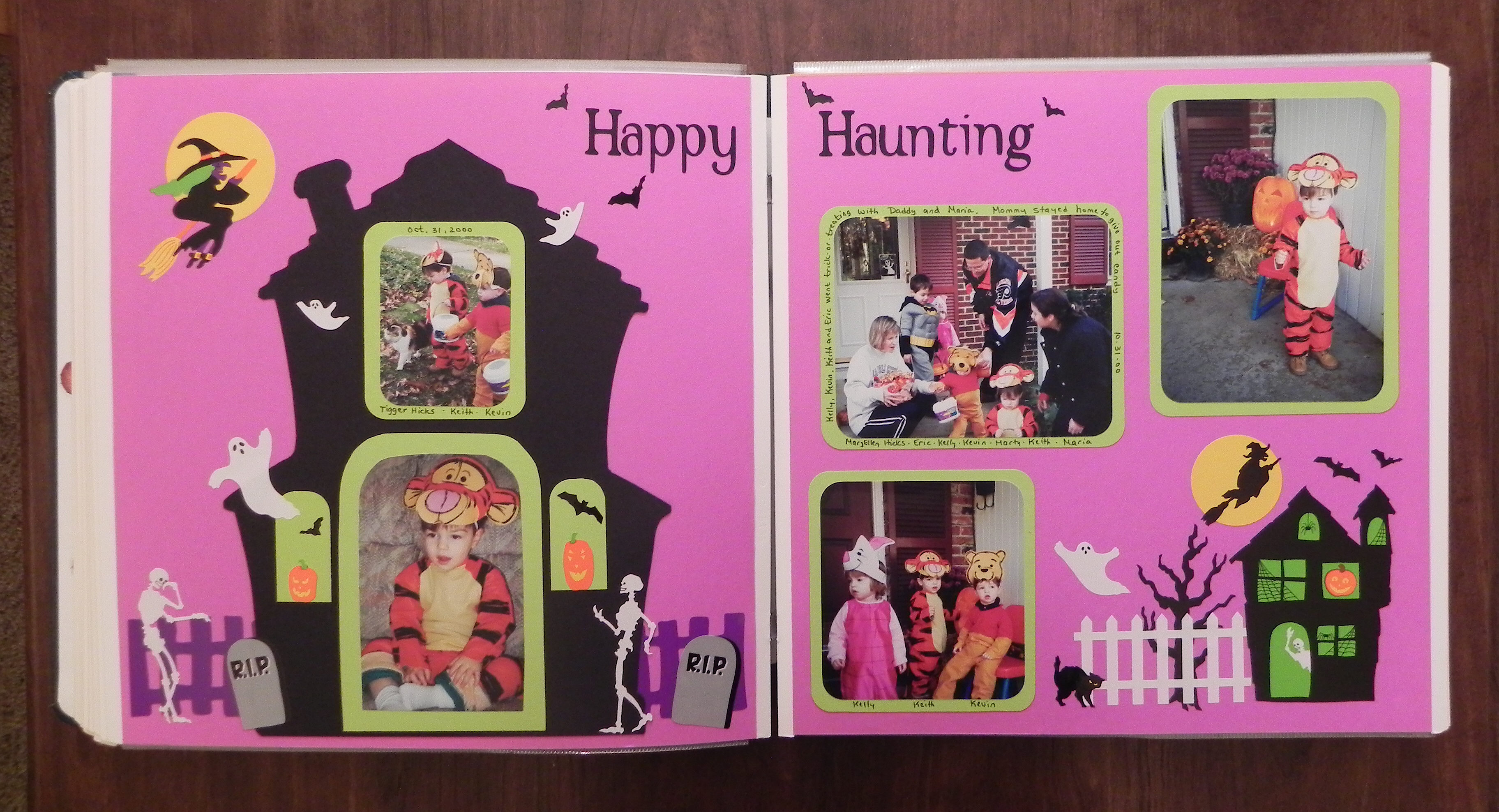
This Halloween spread has photos in the haunted house.

cDSCN9914


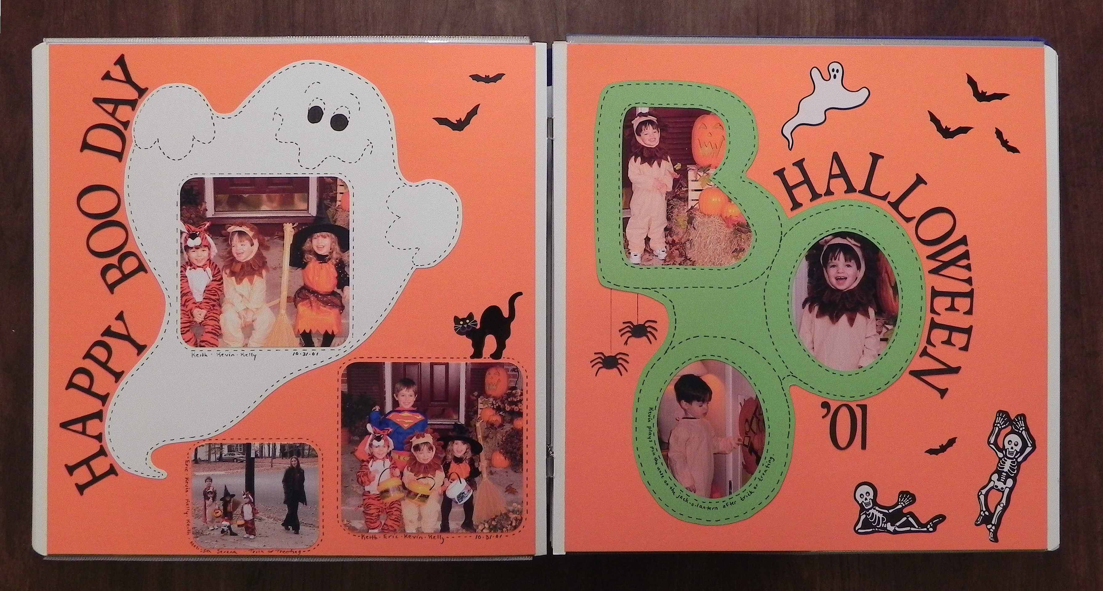
Here’s another Halloween layout with the photos trimmed to fit in the word “boo” and another photo is in the ghost.

cDSCN9928


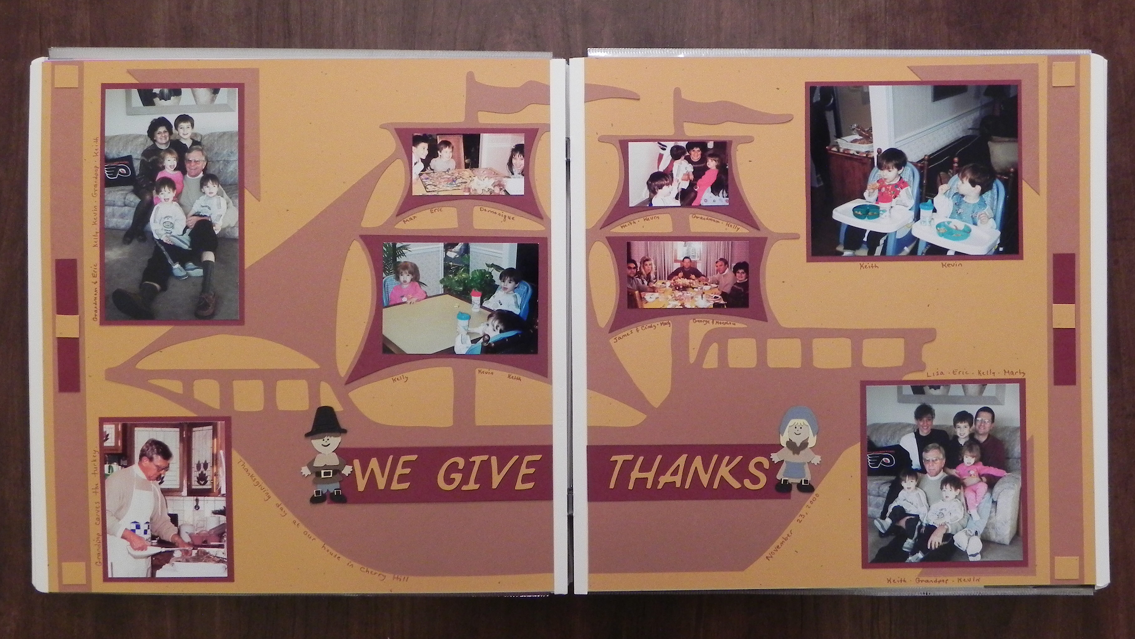
Photos make up the parts of the Mayflower on this Thanksgiving page.

cDSCN9916


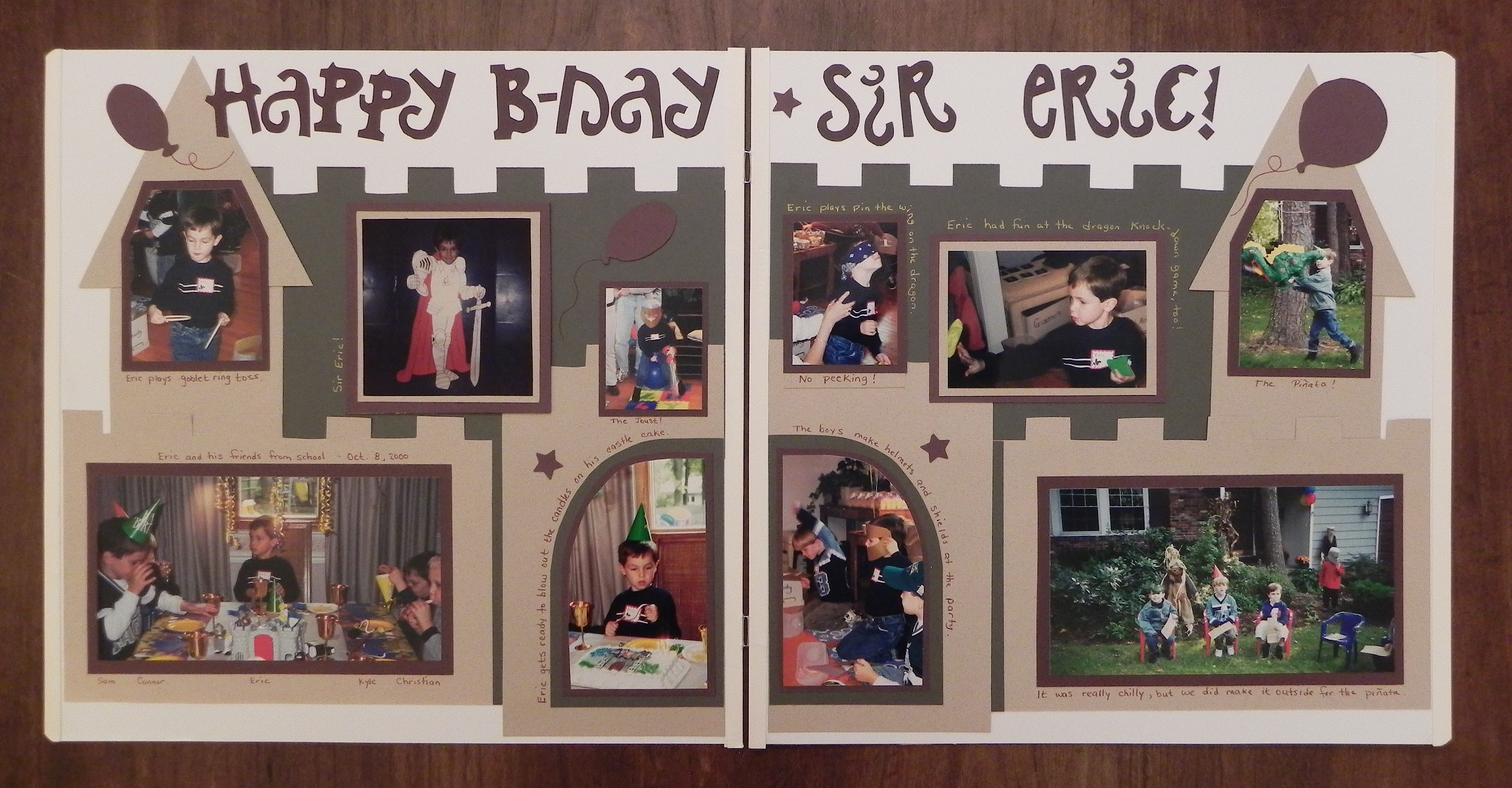
Party pictures are in the hand-made castle layout.

cDSCN9837


Thanks for checking out my post!