CAS Thinking of You Note Card

CAS Thinking of You Note Card

DSC_2614ww.JPG

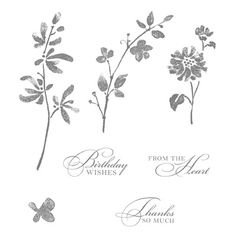
This “Clean and Simple” card features a stamp from the “Water Color Trio” set from Stampin’ Up (retired) and a greeting from the “Banners” set from Joy! Crafts.

I originally purchased a used, incomplete set of these stamps on ebay (specifically for this stamp), but the greetings (and one of the other images) were not included.  I saw the complete set on ebay when doing this post and immediately ordered the complete set!  I just love those greeting stamps!!  (I guess the seller did too – lol!!!)

su water color trio

The stamps in this set were designed to look like the images were water colored, so just stamping them makes it look like water was added.  Although not the correct colors for cherry blossoms (which I think these are supposed to be – lol!), I went with GKD Moonlit Fog and Wild Lilac ink on water color paper.  The base is Bazzill Buttermints, and the mats are Wild Lilac.

Back to basics…  just a few stamps and inks!

Thanks for checking out my card project!


Teal Thinking of You (Two-Tone Inking)

Thinking of You (Two-Tone Inking)

DSC_2542w.JPG

I saw this video where Gina K shows an inking technique she calls “Two-tone Inking” to create the look of layering stamps when using a single stamp and thought I’d give it a try.  It is basically a thumping technique, but instead of using markers, you use the edge of an ink pad to “thump” the second, darker color over the lighter ink on a stamp.

This technique will work with any solid or silhouette image stamp.  I used one of the flower images from the “Petal Prints, Two Step Stampin” set from Stampin’ Up (retired?).  (Even though this is a two step stamp set, I only used one of the layers for this card.)  First, I inked the stamp with GKD Sea Glass ink (the lighter color), and then I thumped over it with GKD Tranquil Teal.  It was suggested that you use the smaller ink cubes for this technique, but I only have the full size pad, and it worked fine.

I “smooshed” my background using GKD Seaglass ink and water.  I used some of this with a paintbrush for the splatters as well.  Tranquil Teal card stock was used for the mat panel.  The leaves (from the same Petal Prints stamp set) were “stamped off” with Sea Glass. The greeting can be found in the “Moments of Grace” set from Simon Says Stamp and was stamped with Tranquil Teal.

Over at the Modsquad Challenge Blog, the challenge this week is “A Time for Giving” where we are to “make a card to demonstrate GIVING such as kindness, thankfulness and friendship.”  This “Get Well” card was sent to let the recipient know she was in my thoughts and prayers as she recovered and to offer any help she might need until she gets back on her feet.

Thanks for checking out my card project!

This content uses referral links as described in the disclosure policy on my sidebar.


A Few Quick Cards to Share…

A Few Quick Cards to Share…

xxDSC_1340.jpg

I was cleaning my craft room recently and came across a few quick cards I had made a while back (and had kind of forgotten about!).

*

yDSC_1357

For this one, I embossed a piece of brown card stock with the Cuttlebug “Thanks” embossing folder (#37-1134) and then rubbed “Walnut Brown” Viva 3D-Stamp Paint over the whole panel.  Love, love, love the rich, metallic shine!

I cut a rectangle window from the embossed panel and another rectangle for the greeting (PSX E-2266) with dies from the Spellbinders “A2 Matting Basics” (A & B) die sets.  Gina K Designs Dark Chocolate ink was used for the greeting panel along with a Vintage Photo distress marker and a Ranger Distress Marker Spritzer Tool for the splattered dots.

*

xDSC_1348

For this next one, I added Gina K Designs Honey Mustard ink and water to my craft mat and dipped/dragged white card stock through it.  Then I used a paint brush to tap/splatter some Dark Chocolate ink and water over the panel.  I sponged the edges and stamped the leaves and greeting from the Momenta “Nature Set” (lot #0005702) with Dark Chocolate ink.  This panel was layered on another piece of white card stock and a Dark Chocolate base.

*

xDSC_1352     xDSC_1353

For these, I let the patterned paper do all the work…  I used portions of a piece of Recollections “Thoreau Flowers” (#505802) paper along with Stampin’ Up Tip Top Taupe and either Peach Ballini or Edible Eggplant card stock from Gina K Designs.

The birthday stamp is from the “Birthday Bash” set by Fiskars.  The greeting on the second one is from the “Various Verses” set (retired?) by Gina K Designs.  Both greetings were stamped with SU Tip Top Taupe ink.

*

Thanks for checking out my card projects!

This content uses referral links as described in the disclosure policy on my sidebar.
Spring Tree Note Card (and a few variations)

Spring Tree Note Card (and a few variations)

wDSC_0811

In my last post, I shared a project I created to demonstrate die cutting, masking, and sponging for the Card Making Class I am teaching.  I also created some spring themed cards as options.

Here is one with slightly different colors:

wDSC_0807

For both these samples, I used “Meadow” Flower Soft to add a bit of texture and dimension.

We had done this same card design in the fall using “Autumn” Flower Soft and fall colors:

wDSC_9958

I also tried a sample using “Polar White” Flower Soft as snow, although I think I’d like it better if the “snow” were whiter/brighter.

xDSC_0822

Thanks for checking out my card projects!

Multi-Layer Emboss Resist Sympathy Card

Multi-Layer Emboss Resist Sympathy Card

xDSC_0194.jpg

This card was inspired by the technique shown in this video.  I love how the background words “fade in and out” across the panel under areas of lighter and heavier sponged ink and behind the solid, embossed images.

To achieve this look, I started by repeatedly stamping a greeting on the white background panel with Memento Rich Cocoa ink.  Then, I stamped the leaves with versamark ink, added clear embossing powder, and heat set them.  Once cooled, I sponged Tim Holtz Vintage Photo distress ink (with varying pressure) over the embossed leaf images and around the edges of the panel.  The embossed areas resisted the ink allowing the stamped background words to show through.  Sponging over these leaves also caused the area around the leaves to be highlighted.

I spritzed the background panel with a Walnut Stain distress marker and a Tim Holtz marker spritzer tool.

I stamped the greeting on a small, white panel.  I then masked the area over my greeting with a torn piece of a post-it note and sponged and spritzed that as well.

Thanks for checking out my card project!

This content uses referral links as described in the disclosure policy on my sidebar.