Ho Ho Ho with Distress Oxide Inks (and a few other samples)

After trying alcohol inks the other night in the course I am teaching through the Haddonfield Adult School (as I mentioned in my previous post), we then played with Distress Oxide inks . I used these inks for the first time while preparing samples for this lesson. (I had watched several tutorial videos back when the inks were first introduced but hadn’t actually tried them until now. Not sure what I was waiting for!!) I love how cool the ink looks when it dries, how it reacts with water, and how easy (and fun!) it is to layer colors.
The background on this one was “smooshed” with Tim Holtz Faded Jeans, Cracked Pistachio, and Vintage Photo Distress Oxide inks. I didn’t add water to my inked surface on this card because I wanted to see how the layered inks looked after they dried without the oxidized look.
The die cut is called “Ho Ho Ho Square” (#590-ZZ) from Impression Obsessions.
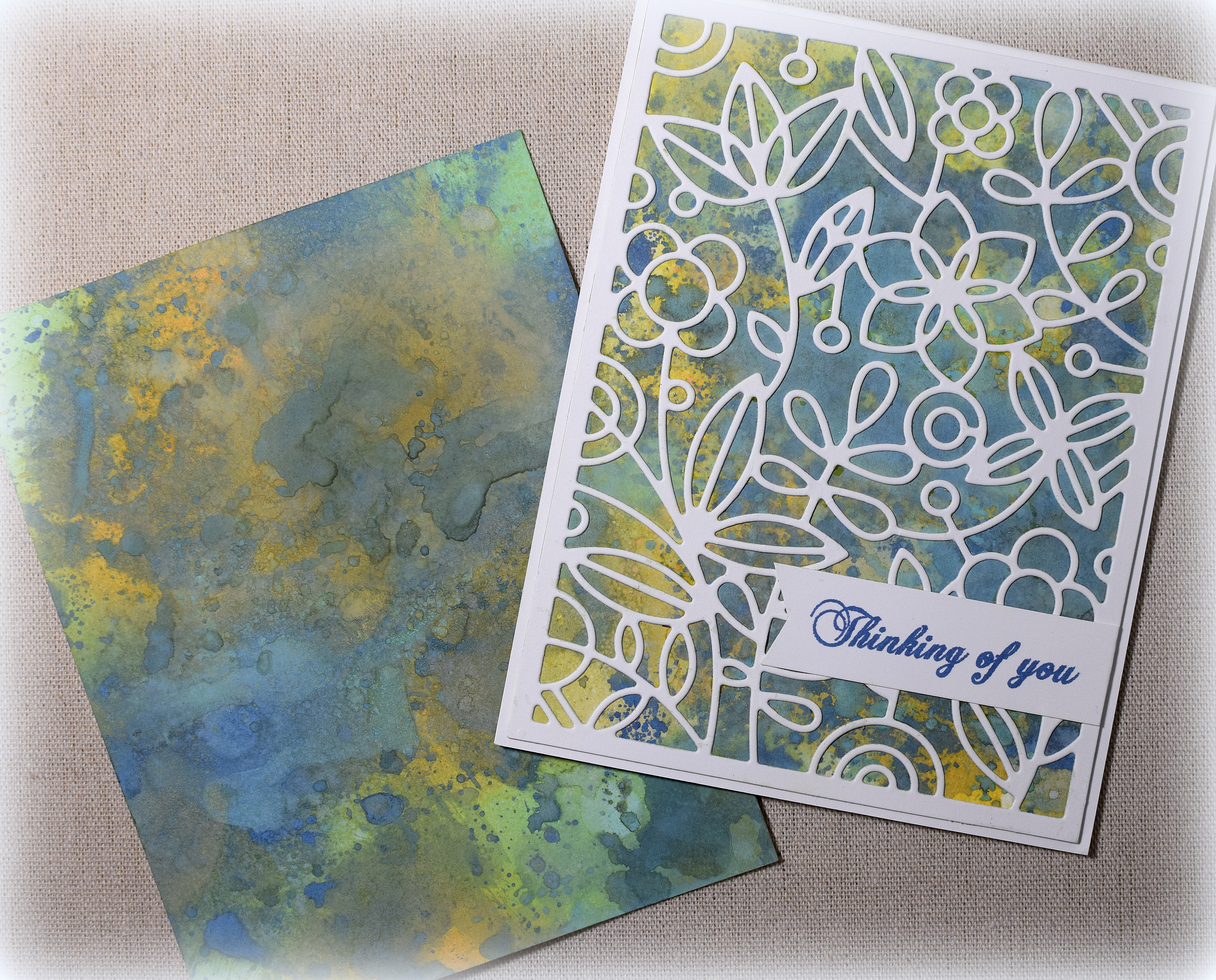
Here are two more samples made with the “smooshing” technique using Cracked Pistachio, Faded Jeans, Wild Honey, and spritzes of water between layers.

The floral die cut on this one can be found in the “Floral Square” die set (PFSA0118) by Pinkfresh Studio. (The “thanks” die was unbranded, but I’ve since found and purchased the “Gallery Frame 2” die set from Hello Bluebird which contains this “thanks” die, but bigger.)
and
The “Fancy Floral 2” die (PFSA0918) is also by Pinkfresh Studio. (There is also a Fancy Floral 1 which is the same design with thicker lines and could be layered under this one to create an offset mat. It could also be used on its own.)
Thanks for checking out my card projects!
This content uses referral links as described in the disclosure policy on my sidebar.


Wonderful cards. I really like the first one with the Santa scene.
LikeLike
Smooching is so fun, you are really getting some spectacular results.
LikeLike