How to Adhere Tiny Elements to Your Project With No Mess
There are so many beautiful flourish dies, cut files with tiny pieces to assemble, delicate die cut fonts, and a variety of other small elements that can prove challenging when it comes time to adhere them to your project.

One of the first Cricut cartridges I purchased years ago was “Disney Mickey and Friends” which I planned to use for my Disney vacation scrapbook pages. I excitedly cut out the pieces for a few of the characters just to see how they’d look (pictured above) and realized very early on that I may have bitten off more than I could chew! All the tiny pieces!!! How was I ever going to assemble enough of these characters to decorate multiple 12 x 24 inch layouts (for each of my 4 children’s scrapbooks)?! The cartridge got tucked away, and I went on to work on “easier” designs with larger die cuts. Then I started purchasing font cartridges which also involved adhering small pieces to my pages. I was determined to figure out a way to use these beautiful (if not small and skinny!) elements on my projects without going nuts or making a mess!
I tried a number of different products and methods and eventually discovered 2 items that I use together that have made adhering these elements to my work a breeze!
***
The first item I use (for paper elements) is Scotch Removable Tape. It allows you to pick up your elements and place them on your project without ever touching them. This is particularly helpful when there is glue on the back of the pieces! This product works great because it is clear so you can see through it to make it easier to place your elements exactly where you want them (as you’ll see below), and you can use one piece of tape over and over so the roll lasts a long time.

***
The second item is glue that can be applied in tiny amounts and with precise placement.
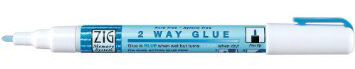
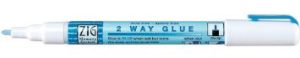
I use a glue pen. Originally, I used the Creative Memories Precision Point Adhesive Pen (which I think is no longer available?), and have since started using the Zig 2 Way Glue pen. It looks like a pen and has a fine ball point. You can squeeze or roll just the right amount of glue that you need with perfect placement. This glue can be used two ways. Use it when it’s blue and wet for a permanent bond or let it dry clear for a few moments to get a temporary bond.
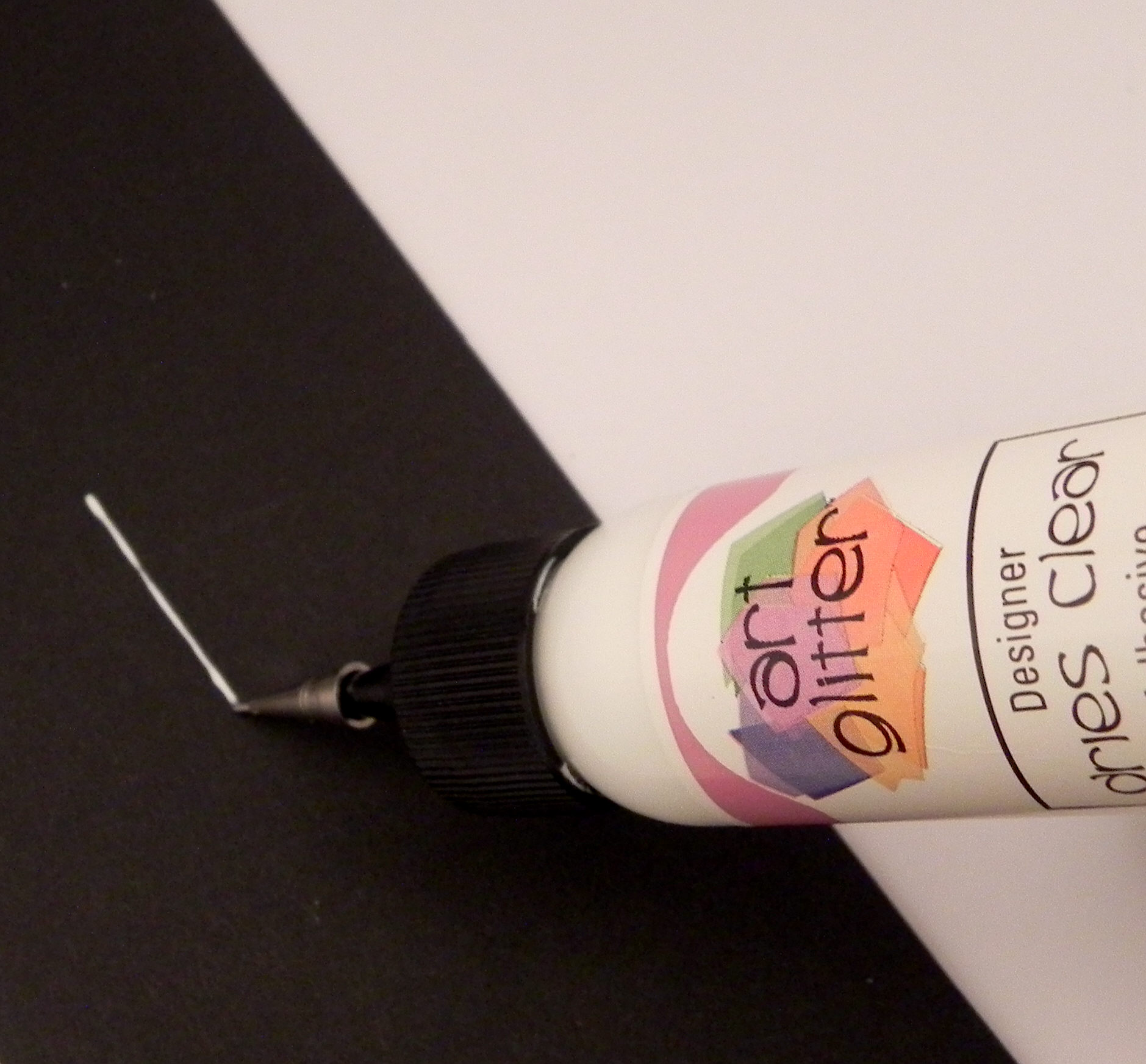
Another type of glue I like is Art Glitter Designer Glue with optional metal tip that I talked about in a previous post (HERE). The metal tip makes applying small amounts of glue very easy, as well.

Any glue will work as long as you can apply tiny dots or lines of glue to your project.
Here’s how it’s done:
Let’s look at an example of paper piecing a character.

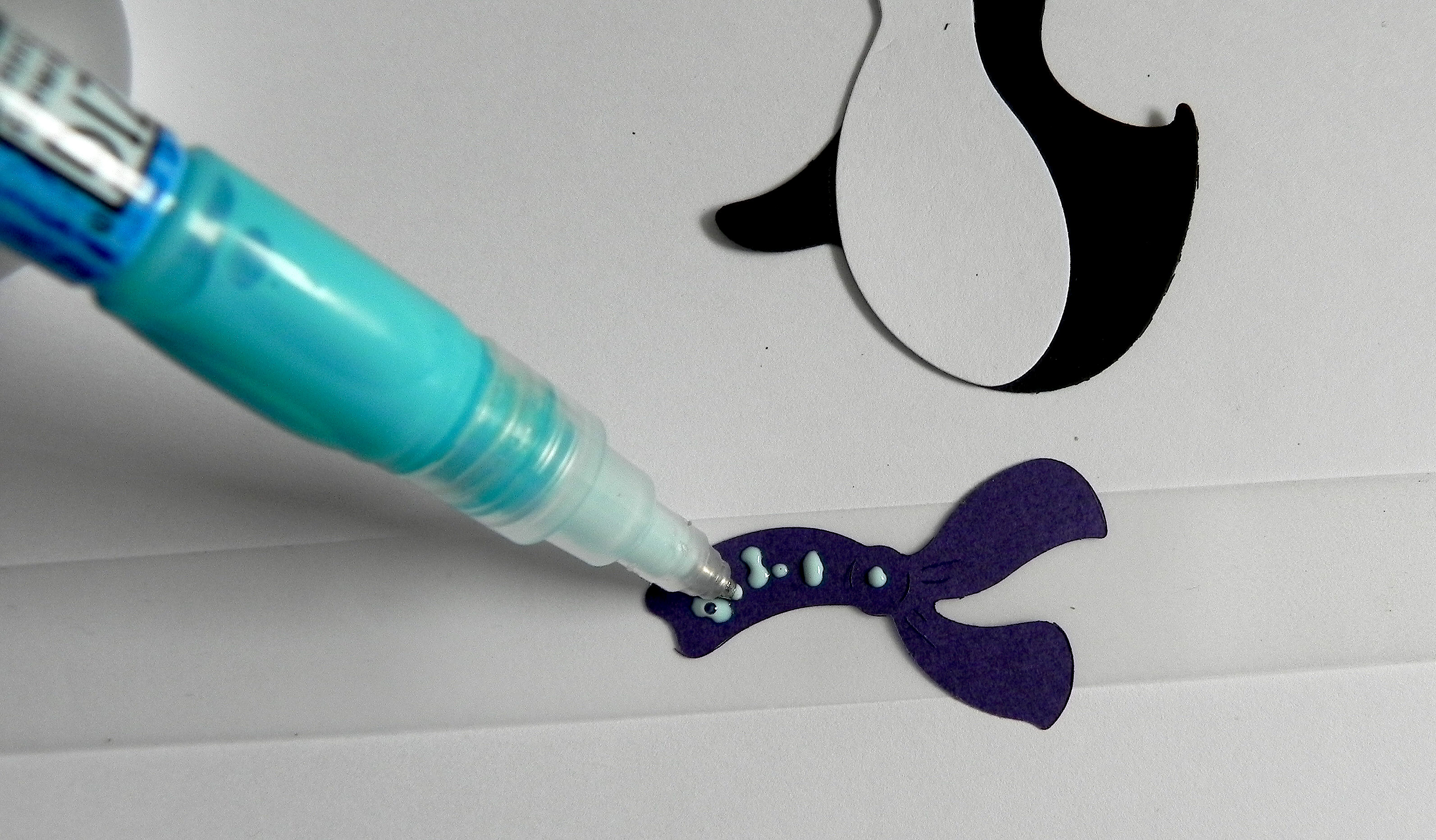
All the pieces (big and small) can be adhered the same way AND WITH THE SAME PIECE OF TAPE. I’ll use the scarf as my example. To adhere the scarf, place it on the table and place a piece of removable tape across the top. Make sure the tape extends past both sides enough that you can hold the tape without touching the scarf.

Flip the tape and scarf over and place it on the table. Use your glue pen to apply your glue to the back of the paper.

Pick up the tape on both ends, and flip it over. (Thanks Kelly, for “lending” me your hands so I could take the photo!)

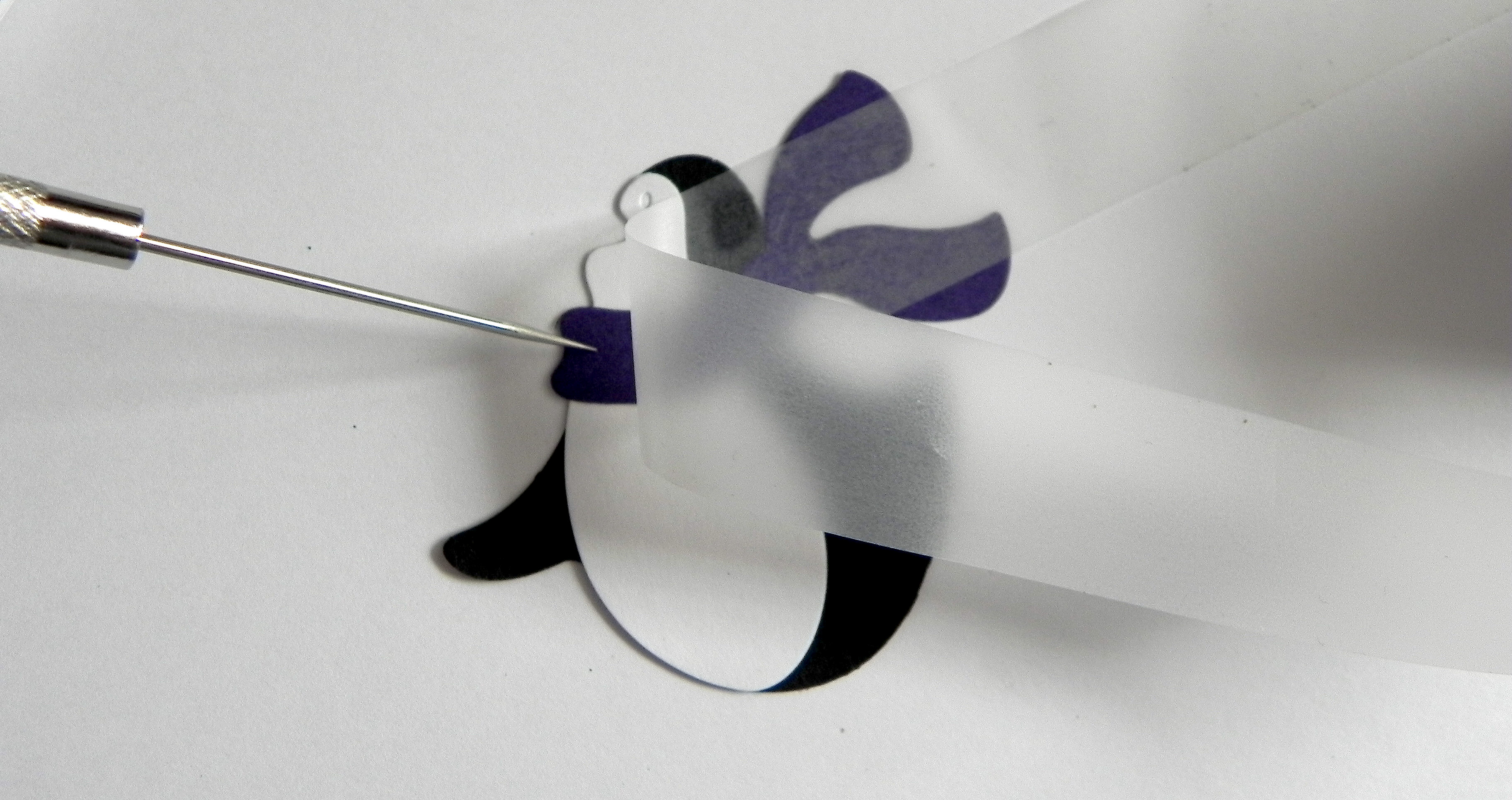
Hold it over the penguin’s body where you’d like to adhere it. Because the tape is clear, it is really easy to see where to place it! Once you are happy with the placement, push it onto the body as if you are taping it in place.

Carefully remove the tape. If necessary, hold the scarf in place with your finger or a pointy tool like a tooth pick or paper piercer while you remove the tape.

The scarf is in place without getting a spec of glue on your fingers or anywhere on your project except where you wanted it!

This method works especially well for tiny pieces:


And here is the adorable penguin all paper pieced together:

(He was made with the Cottage Cutz Skating Penguin die.)
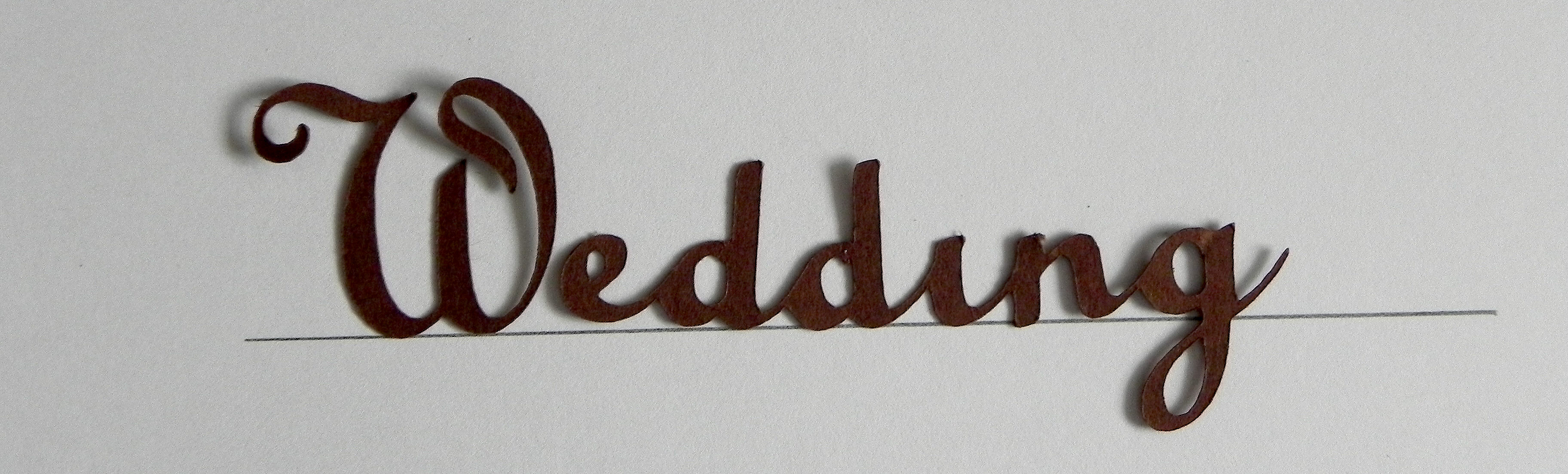
Now, let’s look at an example of something very delicate and thin like die cut lettering. I placed part of this scrapbook page title on a scrap of paper with a line to make sure it’s straight. For this example, the “W” was cut separately from the rest of the lettering, but it needs to be placed properly as part of the word. (The dot over the “i” will be added last.)

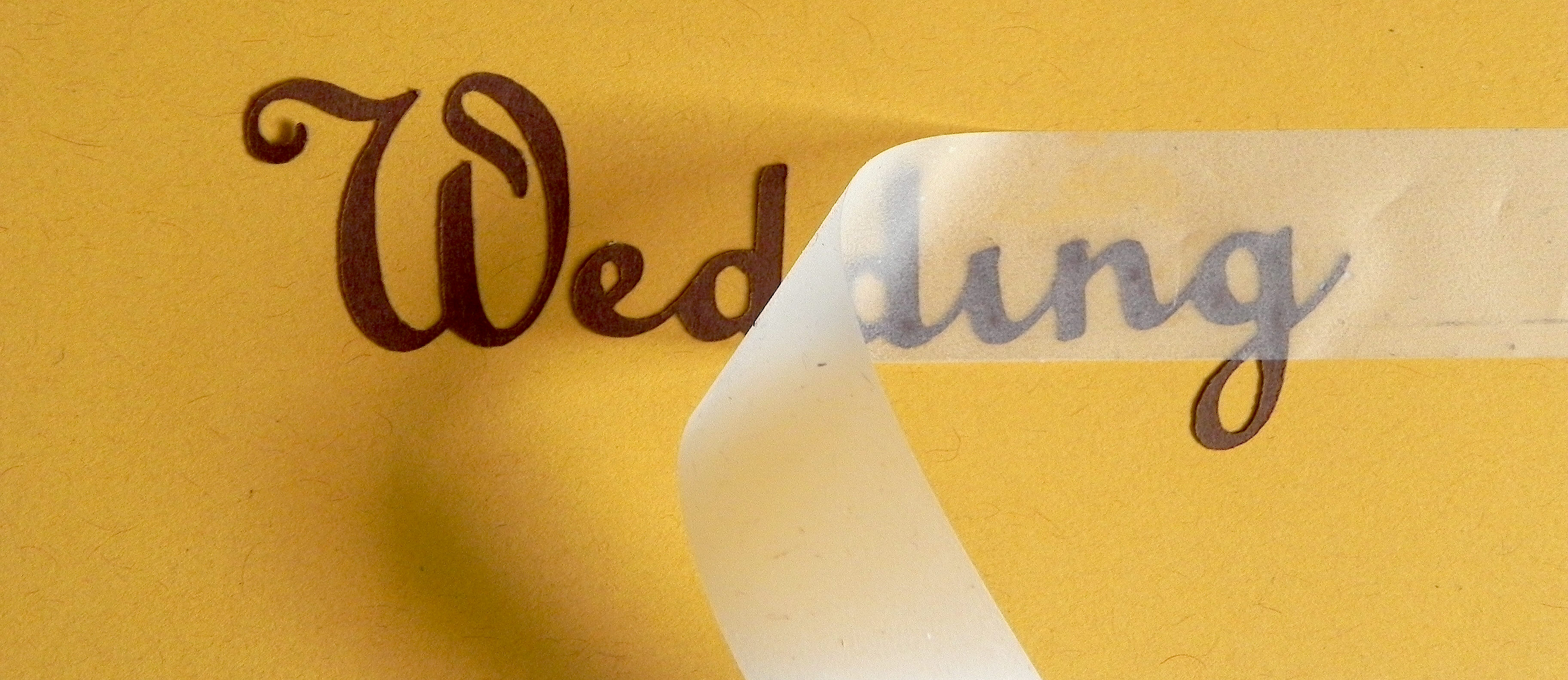
Place your piece of removable tape over the whole word.
I noticed that the second “d” is a bit crooked so I straightened it out on the tape.

Once you are happy with the placement on the tape, flip the tape and lettering over, and apply the glue. These letters are extremely thin so use tiny dots of glue.

Hold the tape on both ends, flip it right side up, and hold it over project to figure out where you want to adhere it. Once you’ve found the perfect place, push it down and “tape” it in place. (I’m using a scrap for my example.)

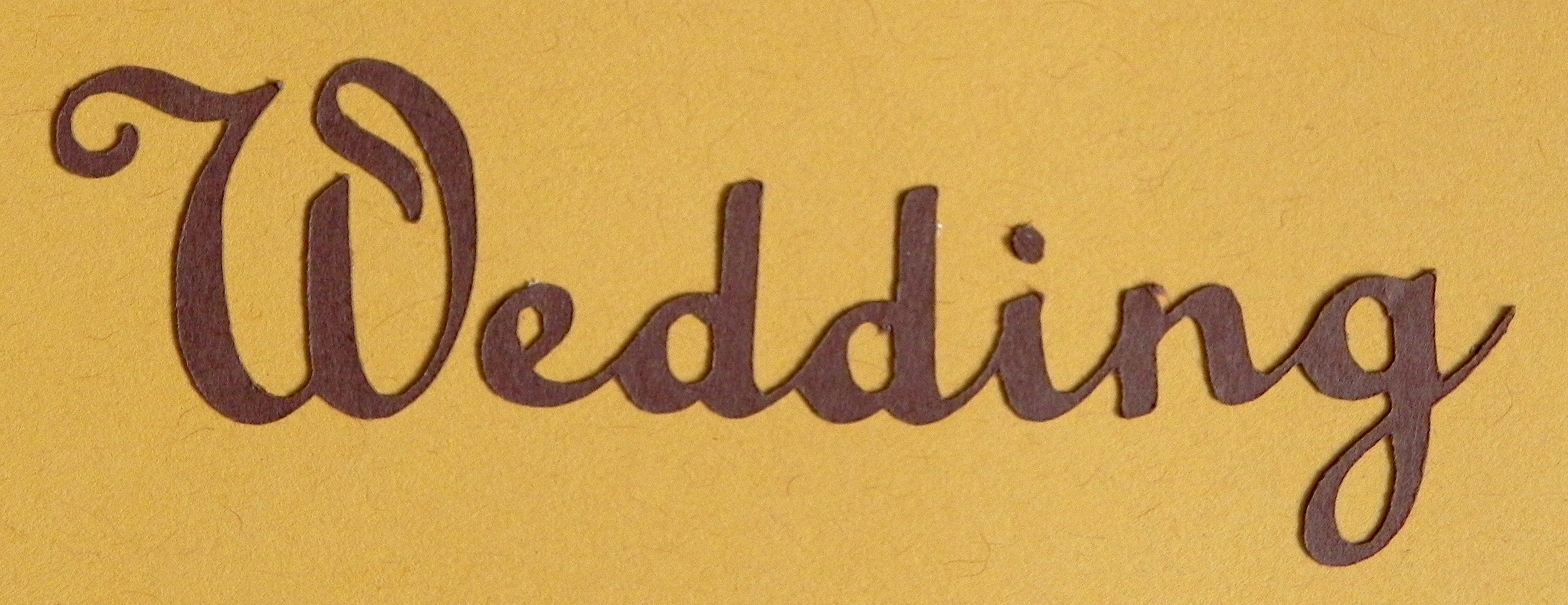
Carefully remove the tape.

Now add the dot over the “i” in the same way.


The finished project:

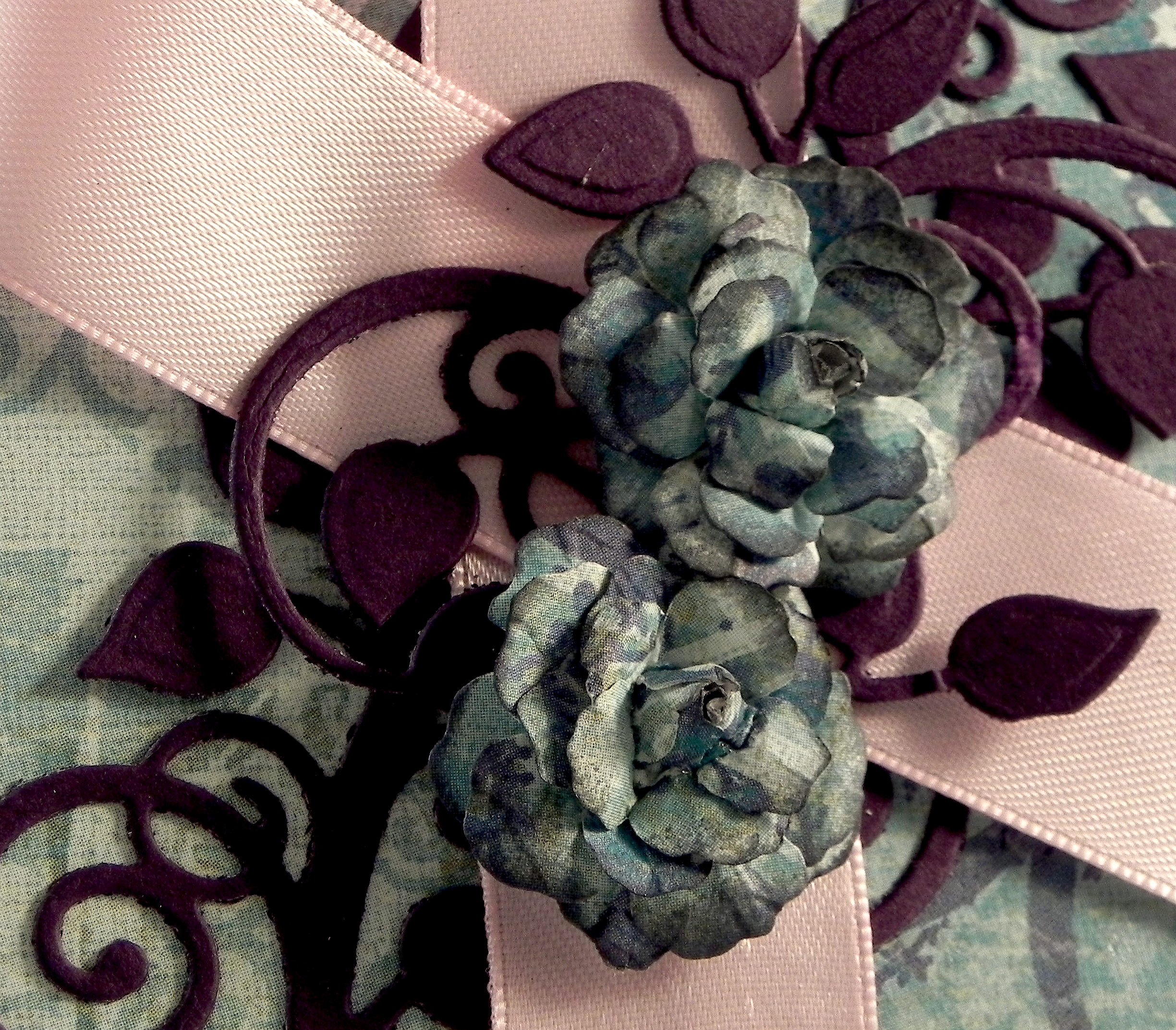
The flourishes and gazebo on this page were adhered using this method as well.
I personally prefer the glue pen, but…
An alternative for adding the glue to your elements is to use disposable micro brushes (with whatever glue you choose; I use the Ranger Matte Multi Medium because it doesn’t dry shiny if you get some on your project by accident. But any glue will do). I’ve seen these brushes marketed as dental tools, beauty tools to adhere eyelash extensions, and on craft sites online. (The craft sites tend to be more expensive.) They come in a variety of sizes. HERE is a link on amazon for the ones similar to those pictured below. (I have used the blue ones from Simon Says Stamp, and I just received my order for these blue ones below. They appear to be EXACTLY the same, but I got 4 times more for the same price when the cost of shipping is taken into account.) Search for the best price and size that suits your needs/taste.


In addition to using glue pens and/or glue, I sometimes use glue dots on some of the heavier, non-paper elements.
I LOVE the removable tape!
In addition to making it easy to adhere tiny pieces to my projects, I find it particularly useful when adhering multiple letters or elements that I’ve worked hard to place just the way I want them but still need to pick up to glue. The tape keeps everything in place relative to the other pieces while the glue is added (like the “W” with the rest of the word in the example above). I use this method a lot for titles on scrapbook pages.
I also love that you can use and re-use the tape. I’ve done whole scrapbook layouts at a crop, stuck the piece of tape I used on the side of my tape dispenser when I was done, and used the same piece a month later at my next crop! Eventually, it loses its stickiness as paper fibers and dust stick to the piece, but that could take a while!
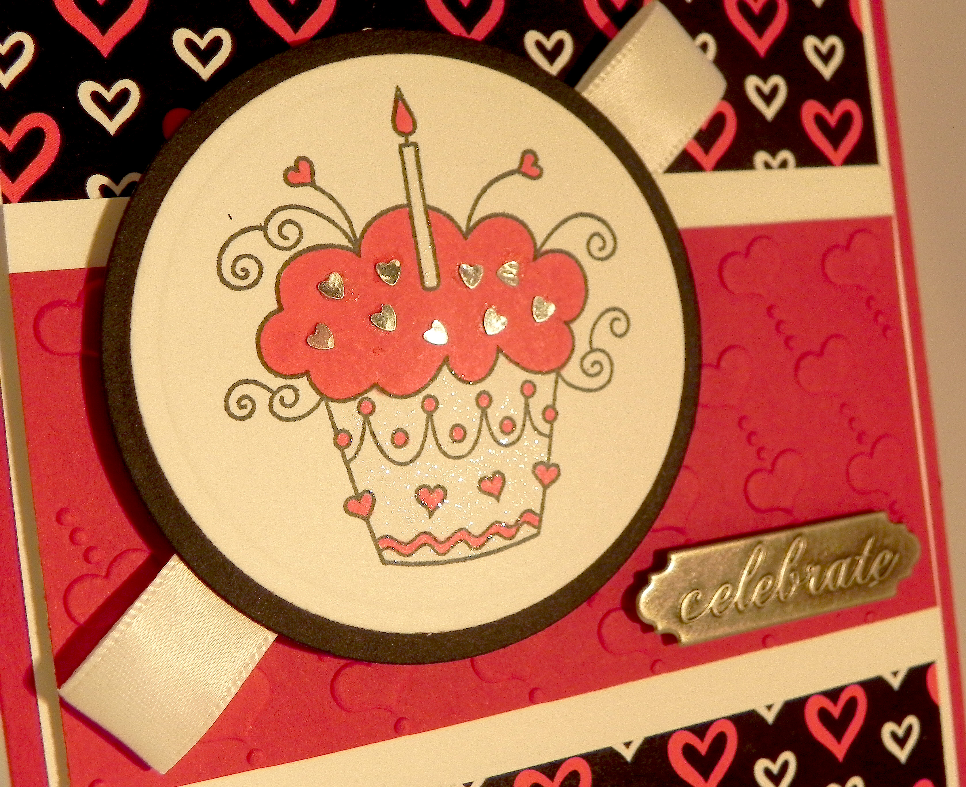
The removable tape works great with paper elements. However, for things like sequins, gems and other tiny non-paper embellishments (like the tiny hearts on the project below), I find that the tape isn’t strong enough to hold these pieces.

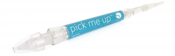
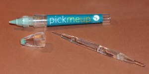
For these elements, I like the Silhouette Pick-Me-Up tool. One end has a tacky substance on it that allows you to pick things up. The other end has a removable tool that has two ends that allows you to push the item off the tacky end and onto the adhesive on your project or to push the item in place. (You can see this tool HERE at amazon.com.) I found a “review” with instructions on how to use this tool online HERE that you may find helpful.

(You can use this for paper as well; I just prefer the tape!)
One final tip:
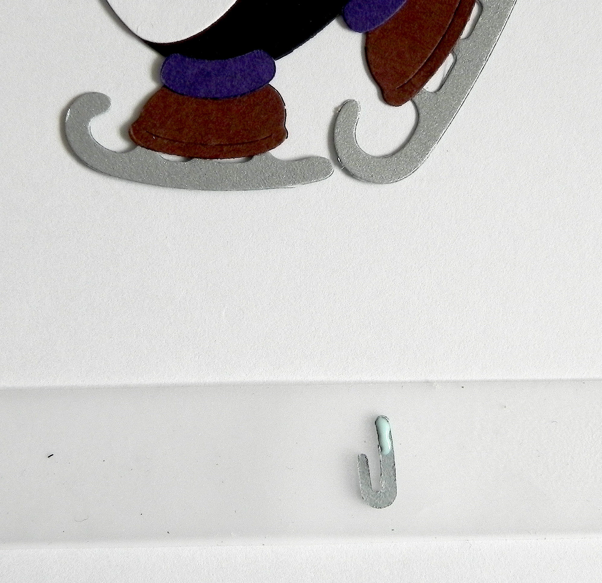
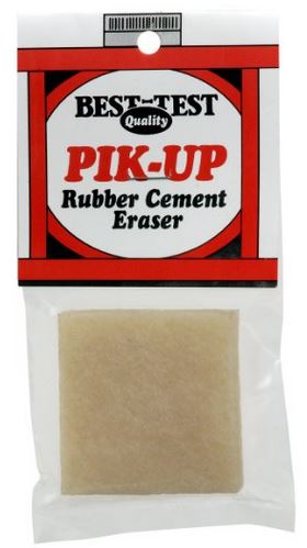
If you should happen to get glue/adhesive on your project where you don’t want it, I have found the best way to get rid of it is with a rubber cement eraser. There are a number of brands out there; HERE is a sample of one I found on Amazon. Just carefully “erase” the blobs away! (I erase the excess glue right away while it’s still wet. Just be careful not to rip the elements you’ve glued in place. Don’t rub the eraser back and forth. Instead, rub in one direction, lifting between each stroke.) It works great for removing mono-adhesive, Xyron adhesive, glue dots ….. just about any adhesive that may stray!

Hope all this helps with mess-free, hassle-free sticking!!
Thanks for checking out my post!
This content uses referral links as described in the disclosure policy on my sidebar.