Fine Wine and Friendship

Fine Wine and Friendship

Fine Wine and Friendship Card final DSCN9316.jpg

The Mod Squad Challenge this week is “Magazine Madness” where we are encouraged to use something on our card project from a magazine, gift catalog, or any other periodical we may have lying around.  We can use it as a background, we can do a little fussy cutting,  or we can get really creative and fussy cut a whole bunch of different shapes and make a collage or scene.  We can do anything as long as something from a magazine is somewhere on our card.  (Sadly, this site is no longer active.)

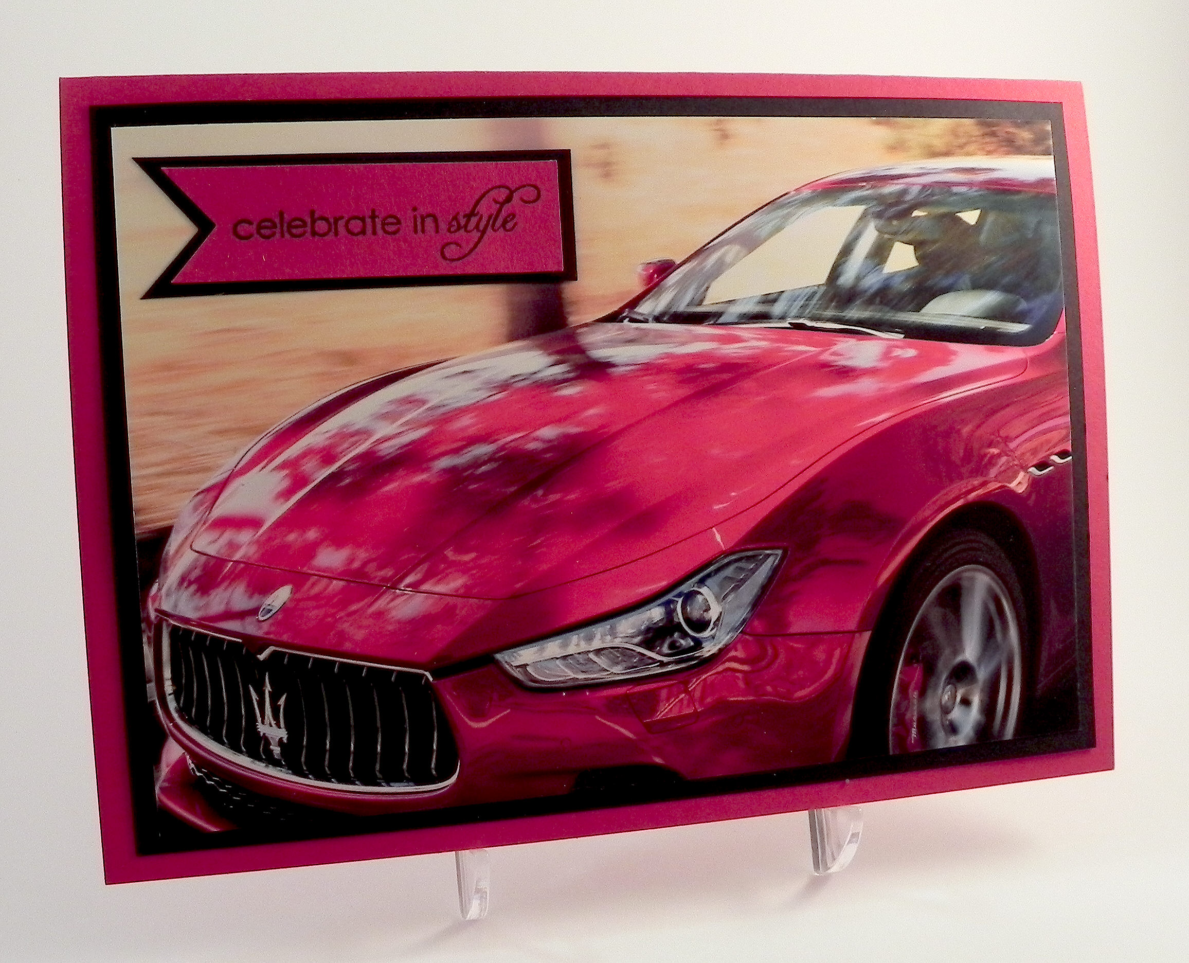
The magazine I used for this card was SJ Magazine (March 2015) which happened to be the only magazine I had lying around here when I saw the challenge!  (I don’t read magazines, and I no longer get the number of catalogs that I used to.)  This is a free magazine that usually goes right into the recylcle bucket when it arrives, but I realized I needed it before I pitched it.  Phew!!  Here is the page I used for my card.

mag page for Fine Wine and Friendship Card 4

I really liked the two image groupings in the bottom corners, but the words got in the way, so I layered the panels to strategically hide the words.

The image panels were matted on Gina K Dark Chocolate card stock.  The patterned card stock I used for the background was from a pad by Momenta which didn’t seem to have a name on the pad itself, but the price tag said “Songbird” and the Momenta label said Lot 20468 R4.  These background panels were also matted on the dark chocolate.  The sentiment along the bottom of the card (“Like a fine wine, our friendship gets better with age.”) is from the Gina K Designs “Better With Age” duo (retired?) and was stamped with the Gina K dark chocolate ink.  Because the printed card stock was textured and a bit dark, I used my MISTI and was able to stamp the greeting multiple times to get it dark enough to see it better.  A bit of raffia finished off my card.

I had a hard time photographing this card because of the glare off the glossy paper from the magazine. When I positioned the lights to prevent the glare, the photo came out darker than I would have liked. Hopefully, you get the idea, though!

Thanks for checking out my card project!

This content uses referral links as described in the disclosure policy on my sidebar.

Wine Diva Thank You

Wine Diva Thank You

Wine Diva Thank You DSCN9190.jpg

A very kind and generous friend of my husband (I’ve not had the pleasure of meeting her yet) left a case of wine for us on our porch yesterday – just because!  So naturally, I thought of this stamp from an AI stamp set I recently purchased to make a thank you note for her.  Frankie is an alumna of the University of Pennsylvania and is involved with setting up interviews for prospective students with alumni in the area like my husband, which is how they met.  I wanted the card to be fun and to reflect the gift, but I also wanted it to have a Penn “feel” to it.  The Wine Diva image along with the red and blue color theme (did you notice her outfit and wine choice?) covered it all!

The stamp used on this card is from an Art Impressions set which I purchased at Michaels. There is no name on the set, but “Aged to Perfection” or “Wine Diva” seem to work when I searched the set on google.  Michaels now carries several Art Impressions stamp sets that Hampton Arts distributes, and if I understand correctly, these exact sets are made exclusively for Michaels and are not sold on the AI website.  Here is what is in this set:

 AI Wine Diva Stamp Set (SC0677)  ai wine diva stamp set clear image

This was the only set my store had when I was there last.  I will keep my eyes open for others as I think these stamp designs are a hoot!! (And using a 40% off coupon makes the price really attractive!)

The set comes with some very cute sentiments, but since this was to be a thank you note, I went with the “Thanks” stamp from the Gina K Designs “Vertical Greetings” stamp set instead.  I stamped it with Versamark ink and heat embossed it with Recollections snow embossing powder.

I used dies from the Spellbinders Standard Circles (large and small) sets for my focal image.  The embossing folders I used were Darice Dot and Sizzix (Stampin’ Up) Stripes (retired?).

The card stock colors I used were Gina K Cranberry Tart and In The Navy, and Express It white.

The image was stamped with Memento tuxedo black ink and colored with Copic Markers:  (Skin: E50, E31, E33; Lips: E04; Cheeks: R21; Shadow: W4; Hair: E25, E27; Clothes: B39, R89; Chair: E31, E55; Earrings & Wine Glass: C1 with a Clear Wink of Stella Glitter Brush Pen)

In addition to the Wink of Stella for a little shimmer, I also added texture to her dress with some Copic blending solution and a scrap of towel.  You can see how I did it HERE.

Wine Diva close-up DSCN9201

 (click on the photo to see the shimmer)

This was a fun card to make.  The AI images always make me smile!!

Thanks for checking out my card post!

This content uses referral links as described in the disclosure policy on my sidebar.

Celebrate In Style

Celebrate In Style

Celebrate in Style DSCN9237

The Mod Squad Challenge this week is “Magazine Madness” where we are encouraged to use something on our card project from a magazine, gift catalog, or any other periodical we may have lying around. We can use it as a background, we can do a little fussy cutting, or we can get really creative and fussy cut a whole bunch of different shapes and make a collage or scene. We can do anything as long as something from a magazine is somewhere on our card.  (Sadly, this site is no longer active.)

As I mentioned earlier, I don’t really have magazines here and get very few catalogs.  This card was the first one I made for this challenge before I got the free SJ Magazine in the mail that I used for my other 2 cards for this challenge.  The image for this card was actually on an ad pamphlet that came in the mail earlier in the week.  I’m not sure if this qualifies for the challenge, but since the card is done, I figured I’d link it.  (If it isn’t eligible, please let me know, and I’ll remove it.)

This Maserati photo screamed masculine birthday card when I saw it, so I whipped up this “stylish” card using Gina K Cherry Red and black card stock and a stamp from the Gina K Designs “Celebrate in Style” duo (retired?).  The stamp was inked with Memento tuxedo black, and then the banner was sprayed with Tattered Angels Pearl Glimmer Mist to make it shiny like the car.  Unfortunately, the shimmer doesn’t show up too well in the photo.  I tried adding ribbon, different card stock panels and die cuts, etc., but everything just took away from the beautiful photo.  Sometimes, less is better!

I’m not really a car person, but even I have to admit that this car is sweet!!  (Even the advertisement was gorgeous!)  Well, I’m off to run errands in my minivan!! 🙂

Thanks for checking out my card project!

This content uses referral links as described in the disclosure policy on my sidebar.

Join us at Perfectly Rustics for the “Make It Better” Challenge

Join us at Perfectly Rustics for the “Make It Better” Challenge

reminder1

There is still time to enter the Perfectly Rustics Challenge #43 – “Make It Better” – where you are encouraged to choose a project that you did (but aren’t crazy about) and make it better.  Link your new better version for the challenge on the Perfectly Rustics site, but post the before and after photos on your blog.  It’s that simple! (http://perfectlyrustics.com/2015/03/09/prdc-no-43-make-it-better/)

Here’s a card project I re-did:

Don't Lose Hope Original and New

(click HERE to see the original post of this “re-do”)

Another card I posted recently was one that was redesigned from my original version:

Make It Better 2(click HERE to see the original post of this card)

Be sure to check out the projects posted by the rest of the design team.  I can’t wait to see your redesigned card projects over at Perfectly Rustics!

Confetti Cluster Flower Card

Confetti Cluster Flower Card

Confetti Cluster FLower Card DSCN9112

I just learned a new technique called Confetti Cluster Stamping where you stamp a bunch of small images in the shape of your choice.  (You can see the video tutorial HERE over at Papertrey Ink.) Basically, you start with a shape template and lightly trace it onto your card panel.   Then you use a variety of tiny stamps and inks to fill in the traced shape.  Once the entire shape is filled in (enough to clearly see the original shape), you erase your traced lines and you are left with a beautiful, confetti-like image.

I am entering this card project in the Mod Squad “Flowers” Challenge this week where we are to use a flower as a focal point.  (Sadly, this site is no longer active.)  The sponsor for this week is Melanie Muenchinger from Hands. Head and Heart so for the bonus entry, you need to use one of Melanie’s stamps.

I am also entering this in The Paper Players challenge # 236 – “Ann’s Clean and Simple Floral Challenge” – where we are to create a clean and simple floral card. (http://thepaperplayers.blogspot.com/2015/03/pp236-anns-clean-and-simple-floral.html)

I started with a flower template from the Cricut George and Basics Shapes Cartridge that I cut with my Cricut.  I traced it very lightly with pencil onto a piece of white card stock.  Then I started stamping.

Inks used:  Tim Holtz tattered rose distress ink, and Gina K wild lilac, turquoise sea, ocean mist, sweet mango, sweet corn, kraft, grass green, prickly pear, and innocent pink.

Stamp Sets used (all Gina K Designs – some retired):  Love You Mini Set, The Giving Tree, Pretty Patterns, Mommy-to-be Diva, Party On, Fabulous Frame Fillers, Fabulous Holiday Fillers, Best Fishes, Bundle of Love, and Sunkissed Autumn.

Card Stock used:  Stampin’ Up Crisp Cantaloupe, Gina K Turquoise Sea, and white.

The Sentiment was from the Gina K Designs Happy Birthday Duo set and was stamped with versamark ink and heat embossed with Recollections snow embossing powder.  I cut the flower center with a Creative Memories circle punch and embossed it with a Cuttlebug Swiss Dots embossing folder.  The ribbon is by American Crafts and is strategically placed to hide an ink smudge!

This project was fun to do, but I needed to start over quite a few times because I kept getting ink on the edges of my acrylic block and then onto my card panel.  With such tiny stamps, you need to be careful not to rock the stamps when you are inking them up and again when you stamp the images.  Another problem I had was that I started off stamping my images slowly and deliberately, and then started moving more quickly which is when I tended to mess up.  I know that sounds obvious, but when you repeatedly stamp the same image randomly on your project, it is really easy to pick up speed!  My final problem was that I don’t normally use this many colors and I wasn’t sure I liked my combination at first.  I ended up putting the panel aside and working on something else, and when I came back to it, the colors had faded when the inks dried, and I liked it so much better!  For this project, I basically just kept grabbing ink pads.  For next time, I think I will try some combinations on scrap paper and let the inks dry to see how it will turn out instead of just starting on my card panel.

Thanks for checking out my card project!

This content uses referral links as described in the disclosure policy on my sidebar.