Don’t Lose Hope – Word of inspiration: HOPE
This card was made for Cat’s “Stamp Out Cancer – Challenge #3 – Just A Word!” challenge for StampTV. The challenge is a word prompt challenge where we get to pick a word and then make a creation that that ONE word inspires. MY WORD IS HOPE. (Sadly, this site is no longer active.)
It was also made for Lee’s “In the Pink for October” Mod Squad Challenge. In following with the very important theme of cancer awareness…..her challenge this week is to use pink – any pink, any way. (Sadly, this site is no longer active.)
This card is also being entered in the Simon Says Stamp Monday Challenge – Falling in Love With … where we are to create a card to show what inspires us this fall. In addition to the warm, fall colors, I am inspired by all of the people trying to raise awareness and funds for breast cancer research and by those who are supporting loved ones affected by this disease. (http://www.simonsaysstampblog.com/mondaychallenge/?p=1955)
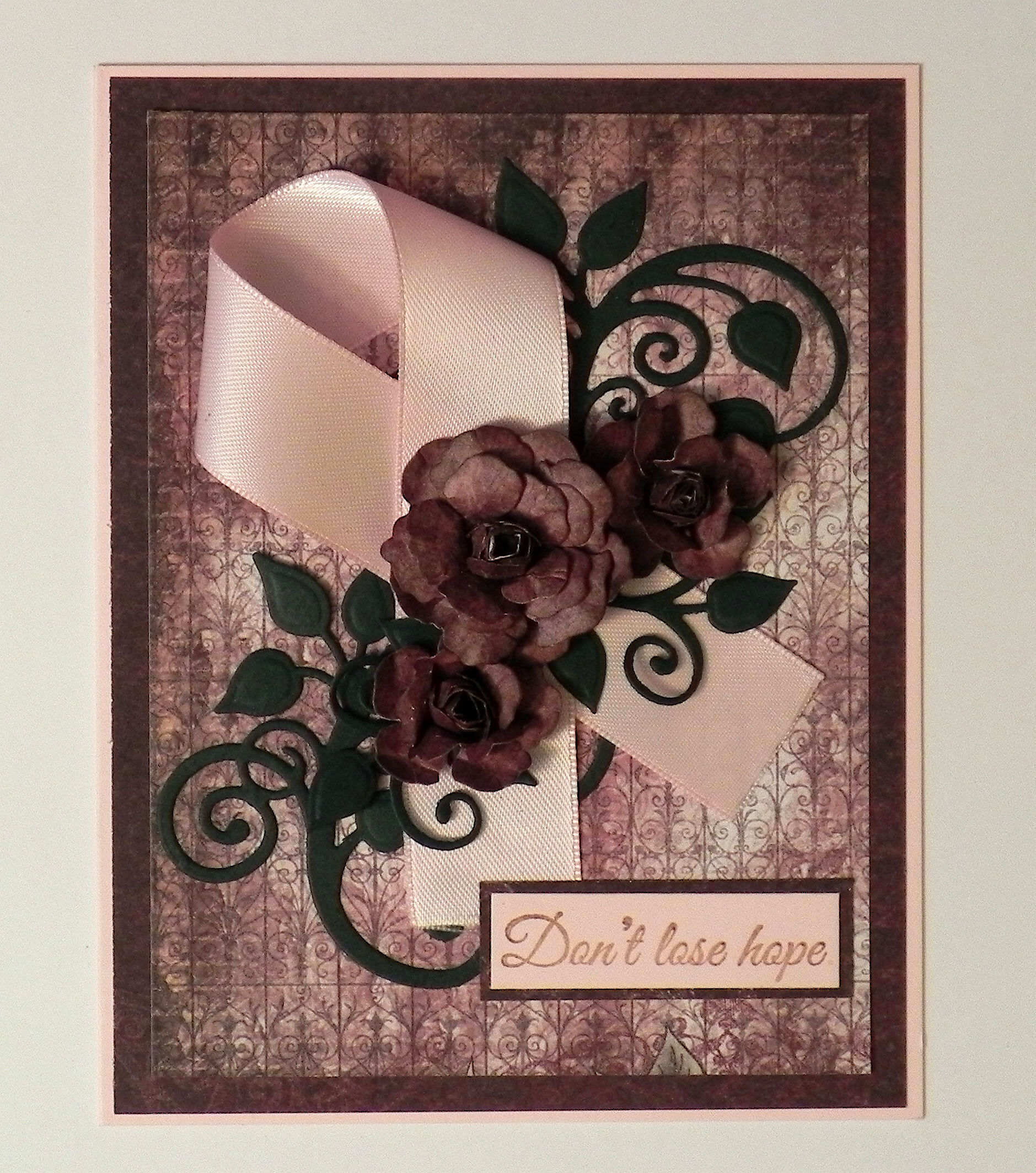
The greeting stamp for this card came from the Gina K Designs “Don’t Lose Hope” duo and was embossed with clear embossing powder, versamark and Tim Holtz walnut stain distress ink.
The flowers were handmade using dies from the Heartfelt Creations (Spellbinders) Vintage Floret set. The leaves were made using dies from the Heartfelt Creations (Spellbinders) Cut Mat Create 2A Die set.
Cardstock used was a pink from a Recollections paper pack and Recollections Evergreen. The printed paper came from two Heartfelt Creations Paper pads: Floral Key Collection and Antiquity Collection.
I was going for a vintage look for this card and chose some darker cardstock so the pink ribbon would really stand out. I thought the printed paper I used for the flowers (and the background panel) was more burgundy. Definitely looks brown in the photo! Hmmm…
Thanks for checking out my card project!
This content uses referral links as described in the disclosure policy on my sidebar.


This is just amazing, Lisa! Everything you chose to coordinate on this card works in the best possible way ~ the colours, the darkness to make the pink stand out, the patterned paper … everything is perfect! Your flowers are incredible!! LOVE the card!! ~ Virginia
LikeLike
It’s beautiful Lisa….I love the deeper and richer colors that really highlight the awareness ribbon!! – Lee
LikeLike
Such a beautiful card and for such a wonderful charity ~ I adore it! Thank you for sharing your project and for joining us over on the Simon Says Stamp Monday Challenge Blog! 🙂
LikeLike
Pingback: Don’t Lose Hope Card – “Make It Better” | I Played With Paper Today!