Bokeh Christmas Card (and a few other samples)

Bokeh Christmas Card (and a few other samples)

DSC_2168W

Bokeh comes from the Japanese word boke (ボケ), which means “blur” or “haze”, or boke-aji, the “blur quality.”  Bokeh is pronounced BOH-Kə or BOH-kay and is defined as, “the effect of a soft, out-of-focus background that you get when shooting a subject, using a fast lens, at the widest aperture.”  Simply put, bokeh is the pleasing or aesthetic quality of out-of-focus blur in a photograph.  (See more HERE.)

To create this effect on a card, you ink a background and then sponge over that with white pigment ink through a stencil made with varying sized circles .  Here is a video tutorial showing exactly how this is done.

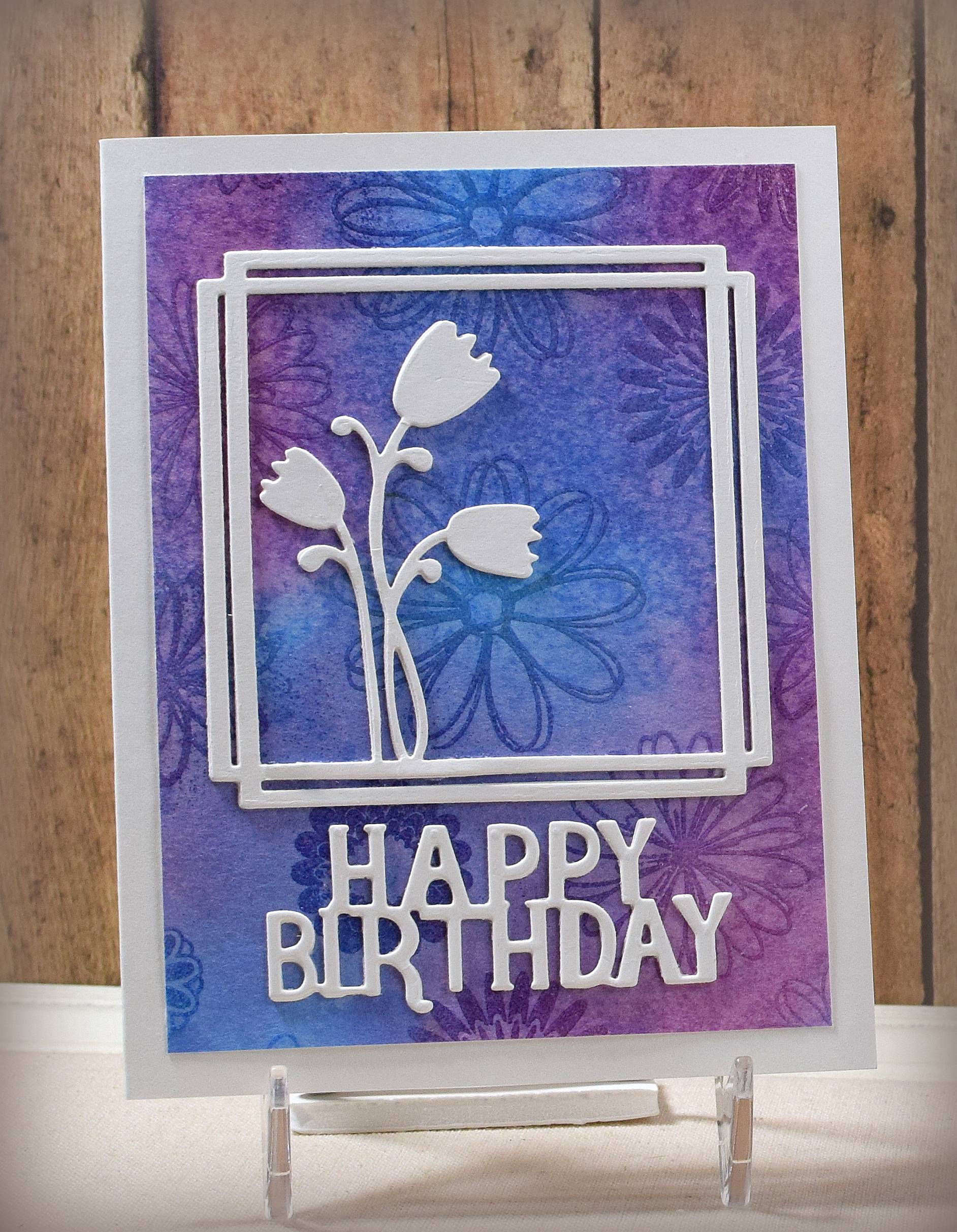
For the card above, I used Memento Blue Danube and Summer Sky inks, Tim Holtz Seedless Preserves Distress ink, and Tsukineko Brilliance Moonlight White Pigment Ink to create my bokeh background.  I layered several of the sentiment die cuts to help it stand out and added a few sequins to finish off my card.

Here are a few more:

DSC_2182W

The die used on this card is the Festive Mini Expressions Stacked Merry Christmas (CEDME014) by Creative Expressions. The background was sponged with Mowed Lawn Distress ink.

DSC_2177W

The stamp sets I used for the greeting and bow were both unbranded on this one and were heat embossed in black.  It is a good idea to do any heat embossing before the background sponging and bokeh technique are done because the embossing powder will stick to any ink that is not completely dry.   Background inks were Memento Dandelion, Tangelo, and Lilac Posies.

The Mod Squad Challenge for the next two weeks is “Sentiment Says It All” where the challenge is to have the sentiment take center stage.  All of these samples feature a sentiment on the bokeh background!

Thanks for checking out my card projects!

This content uses referral links as described in the disclosure policy on my sidebar.

Chalkboard Easel Cards

Chalkboard Easel Cards

wDSC_2727.JPG

Pigment ink is not my favorite type of ink.  I think it’s messy and takes too long to dry, and I avoid it when I can!  However, I wanted to show my students that it is good for certain applications (heat embossing and stamping on dark card stock for example) and that it is good for certain techniques like the chalkboard technique I used here on this card (and for the bokeh technique that we also tried).  Now they can decide if they want to use it on their own – lol!!

I used the Stampin’ Up “Hardwood” background stamp (retired?) with Memento Rich Cocoa ink on the front of a Gina K Kraft A2 card base.  The stamp is taller than it is wide with vertical planks, but I wanted them to be horizontal so I turned the stamp sideways, stamped the top half of the card front, masked the stamped portion, and then stamped the bottom half.  In this way, I didn’t have to worry about overlap or lining up the pattern where I left off.

I wanted to come up with ways this card could be made with minimal supplies.  Here is another sample where I just used my score board and the ink pad (on Recollections kraft) to create the wood grained look:

wDSC_2729

I created the legs with the EK Success Real Estate Punch (partially off the end).  Dies could also be used to create the legs as well as a trimmer (for straight legs), a craft knife, or scissors.

Black card stock matted on a scrap of patterned paper was used to create the chalk board on the easel.  The size could vary based on the stamp(s) you are using.

The pigment ink…UGH!!!  I initially used Craft Smart white pigment ink I purchased at Michaels.  (I needed inexpensive pads I could purchase for my students to use in class.)  The ink literally never dried!  I heat set it, and it smeared.  I let it sit for days (and days and days), and it still smeared.  I sprayed a sample with a fixative.  It smeared.  The only thing that seemed to work was heat embossing it, but the glossiness made it look less like chalk.  (And, by the way, Wow! Clear Matte Dull embossing powder is NOT matte!)  Hmmm…

So then I tried Gina K’s white pigment ink that I had on hand (same paper, same stamp, same technique, etc.)… soooo much better.  It was dry in a few minutes.  Heat setting was even quicker and dried it beautifully.  Not sure what the deal was with the first ink I tried.  I returned it and ordered a few Gina K ink cubes for class!  (I’ve used several other brands over the years, and they worked fine also; I just had trouble with the Craft Smart ink pad I purchased.)

As an afterthought, I pulled out my colored inks and played with those a bit.  Most of the colors I had in my stash were really dark and didn’t show up well on the black, but this “Patina” from inkit looks kind of cool!  (I’ll have to look around for some lighter colors to try.)  I also played around with a white gel pen and smeared it before it dried to make it look more like chalk.  Maybe I’m warming up to pigment inks after all!!

wDSC_2800

The stamp set I used for the greetings was unbranded.  I used a few punches and some scraps for the embellishments.  The birthday images on the additional panels were from a set called “Happy Birthday Stamps” (ms. sparkle & co.) that I found in a $2 bin at Joann Fabrics a while back.

Here is a video tutorial for doing the chalkboard technique.

Thanks for checking out my card project!

This content uses referral links as described in the disclosure policy on my sidebar.


Tarnished Leaves

Tarnished Leaves

wDSC_2734

Two very fortunate things happened that led to this card design.  First, my friend ordered white embossing powder for a project she was working on and received “Aged Silver Embossing Enamel” by Stampendous! instead.  She didn’t feel like dealing with returning it so she tried it on another part of her project (in addition to the white she eventually got) and we both LOVED it.  After the project was completed, she gifted me the jar – thanks, Kirsten!!  The second thing that happened was that I was lucky enough to be randomly chosen as the winner of a Stampendous! gift certificate from the Modsquad Challenge, and I used it to purchase the Decor Cling Leaves Rubber Stamp – DCR101 – thanks Joyce and Laura!!

I used both of those to create this card.

The embossing enamel is a mix of a tarnished looking silver and black that looks aged,  metallic, bubbly, vintage/shabby chic, maybe even a little copper… and cool!  And it looks so different depending on how the light hits it.  (So hard to photograph!!)  Here’s a better look at the shine:

wDSC_2737

The stamp itself is huge (8″ x 8″) and has a bunch of leaves and splatters; I just used a small part of the panel I created for this card.  Before embossing the image, I randomly stamped overlapping leaves (with a single leaf stamp from the Momenta “Nature” set) with Memento Rich Cocoa ink (straight stamping and stamping off) all over a piece of ivory card stock.  I used the same stamp with Memento Desert Sand on ivory for the large background panel.  I love that leaf stamp for adding texture!

The panels were matted on Gina K Chocolate Truffle card stock. (The “thanks” die was unbranded, but I’ve since found and purchased the “Gallery Frame 2” die set from Hello Bluebird which contains this “thanks” die, but bigger.)

I love the stamp with just ink, too!

wDSC_2763

Thanks for checking out my card projects!

This content uses referral links as described in the disclosure policy on my sidebar.

Faux Monoprinting

Faux Monoprinting

DSC_2091w.JPG

Jennifer McGuire shared this cool technique HERE , and I thought it would be fun to try.  Basically, you do some inking and emboss resist on one background panel, and then you wet it and press it against a clean panel to create a second background panel with ink from the first.

Here’s the card with the original panel:

DSC_2112w

And here is the second panel made with this technique:

DSC_2124ww

I used Salty Ocean and Seedless Preserves Distress Inks and clear embossing powder with some flower stamps for the resist.  You can see how the clear embossing powder over the sponged ink gives you a darker image of the flowers on the original panel, but how the images come out looking white on the second panel because the ink trapped under the embossed images did not transfer there and the white paper showed through.

I love both looks, and I love how you get two background panels with this technique!

I topped my panels with some simple, layered die cuts, and the two cards were done!  The delicate Tulip Frame Die by My Creative Time is a great die for this technique since it allows you to still see a lot of the background.  The greeting die was unbranded.

Thanks for checking out my card project!

This content uses referral links as described in the disclosure policy on my sidebar.