Quilled Flowers and Swirls

Quilled Flowers and Swirls

wwDSC_4810c picasa.jpg

(inside: May your birthday be filled with sunshine, smiles, laughter, love and cheer!  Happy Birthday)

I’ve tried some basic quilling in the past and thought I’d give it another try here.

I used a few new (to me) quilling tools and techniques for this project.  The purple petals (marquise/eye shape) and round accents (tight coils) were made with the Quill Ease motorized quilling tool (which I talked about HERE).  The swirly “stems” were too thick for my slotted quilling tool so I held the ends with tweezers and hand coiled them.  I tried out a quilling comb for the leaf.

This is the first time I attempted the large swirls, and I found it challenging to glue them down exactly as I wanted them (the basic shape and to get the strips evenly spaced).  The problem is that once the piece (with glue) touches the paper, you can’t really move it or you have blobs of glue everywhere.  I have a whole new appreciation for the amazing, intricate designs I see on Pinterest!  I definitely need more practice!!

The pre-cut paper strips were from a pack by Quilled Creations.  The card stock used for the card base and panels was Gina K Pure Ivory and Wild Lilac.  The sentiment on the inside was from the Birthday Duo stamp set by Gina K Designs.

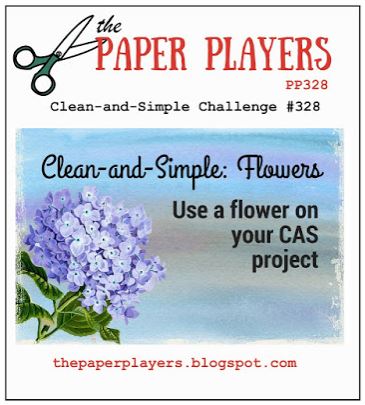
The challenge over at The Paper Players is “Clean and Simple: flowers” where we are to use a flower on a CAS design.

challenge

Thanks for checking out my card project!

This content uses referral links as described in the disclosure policy on my sidebar.

Red and Blue Note Card Collection

Red and Blue Note Card Collection

zDSC_4417 picasa.jpg

My triplets are seniors in high school and have just finished the college application process.  All three of them were just accepted to their first choice – The University of Pennsylvania.  Hooray Kelly, Kevin and Keith!!

They received letters of recommendation and completed several alumni interviews as part of the application process, and they wanted to send thank you notes.  Since there are three of them, I wanted to come up with three different card designs, and since we needed to send quite a few notes, I wanted to keep the designs simple and easy to recreate.  The MISTI made this easy!  Penn’s colors are red and blue so I stuck with those colors.

(I was having a heck of a time getting good photos of these cards.  The blue card stock and ink are the same – both Gina K “In the Navy” – and are very similar in real life.  The ink always looks lighter and the card stock always looks darker in my photos.)

xdsc_4202

For this first card, I used Papertrey Ink Soft Stone ink and card stock along with the two parts of the “Frame and Filler” stamp (retired?) by Gina K Designs to create a tone-on-tone background.   I googled Penn’s logo and hand-made the two parts of the “P” (from red rubber used to make gaskets which I purchased at Home Depot).  The logo was stamped with Gina K Cranberry Tart and In The Navy ink.  I embossed the border with a Spellbinders Matting Basics B die.

xdsc_4188

The second card design features stamps from the “Work of Art” set by Stampin’ Up.  The ink used for this one was Papertrey Ink Scarlet Jewel and Gina K In the Navy.

xdsc_4187

For the third card design, I created a background with stamps from the “Flower Builder” set by Gina K Designs.  The greeting is from the “Wonderful Words I” set by Stampin’ Up (retired?). Gina K In the Navy and Cranberry Tart ink and card stock was used.

Each of the stamped panels was mounted on a card base made from Gina K In the Navy card stock.  (It looks black in the photos, but it’s really blue!)  A plain white panel was adhered to the inside for the message.

*

flags-dsc_4257

 Kelly, Kevin, Keith, and their older brother Eric will all be together at Penn next year.  I’m going to have to come up with something to keep me busy when they are away….

Thanks for checking out my card post!

This content uses referral links as described in the disclosure policy on my sidebar.

Coffee Note Cards

Coffee Note Cards

Coffee Note Cards yDSC_2082.jpg

I see many coffee themed cards in my internet travels, but I have never made one myself. Last week, I was asked if I had any coffee themed cards on hand…  Guess what I did as soon as I got home! After looking online at the large collection of coffee related stamps and dies available, I ordered a few and not-so-patiently waited for them to arrive.

As I mentioned in my “Falling Leaves” post, I also received a request for blank note cards without a greeting so I decided to combine the two requests and design another plain note card but with a coffee theme.

For this card, I featured the Stampendous “Coffee Background” stamp which I stamped with Gina K Dark Chocolate ink on Recollections Ivory card stock.  I crimped a strip of Recollections Kraft card stock with my Uchida Crimping tool and adhered that to the stamped panel.  (This kind of reminded me of the corrugated cup sleeves you often see with take-out cups to protect your hands.)  The edges of both were inked with the Dark Chocolate.  After adding some baker’s twine (from Target), I added this to an ivory mat and a kraft card base.  A blank ivory panel was adhered inside for a personal message.

I used my MISTI to make sure I got a good stamped image for the front of my card and was able to make multiples for boxed sets.

wdsc_2051

I am still waiting for a few more stamps and dies to arrive in the mail and will be making more coffee themed cards when they do!

Thanks for checking out my card project!

This content uses referral links as described in the disclosure policy on my sidebar.

Falling Leaves Note Card

Falling Leaves Note Card

Falling Leaves yDSC_2024.jpg

I was recently asked (several times) if I had any note cards on hand with no greeting (I did not) and decided it was time to create one!  Both people who asked me were men, so I decided to go with a design with a more masculine feel to it.

I started out by creating a reverse mask by cutting out a rectangle in the center of a piece of acetate which was the same size as my image panel.  The rectangle was cut with a die from the Spellbinders  “A2 Matting Basics A” set.  I then sponged Gina K Kraft ink in the cut-out portion of my mask onto a piece of Gina K Sandy Beach card stock.  (I used acetate for my mask since I intended to create several of these cards and didn’t want a paper mask to become saturated with ink; a paper mask normally works fine for this reverse masking technique.)

Still using the Kraft ink for a tone-on-tone effect, I stamped the splatter image from the “Tiny Textures” set from Gina K Designs and one of the leaves from the Gina K Designs “Fall Foliage” set (retired?).  I used two additional leaves from this set for my focal images.  One was stamped with Gina K Faded Brick ink and the other one with Honey Mustard.  Once these two images were stamped, I thumped Charcoal Brown ink in random spots on the stamps and re-stamped them to add a little variation to the color.  Since I was using my MISTI, I was able to re-stamp with no problem.

The stamped panel was matted on Gina K Honey Mustard and Charcoal Brown card stock and was then adhered to a plain ivory card base.

I ended up making multiples of this card design to create boxed sets.

wdsc_2020

The Mod Squad Challenge is called “Falling Leaves” this week, and we are encouraged to use a leaf or leaves on our projects.   (Sadly, this site is no longer active.)

The challenge over at AAA Cards is “Game #74 – Masking” where we are to make a CAS card using the masking technique.

The theme is “Goodbye Summer, Hello Fall!” over at Cards in Envy.  For this challenge, we are to create fall themed or fall color cards while keeping the total thickness of the cards to 1/4 inch or less. (No lumpy bumpy cards!  All cards MUST fit in an envy for mailing.)

Thanks for checking out my card project!

This content uses referral links as described in the disclosure policy on my sidebar.

Inside-Out Chef Card

Inside-Out Chef Card

I called this card an “Inside-Out” card because the card front is pretty simple, but the inside is the more elaborate part and the part meant to be displayed.  The above photo shows the inside of the card after the card is opened and the front is flipped over.  Below is the front of the card before it is opened:

wDSC_1823

I think the images in this stamp set called “Recipe for Happiness” by My Favorite Things are just the cutest ever, and I had loads of fun making this card!

mft-stamp-set

The nice thing about a step card is that it has a lot of dimension but folds flat and usually fits in an envelope.  (This particular card is a bit thick even when folded so it requires a trip to the post office to mail.)

wDSC_1828.jpg

This card is being entered in the My Favorite Things – “You Could Be a Card Design Superstar Contest – 2016!”

*

The rest of this post is a detailed description of how I created this card.  If you wish to keep reading, grab a cup of coffee and get comfy – it’s a bit long!

Continue reading