Goodbye Winnie & Walter – Two Note Cards from One Die Cut

Goodbye Winnie & Walter – Two Note Cards from One Die Cut

wDSC_1385

I have two “Clean and Simple” cards to share…

I usually just use scraps when cutting with dies, but with some pre-planning and careful placement, you end up with a “negative” on a panel that could be used to create another card.  Bold word dies like the Winnie & Walter “In A Word: Thanks Cutaway” die work well for creating project-ready die cuts and negatives.  (Sadly, I just learned that Winnie & Walter closed shop at the end of 2019.)

wDSC_1380

First, I used my airbrush and Copic marker (C5) to create the splattered dots on a white panel sized for the front of my card.  Then I centered the die on the panel and ran it through my die cutting machine.  It’s important to keep the scraps from the die cut (for this one – the piece between the “k” and “s” and the inner pieces of the “a” and by the “n”) because these need to be glued back into the negative space.  By airbrushing first, the dots are on these scraps and match the panel nicely.  In order to position the scraps properly, I temporarily place the die cut back into the “hole” and then glue the scraps into the areas of the die cut from which they came.  Once the scraps are positioned and adhered, the actual die cut can be removed and used on a second card.

wDSC_1383

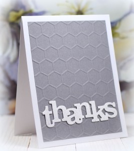
Because I airbrushed my dots before cutting, they are also on the die cut for the second card – bonus!!  The embossing folder is “Honeycomb” by Darice.

Thanks for checking out my card projects!

CAS Framed Tulip Thanks

CAS Framed Tulip Thanks

DSC_2626w.JPG

A few die cuts and some “smooshed” ink….

I just love the delicate Tulip Frame Die by My Creative Time.  (The set also includes dies to create an additional layer/color of just the petals/cups.)

(The “thanks” die was unbranded, but I’ve since found and purchased the “Gallery Frame 2” die set from Hello Bluebird which contains this “thanks” die, but bigger.)

I created my simple card with Mowed Lawn Distress ink (and water) and white card stock.  You can see how I adhere intricate die cuts HERE.

Thanks for checking out my card project!

A quick note:

I had been in Arizona for the last two weeks (spending time with my son who is there for Brewers’ spring training, catching a few games myself, and hiking/site seeing with my husband) and am just getting back in the swing of things here at home.  While I was able to look at all the email notifications of the sites I follow on my phone, I was not able to leave comments for cards on blogspot sites.  (I guess I wasn’t logged in properly or something?)  Leaving comments on wordpress sites was possible, but I am a terrible “phone typist” so those were short!  Anyway, I have enjoyed all the projects you all have been posting and look forward to using my computer (instead of my just phone) for checking out your projects going forward.  As always, thanks for the inspiration, and thanks for visiting my site as well!

Eclipse Thank You Card (and a few other samples)

Eclipse Thank You Card (and a few other samples)

DSC_2259w.JPG

To do the eclipse technique, die cut shape(s) are cut out of the decorated or printed panel and reattached after being layered/raised up so you have a continuous pattern across the whole card.  I smooshed the background with ink and water and then partially stenciled a pattern which was darker/complete in the upper left corner and “trailed off” as I moved towards the lower right.  The pattern on the portion of the card where I die cut my “thanks” is subtle, but you can see how the drops and splotches of color continue onto the raised letters.  (I cut and layered four plain white die cuts under the patterned one to raise it up.  You could also use a piece of fun foam.)

For the next two cards, I used patterned paper.

DSC_2273ww    DSC_2263w

Both of these panels were made from different parts of a sheet of  “Thoreau Flowers” (#505802) paper by Recollections.  The  “In A Word: Thanks Cutaway” die (#WW031CA) from Winnie & Walter is perfect for this technique.  The butterfly die was unbranded.

Thanks for checking out my card projects!

Winter Flowers

Winter Flowers

wDSC_3034.JPG

This card features stamps from the “Winter Flowers” stamp set by Simon Says Stamp.

I heat embossed the images in Hero Arts Copper embossing powder on black card stock and colored them with Prismacolor Pencils and a Dove Blending Pen.  I am honestly not sure how I feel about this as it is awfully dark.  I was trying to use traditional red and green, but I think it might have needed lighter colored pencils?  I did think it was cool that the colored pencils actually showed up on the black; I was expecting to need to put white pencil or ink down first (and I did not need to).  Anyway, I also purchased the “Spring Flowers” set which is similar in style, and I think I will try this technique again with lighter colors.

The mat is “Copper” card stock from Cardstock Warehouse’s Starstream Collection with an ivory card base.  The Merry Christmas stamp is from the “Sentimental Holidays” set (retired?) from Gina K Designs.

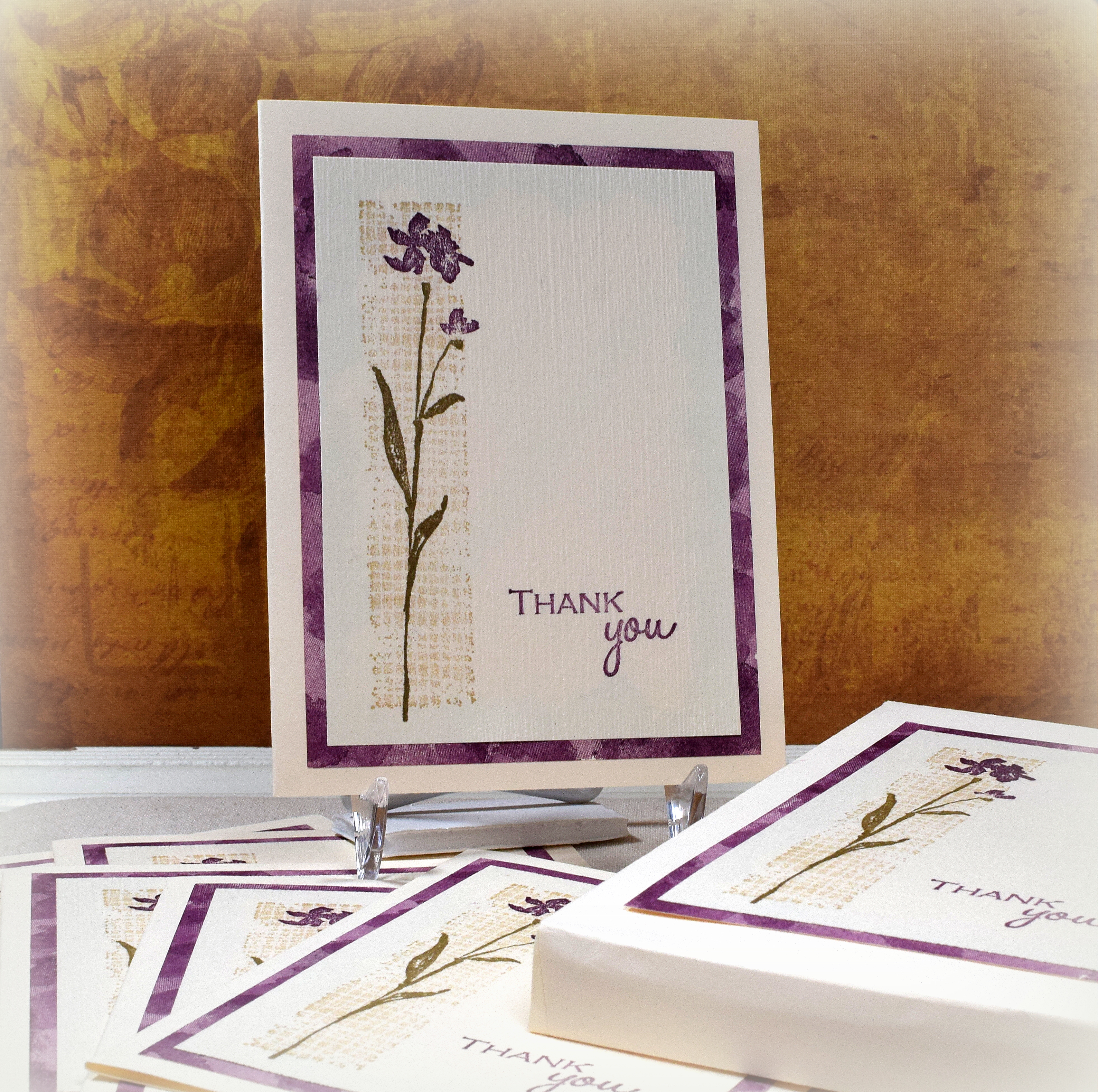
While I still had the embossing supplies out and the stamps on my MISTI, I decided to make a few simple thank you notes.

yDSC_3047

The thank you stamp was from the “Wonderful Words I” set (retired?) from Stampin’ Up.  There were long lines/tails at the beginning and end of the words that I masked off for this card.

thank you stamp

The card based is “Ocean Tides” from Papertrey Ink.  It’s hard to see in the photo, but I added texture to the stamped panel with Gina K Designs Whisper Amalgam Ink and the GKD Gauze background stamp.

Thanks for checking out my card project!

This content uses referral links as described in the disclosure policy on my sidebar.
Ho Ho Ho with Distress Oxide Inks (and a few other samples)

Ho Ho Ho with Distress Oxide Inks (and a few other samples)

wDSC_2814.JPG

After trying alcohol inks the other night in the course I am teaching through the Haddonfield Adult School (as I mentioned in my previous post), we then played with Distress Oxide inks .  I used these inks for the first time while preparing samples for this lesson.  (I had watched several tutorial videos back when the inks were first introduced but hadn’t actually tried them until now.  Not sure what I was waiting for!!)  I love how cool the ink looks when it dries, how it reacts with water, and how easy (and fun!) it is to layer colors.

The background on this one was “smooshed” with Tim Holtz Faded Jeans, Cracked Pistachio, and Vintage Photo Distress Oxide inks.  I didn’t add water to my inked surface on this card because I wanted to see how the layered inks looked after they dried without the oxidized look.

The die cut is called “Ho Ho Ho Square” (#590-ZZ) from Impression Obsessions.

Here are two more samples made with the “smooshing” technique using Cracked Pistachio, Faded Jeans, Wild Honey, and spritzes of water between layers.

wDSC_2831

The floral die cut on this one can be found in the “Floral Square” die set (PFSA0118) by Pinkfresh Studio.  (The “thanks” die was unbranded, but I’ve since found and purchased the “Gallery Frame 2” die set from Hello Bluebird which contains this “thanks” die, but bigger.)

and

wDSC_2809

The “Fancy Floral 2” die (PFSA0918) is also by Pinkfresh Studio.  (There is also a Fancy Floral 1 which is the same design with thicker lines and could be layered under this one to create an offset mat.  It could also be used on its own.)

Thanks for checking out my card projects!

This content uses referral links as described in the disclosure policy on my sidebar.