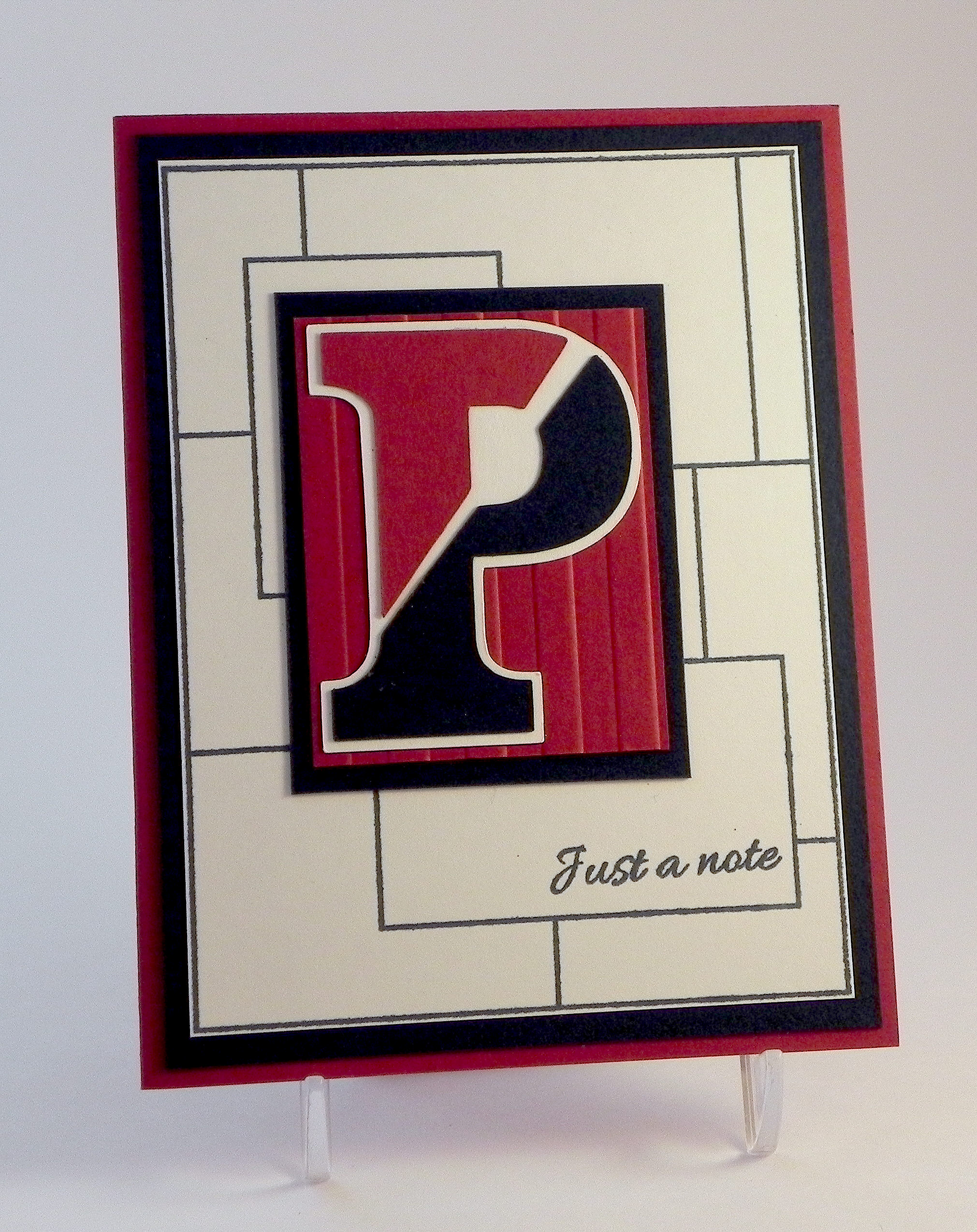
Celebrate – Graduation Card

Join us this fortnight for a new challenge over at Perfectly Rustics. The challenge is “Letters or Symbols” where you are to make the letters or symbols the hero of your project. For example, if you were making a card with the word love on it, make the letters big, emboss them, have them in patterned paper, etc. (http://perfectlyrustics.com/2015/06/01/prdc-no-49-letters-or-symbols/)
I created a graduation card featuring the word “celebrate” where I embossed and glittered my stamped image, cut it out, and adhered it to multiple layers to make it thick/3-dimensional.

(click on photo to see sparkle)
The stamps I used are from the Gina K Designs “Lots of Lines” set (retired?). I started by stamping a star on my white panel with versamark ink and Ranger “Rich Red” embossing powder. While the embossed image was still hot, I sprinkled on some Artsyfartsy Crafts “Sunrise Red” microfine glitter and applied a touch more heat (first from behind and then on top) to remelt the embossing a touch so the glitter would “stick” to the embossed image. (I did one star completely and then went back to do the other one.) To see a video on how to add glitter to your embossed image, click HERE.
I created a cut file with my Silhouette for the greeting stamp. On plain white card stock, I cut this multiple times (5-6) and glued each of these cuts together to make a thick version of the cut. I created one additional cut that I embossed and glittered to glue to the top.
The graduation cap and diploma/scroll are die cuts from the svg.cuts “Graduation Elements” SVG Collection. I added a bit of embroidery floss and ribbon to the cuts to spruce them up a bit.
For added color, I added a mat and strip across the center of 7 Gypsies “Antiquaries Postale Collection: Post” card stock as well as some black.
Clean and Simple has always been tough for me, and while there is more on my card than CAS allows, I was having a lot of trouble walking away from this project with all the plain white showing in the two corners. (Before the strip of color, there was even more!!) Baby steps towards CAS!!!
Now it’s your turn! Create a project where the letters or symbols on your card are the focus, and share it over at Perfectly Rustics. I can’t wait to see what you create!
I’m entering this card in the Mod Squad Challenge this week which is “Masculine” where we are encouraged to make a Masculine card/project. (Sadly, this site is no longer active.)
Thanks for checking out my card project!
This content uses referral links as described in the disclosure policy on my sidebar.