I Believe In You

I Believe In You

I Believe In You zDSCN7438.jpg

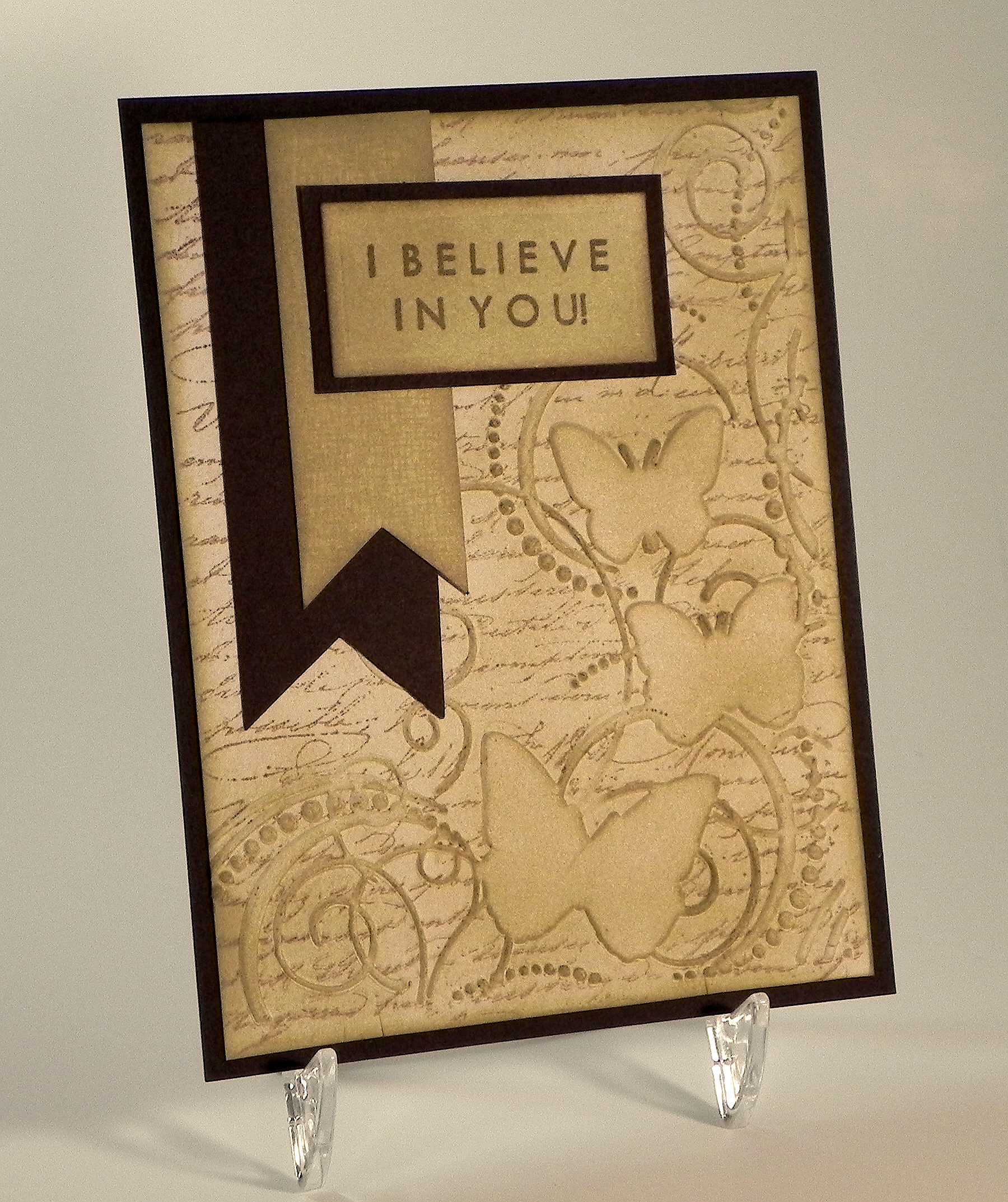
I had recently seen a cool technique on You Tube (HERE) where you create a background behind an embossed image and was anxious to give it a try.  Basically, you first apply ink directly to the inside of your embossing folder with a sponge (to the side where the sections to be embossed are recessed and onto the raised background portion of the folder) , and then you stamp an image (also onto the inside of the embossing folder) on top of the inked surface.  When you insert your card stock in the folder and run it through your embossing machine, the ink and stamped image transfer to the card stock.  Because the ink and stamping didn’t hit the recessed portions of the folder, these embossed areas will remain “clean” and the ink and stamped image will appear behind.

I ended up lightly inking over the whole panel when I was done because I had started with white card stock and didn’t like the contrast between the browns and white.  Had I not done that, my butterflies and swirls would still be basically white.  In addition to the color added, I also like the way the sponging added darker detail to the edges of the embossed portions of the panel.

One thing to keep in mind is that the stamped image on your card stock will be a mirror image of the stamp.  Since I wanted text on my background, I used the Tim Holtz Stampers Anonymous Reflection Script stamp because this image is reversed so it came out the correct way on this project.  (Had I stamped this image directly onto my card stock, the text would all be backwards!)  For this technique, you need to select a stamp that works in reverse.

Another thing to consider is the embossing folder.  This technique works best with an embossing folder that has large, solid embossed areas and not just line images.  You want the background to be behind stuff.

For this card, I used Gina K Kraft ink for my background sponging and Dark Chocolate for my stamped image.  The embossing folder is “Butterfly In Corner” by Darice.  I sponged Kraft ink onto white card stock to create the lighter banner and the greeting panel, and as I mentioned earlier, I also sponged a bit of this ink over my embossed panel.  I used the Gina K Designs “Frame and Filler” background stamp (retired?) to add a bit of texture to the Kraft banner.  Gina K “Dark Chocolate” card stock was also used.

The greeting, stamped with Gina K Dark Chocolate ink, was from the Gina K Designs “Inspiration Mosaic” stamp set.  I was browsing through my greeting stamps, and when I saw this stamp, I knew I had to use it on a card for my husband… just because!

I love earth tones and created my husband’s card in varying shades of brown.  I also wanted to try this same card in a different color scheme and ended up with this one:

yDSCN7472

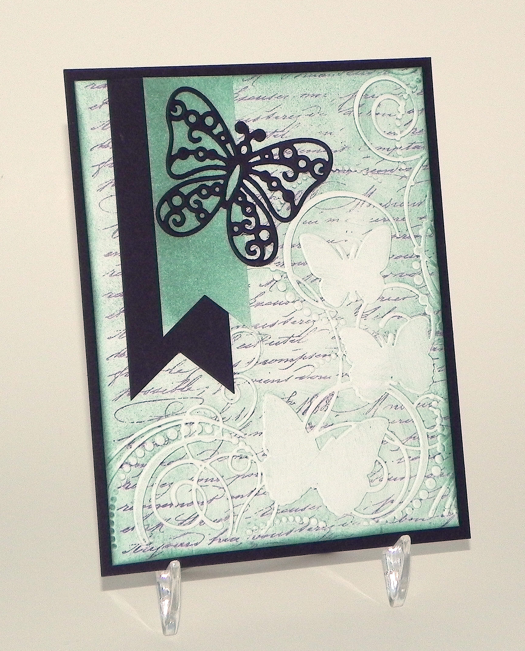
For this version, I used Stampin’ Up “Lost Lagoon” and “Blackberry Bliss” ink and Gina K “Edible Eggplant” card stock.  (The card stock looks so dark in the photo, but it is a beautiful, deep purple color.) Instead of a greeting, I used the butterfly die cut which was made with a die from the Spellbinders “Les Papillions” set (S4-371).  Everything else was the same as the brown version.

This card design with the butterfly embossing folder and script background was inspired by this card on Pinterest.  I pinned it a while back and forgot about it, although it must have stuck in the back of my brain because I made these cards before looking at my board and re-discovering this card!  So this was a CASE, and I didn’t even realize it!!

Thanks for checking out my card projects!

This content uses referral links as described in the disclosure policy on my sidebar.


Golf Photo Note Cards

Golf Photo Note Cards

Golf Photo Note Cards

This card is part of a set of note cards that I made with photos I took at Rolling Green Golf Club in Springfield, Pennsylvania.  These were made to sell as boxed sets at the annual Ladies’ Holiday Boutique and Luncheon that will be held at the club for the members in December.  (Thanks, Mom, for inviting me!)  In addition to the hand-made cards I will be selling, I thought it would be neat to create sets of photo note cards featuring scenery from their home course.

My dad drove me around the course on a golf cart while I snapped a ton of gorgeous shots (333 photos in all!!) – thanks Dad!  The hardest part was choosing which ones to use!  I ended up using 20 shots (divided into 2 sets) which includes all of the holes on the course.  I also made two bonus cards of their clubhouse (a front and back view) to give as a gift with the purchase of a set.

While I originally thought I’d make these cards as thank you notes, I decided to omit a greeting on the front so the cards would be suitable for any type of note.  I had the cards professionally printed on white card stock at a place in Cherry Hill, NJ called dpi Copies Printing & Grahpics, Inc.  (The cards look gorgeous in real life; what a difference professional printing makes!)

I purchased boxes online from BAGS Unlimited.  They have a wide variety of sizes from which to choose, include shipping in their listed prices, and deliver quickly.

Each box contains a sheet showing thumbnails of each of the cards and which hole is featured.

Thumbnails for box 1 final

Thumbnails for box 2

BONUS CARDS

Photo Only Card 31 Club House DSCN8267 with worker removed   Photo Only Card 33 Club House Front DSCN8327 cropped

After cutting, scoring, folding, collating, boxing…..they’re ready to go!

DSCN8534

(set 1 pictured above)

Hopefully the ladies at the club will like them!

Thanks for checking out my card post!

Fishing You The Best

Fishing You The Best

wwwDSCN6209.jpg

As I mentioned in my last post, the Perfectly Rustics site will no longer be hosting challenges after their last “Anything Goes With Glitter” challenge.

I had already made this card for a color challenge we were intending to run in a few weeks (using three Stampin’ Up! colours -Basic Black, Bermuda Bay, and Smoky Slate), and since there will be no color challenge, I decided to share it now.

For this project, I found a printed paper by Karen Foster Design called “Coral Reef” which matched the Stampin’ Up Bermuda Bay.  I used that as the backdrop for this card.  The frames were cut with dies from the Spellbinders 5×7 Matting Basics A and B sets.  The card stock I used is Stampin’ Up Smoky Slate, Bazzill Tiarra (similar to Smoky Slate), Core’dinations Mediterranean (similar to Bermuda Bay) and black.  (This card is 5×7)

The tag was cut from a die from the Heartfelt Creations “Decorative Flower Pot” die set by Spellbinders.  The stamp is from the Gina K Designs “Fishing You the Best” set (retired?) and was heat embossed with versamark ink and Gina K black embossing powder.  A piece of black string was added.

I filled a ziplock sandwich bag with clear Suave Sculpting (hair) Gel, and placed it over the fish paper and “under” the mats to make it look like the fish were in water.  I had done another card using this technique (HERE) and a tutorial (HERE).  For the tutorial, I used blue hair gel, but the paper I was using here was blue so I used clear gel on this project.

wwDSCN7622

(click on photo to see the water/bubbles)

Thanks for checking out my card project!

This content uses referral links as described in the disclosure policy on my sidebar.

Farewell/Crafting Site No Longer Here

Farewell…

farewell cake image

UPDATE – PERFECTLY RUSTICS IS NO LONGER A CARD CRAFTING SITE….

Perfectly Rustics has been running for about two years now, and sadly, Kim and her husband Colin decided that they no longer have the time (with two small children) to continue with the challenge site so this will be the last Perfectly Rustics Challenge.

I discovered this site last summer and enjoyed regularly participating in their bi-weekly challenges. The team was always so encouraging, the challenges fun and motivating, and I got a lot of great inspiration from the design team and the projects posted by the participants.  I was truly honored when they invited me to join their design team in March and have greatly enjoyed and appreciated the opportunity.  I will really miss Perfectly Rustics, and I wish Kim and her family all the best!

Congratulations! - Wedding Card yDSCN7536


Join us this fortnight over at Perfectly Rustics for their FINAL Design Challenge: Anything Goes – with Glitter.  You can create absolutely anything from a card, a scrapbook page or an off the page project for any theme or topic – just add glitter to it and maybe a little to yourself! (http://perfectlyrustics.com/2015/07/25/prdc-no-52-glitter/)

The card I am posting for this challenge was posted a few days ago (HERE) when I thought the challenge was to be announced and was originally made for a color challenge that was planned to run in a few weeks.  The three Stampin’ Up! colours for that challenge were to be Basic Black, Bermuda Bay and Smoky Slate.  Here is my original design.

Wedding Card Color Challenge yDSCN9933

I really liked the way this card came out, but I felt like it was a bit dark with the gray background panel. (I was trying to stick with the color challenge requirements at the time!)    When I saw that the new challenge included glitter, I saw an opportunity to brighten up my card a bit!

Those gorgeous stamps (I just love them!) are called Wedding Dress, Groom, and Congratulations and are by So Suzy Stamps.  I stamped these images with Gina K Black Onyx ink.  I used my MISTI so I could stamp them multiple times to get really dark, crisp images.

The gems were airbrushed with Copic BG18 to coordinate with the Bermuda Bay.

The cardstock I used was black, Core’dinations Mediterranean (for the Bermuda Bay), American Crafts The Goods – Tulle (for the Smokey Slate), and Recollections silver glitter paper.  I rounded the corners with a Fiskars corner rounder.

The hearts were punched out with a Creative Memories double heart punch.  I punched the smaller heart first, and then I punched the larger heart around the hole from the smaller one.

This card was extremely quick and easy to create.  Cut 3 panels and a card base.  Round 2 corners on each.  Stamp 3 images in black.  Add a touch of bling (which I airbrushed to coordinate).  Punch 4 hearts, and adhere.  DONE!

Now it’s your turn! Create any project you choose, and just add glitter!  I can’t wait to see your sparkly project over at Perfectly Rustics.

Thanks for checking out my post!

(Farewell image at the top of my post is a google image and is not my own.)

This content uses referral links as described in the disclosure policy on my sidebar.

Tropical Penguins – Penny Slider Card

Tropical Penguins – Penny Slider Card

Penguin Vacation Penny Slider Card wc DSCN9852

Join us this fortnight for the Perfectly Rustics Design Challenge #51 “Something That Moves” where we are to make a card or project with something that moves (like a shaker or slider card).  I created a penny slider card. (http://perfectlyrustics.com/2015/06/30/prdc-51-something-that-moves/)

A penny slider card has an element on the card that spins as it travels across the card.  It’s called a penny slider card because the spinning element is mounted on a “sandwich” of two pennies with a pop dot in the center which rolls across the card in a slot or channel that you create on the front of your card.  (Click HERE to see a tutorial on how to create a penny slider or spinner card.)

My daughter LOVES palm trees and penguins, and even though these don’t usually go together, she has been asking me to create a card with both.  Luckily, I had these adorable “beachy” penguin stamps so I was able to honor her request!

The penguin images are from the Stampin’ Up “Penguin Paradise” set.  I created cut files of these stamped images with my Silhouette, cut the die cuts from white card stock, and stamped the images on my die cuts with Memento Tuxedo Black ink.  The stamps in this set are mounted on wood, so I used my stamp-a-ma-jig for perfect placement and for stamping each image multiple times to get them nice and dark.  Then I colored the images with Copic Markers (Straw, E31, YR23; Beaks/Feet, Y17; Clothes, B29, YR09, YG07) and a white Sakura gel pen.  There was a tiny white border around parts of each of the stamped images, so I filled that in on the top half (the parts that would be in front of the water when on the card) with Copic B97 and the bottom portions with the black copic marker.  The penguins were adhered with very thin pop dots so they stood ahead of the trees but behind the beach ball on the card.

For my beach scene background, I used digital paper I purchased on Etsy from a set called “Beach Party Collection” by Cherry Clipart (seen HERE).  I originally started sponging my own background scene, but I wanted the image on the area behind the slit to be the same and line up exactly with the image on my front panel.  For this reason, it made more sense to use a paper that I could make multiple, identical copies of instead of trying to hand ink identical duplicates. The slit for my penny to roll through was created with the smaller skinny rectangle die from the Spellbinders A2 Matting Basics B set.  The blue mat is from the Recollections “Cape Cod” Card stock Paper Pack (5 shades of blue), and I used a piece of Gina K “Kraft” card stock for the card base.  (This card is 5×7.)

The beach ball is from a coloring page I found on google HERE.  I created a Silhouette “print and cut” file for this image, cut it out, and colored it with Copic Markers (YR68, Y15, B29, R46, G05).  Once colored, it was adhered to the penny spinner with a glue dot.  The beach ball spins as it rolls back and forth when the card is tipped slightly from side to side.  ((Excuse the poor quality of the GIF file below.  I cannot include videos here in my blog post but wanted to show the movement.)

Tropical Penguins Penny Slider Card Video Clip

The palm trees are from the “Mindy’s Zoo” stamp set by Autumn Leaves.  I created a cut file and stamped the image onto the die cuts with Memento Tuxedo Black ink.  Copic Markers (G94, E44 and E71) were used to color them. 

The greeting is from the Gina K Designs “Botanicals” set (retired?) and was stamped with Gina K charcoal brown ink.  I have to confess that I did something INCREDIBLY stupid.  Originally, I had not included a greeting but then felt like it was “missing something” when it was done.  My first thought was to stamp the greeting on a duplicate panel, cut it out, and line it up on the card.  It looked ok, but I wasn’t happy with the lines around the panel.  Then I matted it which was better… but still not great.  Now here is the stupid part.  I decided to try to stamp it directly onto my finished card.  (I can hear my daughter in my head screaming, “JUST WALK AWAY!” which she often says when she realizes that I am about to go one step too far.  Usually when I try something like this, I end up having to start over – and this card took me ALL DAY to make!)  I wanted to use my MISTI because I wanted it to be lined up perfectly, but I was really afraid that all the layers and the thickness of the card and the extra, uneven thickness from the beach ball would prevent the MISTI from stamping properly.  (The lid came down on an angle.) Here’s what I ended up doing – I positioned the card in the MISTI, placed a piece of acetate over the card, and stamped on the acetate (barely pushing down so I wouldn’t break the lid).  You can see through the acetate so the stamped image looked like it was on the card, and I could see how it would look (but if it didn’t come out, it wouldn’t actually be on the card). I got a very nice stamped image, and it looked so much better than the panel I had stamped and cut before.  SO….. I removed the acetate, took a deep breath, and stamped directly onto my card.  PERFECT IMAGE!   PHEW!!!!!!!  All’s well that ends well, but it was very stressful, and I don’t think I have the nerve left to try that again!!

I love the penguin images in this set and really enjoyed making this card!  Kelly really liked it, too!

Now it’s your turn!  Make a project with something that moves, and share it in the “Something That Moves” Challenge over at Perfectly Rustics.  I can’t wait to see what you create!

Thanks for checking out my card project!

This content uses referral links as described in the disclosure policy on my sidebar.