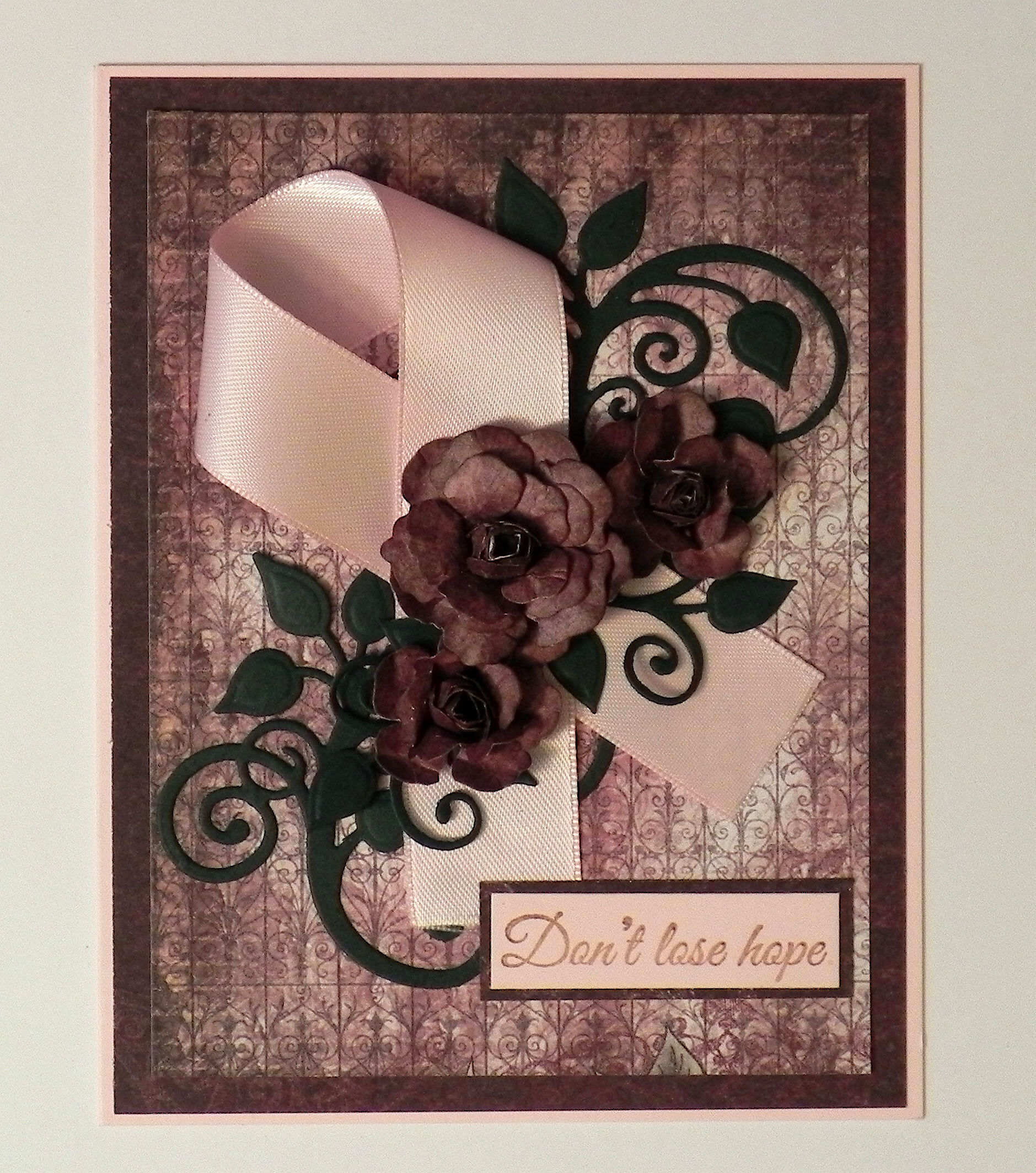
Pink Get Well – Sketch

This project was made for Joyce’s “Stamp Out Cancer – Challenge #6 – Sketch” for StampTV. For this challenge, we are to create a card using the sketch provided. (Sadly, this site is no longer active.)
Here is the sketch:

It was also made for Lee’s “In the Pink for October” Mod Squad Challenge. In following with the very important theme of cancer awareness…..her challenge this week is to use pink – any pink, any way. (Sadly, this site is no longer active.)
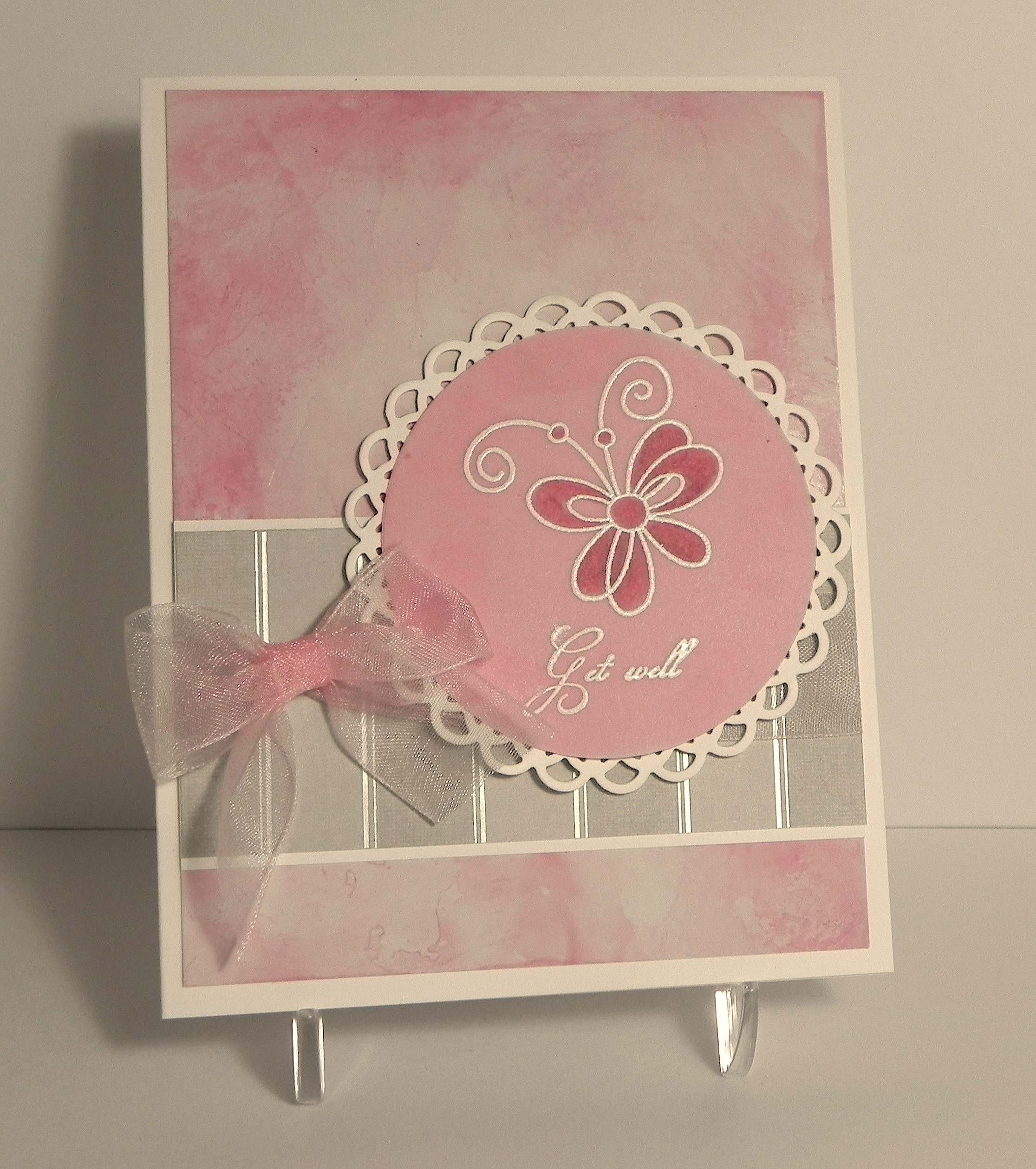
For the background panel on this card, I used a technique called ABS Monoprinting, done with the Copic Airbrush System (ABS) which creates a marbleized background. The Copic markers I used were R56, R83, and R85, along with colorless blender solution in a mini mister (spritzer), and glossy card stock. The ink was airbrushed in spots on my craft mat and then spritzed (with a mini mister) with the colorless blender. Once the ink started to pool or formed puddles, I put the glossy card stock, face-down, onto the craft mat into the ink puddles. I twisted the card stock slightly when picking it up and then placed it in the ink again, and again until I covered my panel. A few notes: If you use too much colorless blender, your ink will look very light and washed out. (I probably used a little too much on mine, although I wanted a soft, muted look.) If you don’t use enough colorless blender solution, your ink will look spotted without much blending. If the ink runs out on the craft mat, more ink and blender could be added. Regular card stock can be used instead of glossy which will give you a softer look. Waxed paper can be used if you don’t have a craft mat. And finally, I think you can probably just scribble ink onto the craft mat directly from the marker if you don’t have an airbrush system. I tried it, and it worked, but I think you use less ink with the ABS. (You can use the colorless blender solution to clean your mat when you are done.)
For the butterfly and greeting, I used stamps from the Gina K designs “With Love and Prayers” and “A Little Something” sets. I stamped the images with versamark on thick vellum card stock and heat embossed them using white embossing powder, being careful not to over heat and burn the vellum. I then colored the butterfly, from the back of the vellum, with Copic Marker R56. The vellum was then adhered to a piece of pink card stock using Tombow adhesive made for vellum, and this was then mounted on a white mat created with a Spellbinders lacey circles die. (I originally planned to just use the vellum with no pink paper, but you couldn’t really see the embossed images too well when it was placed against the white mat.)
The silver panel across the bottom was from the DCWV “The Formal Affair Stack” which was mounted on a piece of white card stock. A white card base was used as well. A sheer ribbon and bow were added. Then the circular panel was adhered using pop dots.
This card was VERY difficult to photograph. It is a very soft looking card, and the camera had trouble picking up the details in the background and the actual colors on the card. It also looked slightly blurry to me no matter what I tried! Maybe my camera had trouble focusing with the glare from the glossy card stock? I took over 70 pictures (thank goodness they were digital!!) and finally settled on the above photo; it was the best I could get! Sigh…
Thanks for checking out my card project!
This content uses referral links as described in the disclosure policy on my sidebar.