Understanding The Copic Marker Letter/Number System, And How I Store My Copic Markers

Copic markers are great for adding color to images, backgrounds, etc. There are so many colors from which to choose (over 350), and they blend beautifully to add shading, detail and depth to any project. I used to store my markers in a shoe box, but as my collection grew, storing my markers in an organized way became a must for me. I based my storage system on the letter/number system (with natural blending groups) that the Copics fit into. And I made sure my storage system would allow me to easily add newly acquired markers.
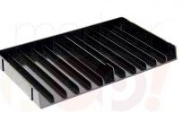
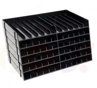
Slotted Trays
In my craft room, I use storage trays by Crafter’s Companion. I believe they are designed to store Spectrum Noir markers, but the Copic markers (sketch, ciao, and original) all fit in the slots perfectly.


Depending on where you buy them, you can get them as a single tray, or they come 6 in a pack. (They kind of snap into place if you are stacking them- either on a diagonal or lined up straight.) I’ve included a few links of places I’ve seen them:
I purchased singles at markerpop.com (See HERE.)
I purchased a box of 6 at Staples.com (See HERE.)
They are also available on amazon.com (See HERE).
I usually keep the trays on the shelf and bring the markers that I need to my desk. Occasionally, I need to bring the whole stack, though, so I put some decorative duct tape on the sides to keep them from coming apart and spilling all over the place.


How My Markers Are Organized:
I arrange my markers by keeping all the letters together, and then I arrange the markers in chronological order within the letter groups.
(click on photo to see a closer view; use back arrow to return to post)

Why do I arrange them like this? Understanding what those letters and numbers mean might make it clearer!
Copic Markers have letters and numbers on the caps (or on the marker) to give information about the color itself and to help you see what markers will blend together nicely.
The Letter(S) stands for the Color family: E = Earth, C = Cool Gray, B = Blue, YR = Yellow-Red, etc.

The First Number represents the Blending Group or the saturation of the color. Lower numbers are more vibrant (or more pure), and higher numbers have more gray (or are toned down). So B04 is a more vibrant or more pure blue than B24 which has more gray in it.

(The E’s are a little different since you can get brown from so many different color combinations, but there are still groups of browns that seem to go together.)
The Last Number(s) represents the Specific Value or shade – how light or dark a color is. The lower the number, the lighter the shade. So within the same color family (B2), B24 is a lighter blue than B29.

A Natural Blending Group is a sequence of specific values (light to dark) within the same color family and the same blending group. In other words, a blending group of markers will be markers where the letter(s) and first number are the same and the end numbers change. (Only the shade varies.) When these colors are blended together, they coordinate perfectly, especially if you choose end numbers within 2-3 digits from each other. Use (end numbers) 0-3 for highlights, 4-6 for mid-tones, and 7-9 for shadows.

Using a Natural Blending Group is simply a guideline; any color has the potential to blend with any other color. But for storage purposes, I chose to keep the blending groups together. This allows me to quickly and easily make color choices for my projects and is why I store them grouped with like letters and in chronological order.
Since I do not own all of the colors, I have left spaces for new markers. However, the markers are easy to move around if necessary.
Label Strips
In addition to having the markers arranged “in order” in the trays, I also made strips of cardstock with the letters/numbers of each marker and put them in each of the slots with the corresponding marker. When I work, I pull out all of the markers that I plan to use for a project. These labels show me very quickly where they go when I am done with them! This is particularly helpful when trying to replace markers that go near the ciao markers since these don’t have letters and numbers on the caps. (They are on the markers themselves.)


Because these strips are just card stock, they can easily be moved to other slots if necessary when new markers are purchased and the old ones need to be rearranged to make room.
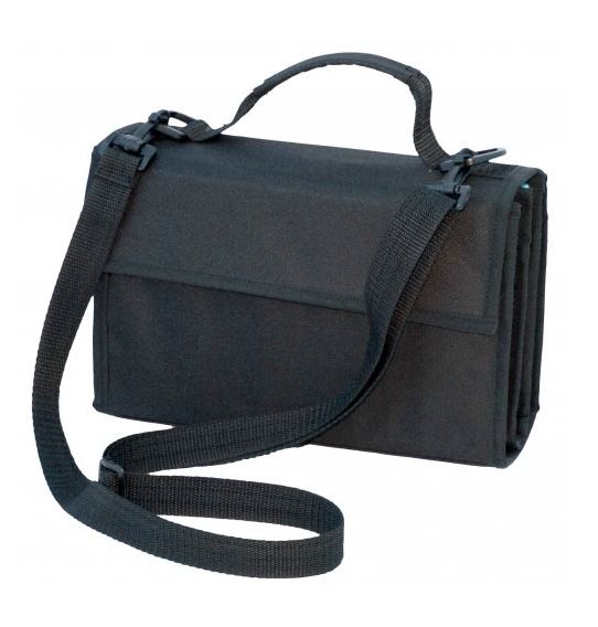
Travel Wallets
For traveling with my markers, I have 2 “wallets” that I use. One holds 72 markers and the other holds 36 markers.


I really like these wallets for traveling because the markers are very secure and easy to carry. The reason I do not use these as my primary way to store my markers in my craft room is because I couldn’t use my card stock labels, and they were not big enough to hold all of my markers. Also, the markers are held pretty firmly in place with elastic, and moving all of the markers every time I bought a new one would be a bit cumbersome! It is fine as an “every once in a while” thing, but for every day use, I find the trays work best.
Click HERE to see 72 marker wallet on amazon.com
Click HERE to see the 36 marker wallet on amazon.com
Color Swatch Book
One final thing I want to share with you is my Copic Color Swatch Book. This contains a blank rectangle for each of the Copic markers available. The book has the markers arranged the way I arrange them on the trays and really helps when setting up the trays initially! When I purchase a marker, I color in the rectangle that corresponds to that marker. This helps me keep track of the markers I own. Coloring in the “swatch” also shows the true, actual color of each of the markers which makes choosing colors for a project much easier than relying on the caps.


Click HERE to see it on amazon.com
(Some of the above photos were found on google images, some were found at the various links provided, and some were taken by me.)
Thanks for checking out my post!
This content uses referral links as described in the disclosure policy on my sidebar.