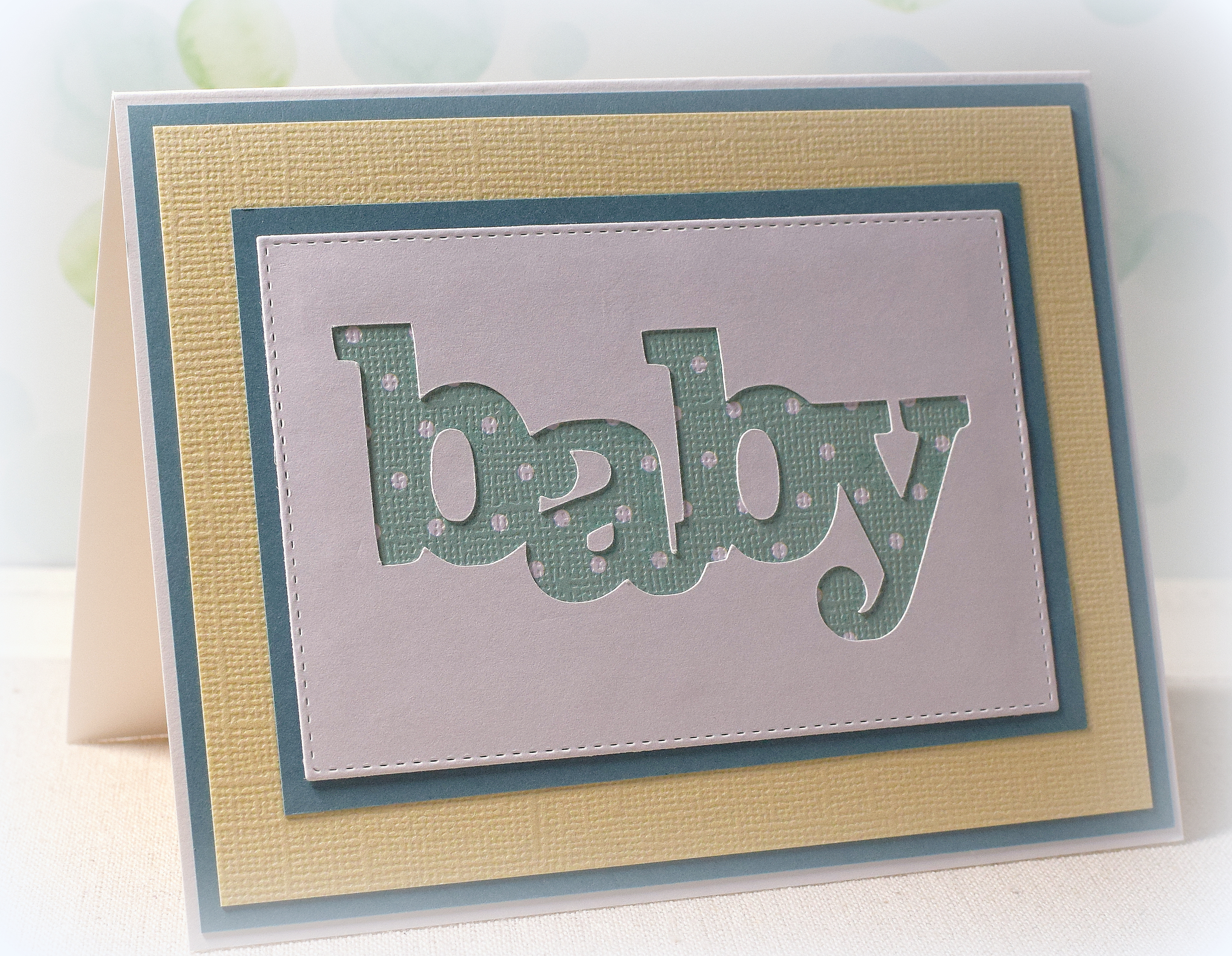
Paper Pieced Baby Card

Here’s one more baby card (along with a quick “paper piecing” tutorial) I made while playing with the papers and supplies I had pulled out for the cards in my last post…..
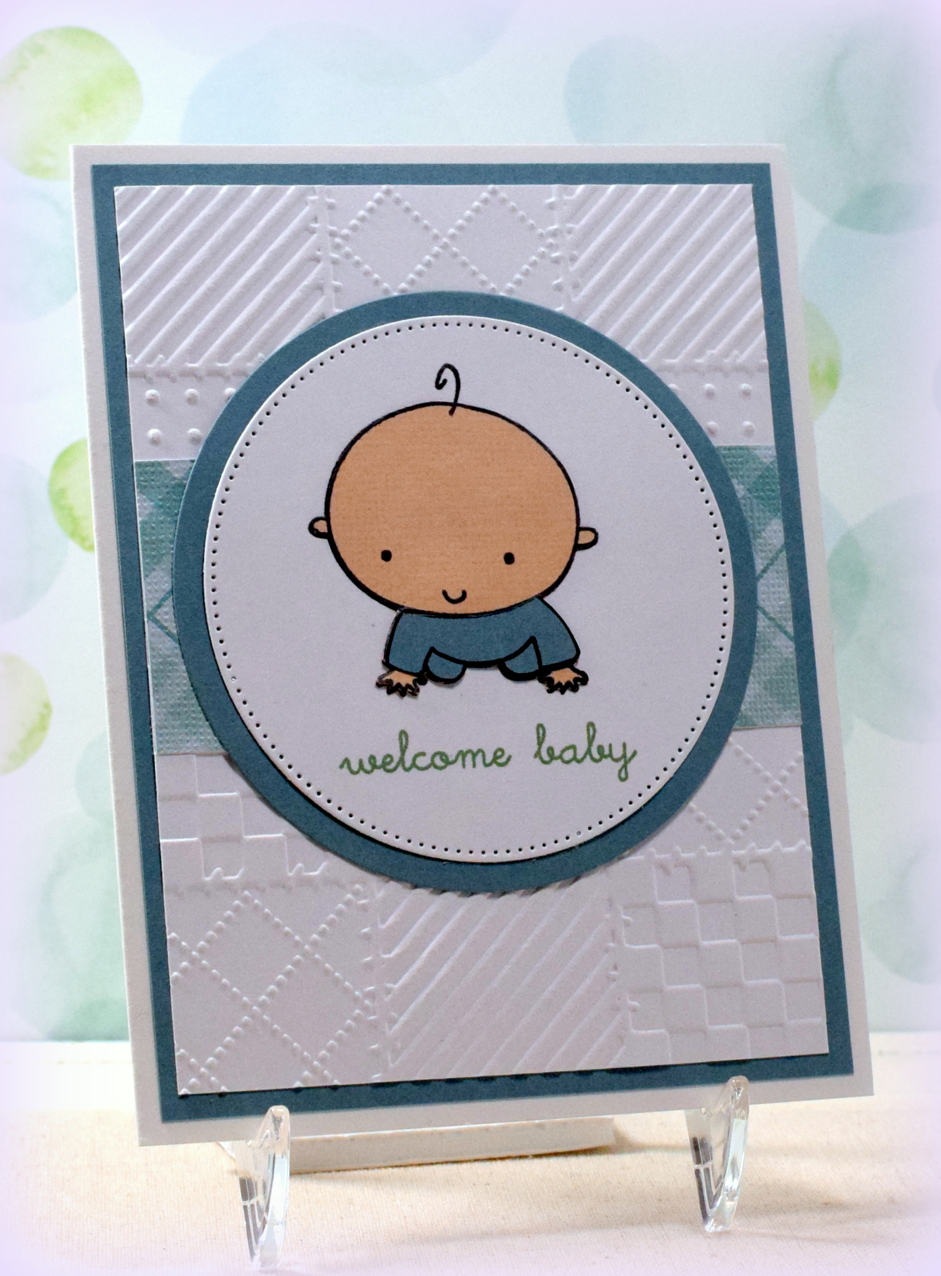
This cute baby image is a cling stamp from a set called “Baby” (#227909) by Recollections. (I purchased this set at Michaels a while ago and can’t seem to find it in the store or online anymore.)

I used the Darice “Quilt Blocks” embossing folder and a scrap of Core’dinations “Light Aqua Plaid” (#320009) card stock for my background along with a pierced circle (and plain circle) die cut to frame the stamped images.
The greeting is from the “Bundle of Love” stamp set from Gina K Designs (retired?) and was stamped with “Mint Macaron” ink from Stampin’ Up. I’m not sure why my camera “sees” blues differently than I do; the ink and these papers match so much better in person than on the photo. (The papers are more greenish, and the ink is more bluish in real life.) Oh well!
I “paper pieced” scraps of card stock to my baby image to add the color. I really like this technique because you can easily match whatever card stock you are using on your project.
HOW TO PAPER PIECE:
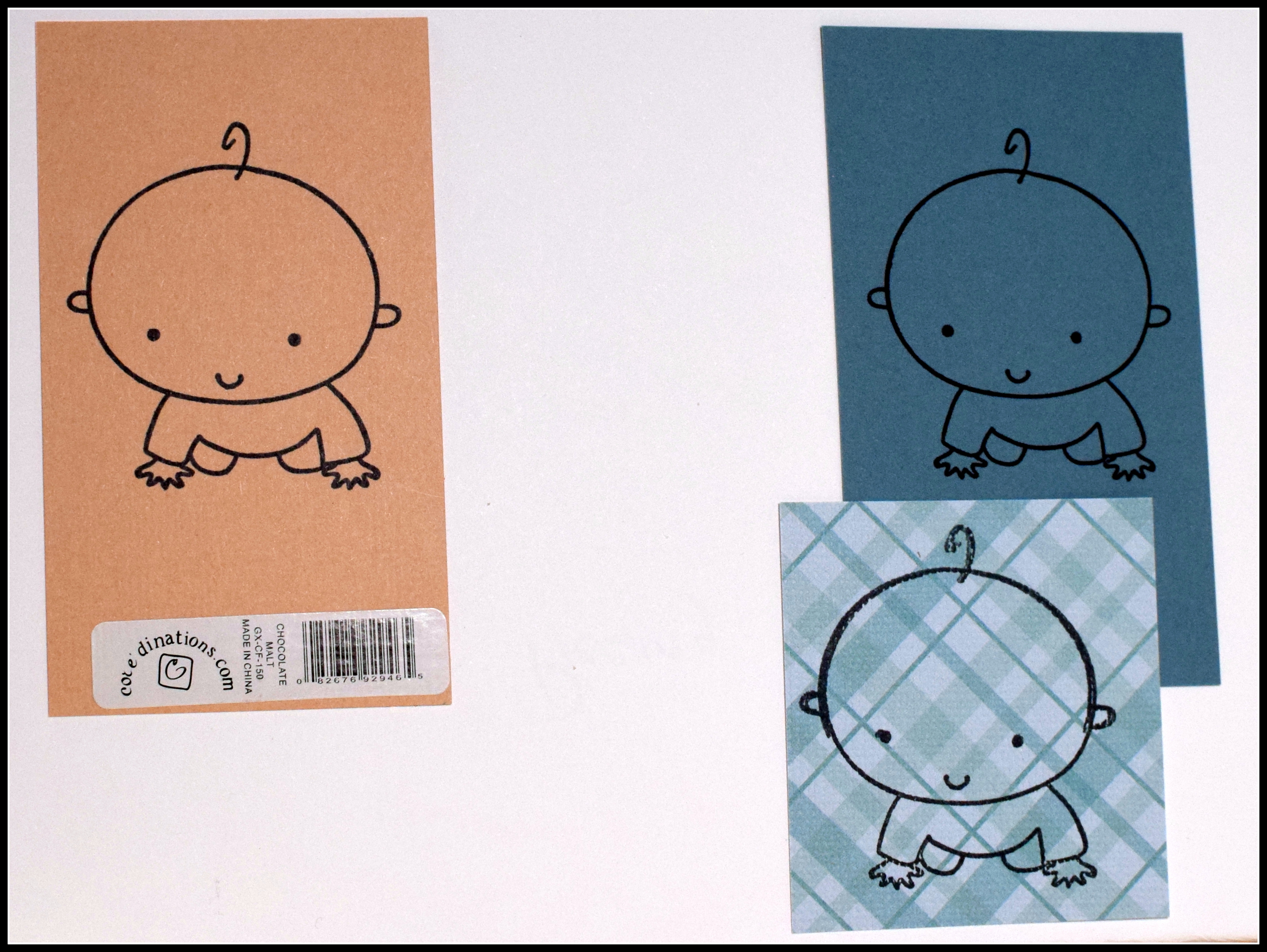
To do this technique, you stamp the image onto the panel you plan to use on your card. (For my card, I wanted the baby and greeting to be on a white panel, so I stamped him on white making sure I had enough space around him to die cut the panel with the pierced circle die.)
Next, decide what colors you want to “color in” the image and stamp the image on a scrap of each of those colors. (I couldn’t decide if I wanted his pj’s to be solid or plaid, so I stamped it on a scrap of each.)

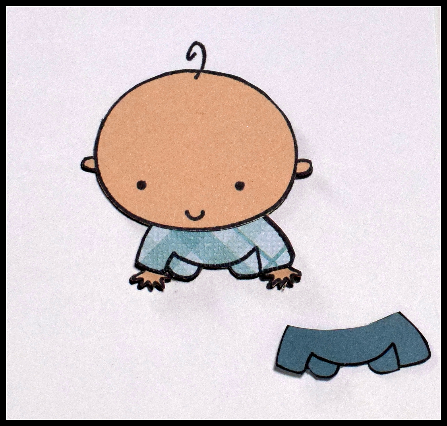
With scissors, cut out the portions of the colored pieces you need to “fill in” your image. I cut out the whole body from the peachy paper and just the pj’s from the aqua pieces. Notice that I did not worry about cutting out the line for the baby’s hair on the peach piece. (The hair is too thin to cut out and is not supposed to be peach; it is supposed to be black and is still on the image on the white panel.)

The final step is to glue the layers on to the white panel. Line up the black stamped portions when doing that. You can see how the hair “reappears” in this step! (I was still deciding what he should wear in the photos below. Ultimately, I decided to use the solid piece and removed the plaid one.)


Thanks for checking out my card project!
This content uses referral links as described in the disclosure policy on my sidebar.