Mod Squad Challenge – “Encouragement” – A Top 3 Winner!

Mod Squad Challenge – “Encouragement” – A Top 3 Winner!

Mod Squad Challenge Badge-TOP3

 (April 29, 2015)

xDSCN6124

(The host/hostess picked the “Top 3” which will be featured on PINTEREST.)

Click HERE to see the winning announcement.  (Sadly, this site is no longer active.)

Click HERE to see the original challenge post.  (Sadly, this site is no longer active.)

Click HERE to see original blog post for this card project.

Thanks for checking out my post!

Three Beach Babes

Three Beach Babes

Three Beach Babes xDSCN9354.jpg

They ARE fabulous, aren’t they?!

This fortnight, the challenge over at Perfectly Rustics is to use three of something on your project. (http://perfectlyrustics.com/2015/05/04/prdc-no-47-three-of-something/)

For this card project, I used the three beach babes image from the Art Impressions (Hampton Art) “Beach Babes” stamp set.  Here is what is included in this set:

BEACH BABES SC0653 (ART IMPRESSIONS)

I stamped the image and sentiment on white card stock with Memento Tuxedo Black ink.  Then I masked the image using a mask I made with my Silhouette and stamped my background swipes using a stamp from the Stampin’ Up “Work of Art” stamp set.  I used Memento Desert Sand ink for the sand, and I used Gina K Turquois Sea ink (which I “stamped off”) for the sea/sky.  (I LOVE this stamp set and can see myself using it a lot.  However, I am embarrassed to tell you how many times I tried to get my background swipes “just right” for this card!  You’d think it would be random and quick (and it may be for most people!), but I’m not really a random stamper, and I experimented with a lot of different combinations before coming up with the design I ended up using.)  Once I was FINALLY happy with the background,  I colored the image with Copic Markers (Skin – E50, E31, E33, E04, R21; Clothes – B29, B04, YR68, Y15, B66, E47; Chairs – C1, B04; Drinks – Y15, E50, and E55, E57, YR68).

The card stock I used was Gina K Turquoise Sea, Sweet Mango, and white.  The background paper is from a digital pack called “Beach Holiday Fun” from Digital Potpourri.   (You can see the listing HERE.)

Since this card was made for a challenge to use three of something, I decided to create 3 coconut embellishments to add to the palm tree.  I made these with my Epiphany Crafts Shape Studio Bubble Cap maker , Clear Round (14) epoxy shapes, and a scrap of orange swirly paper from my stash.  This tool is pretty cool because you can use whatever paper you want to create custom embellishments for your projects.  You can check out this tool HERE on amazon.com.

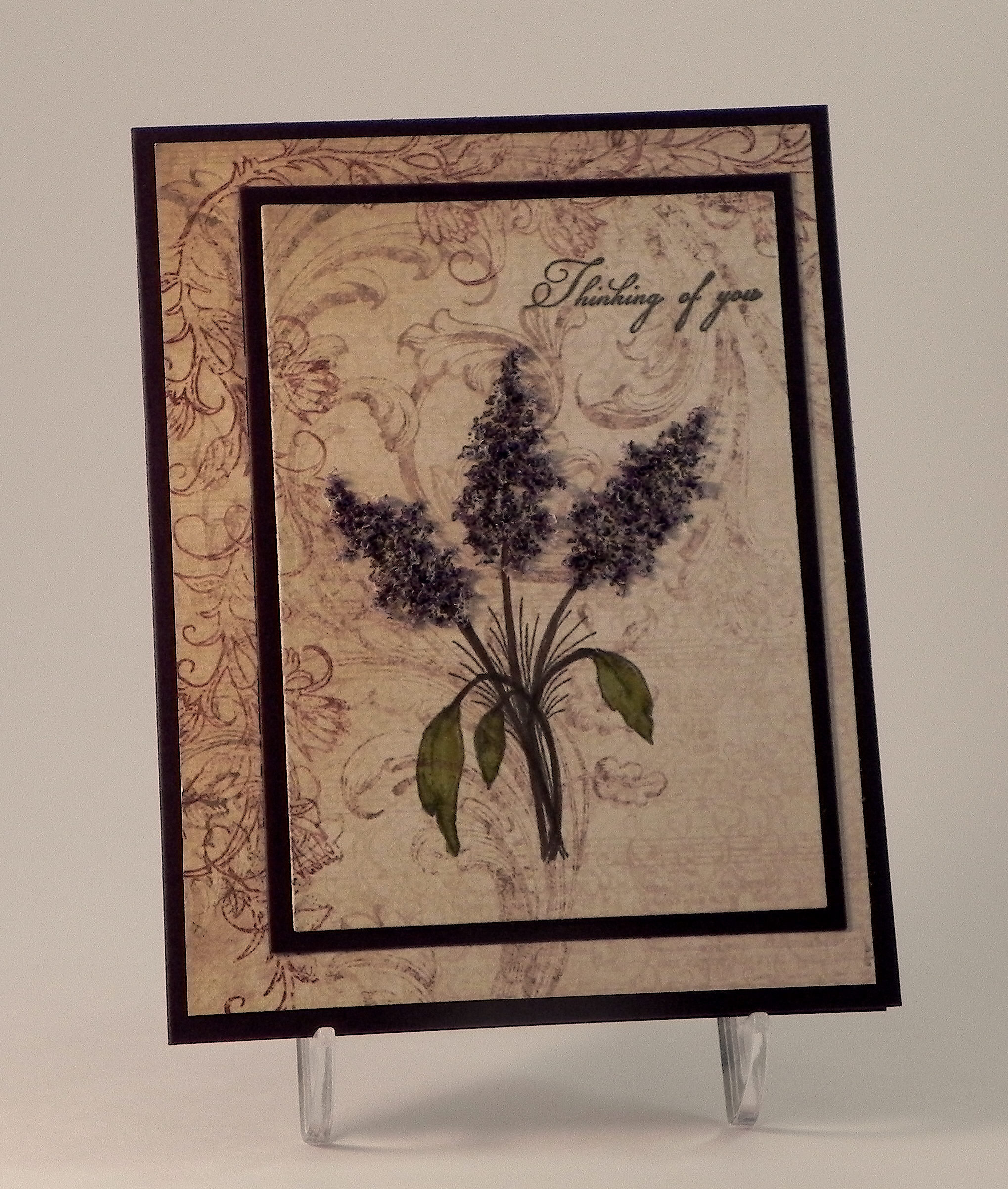
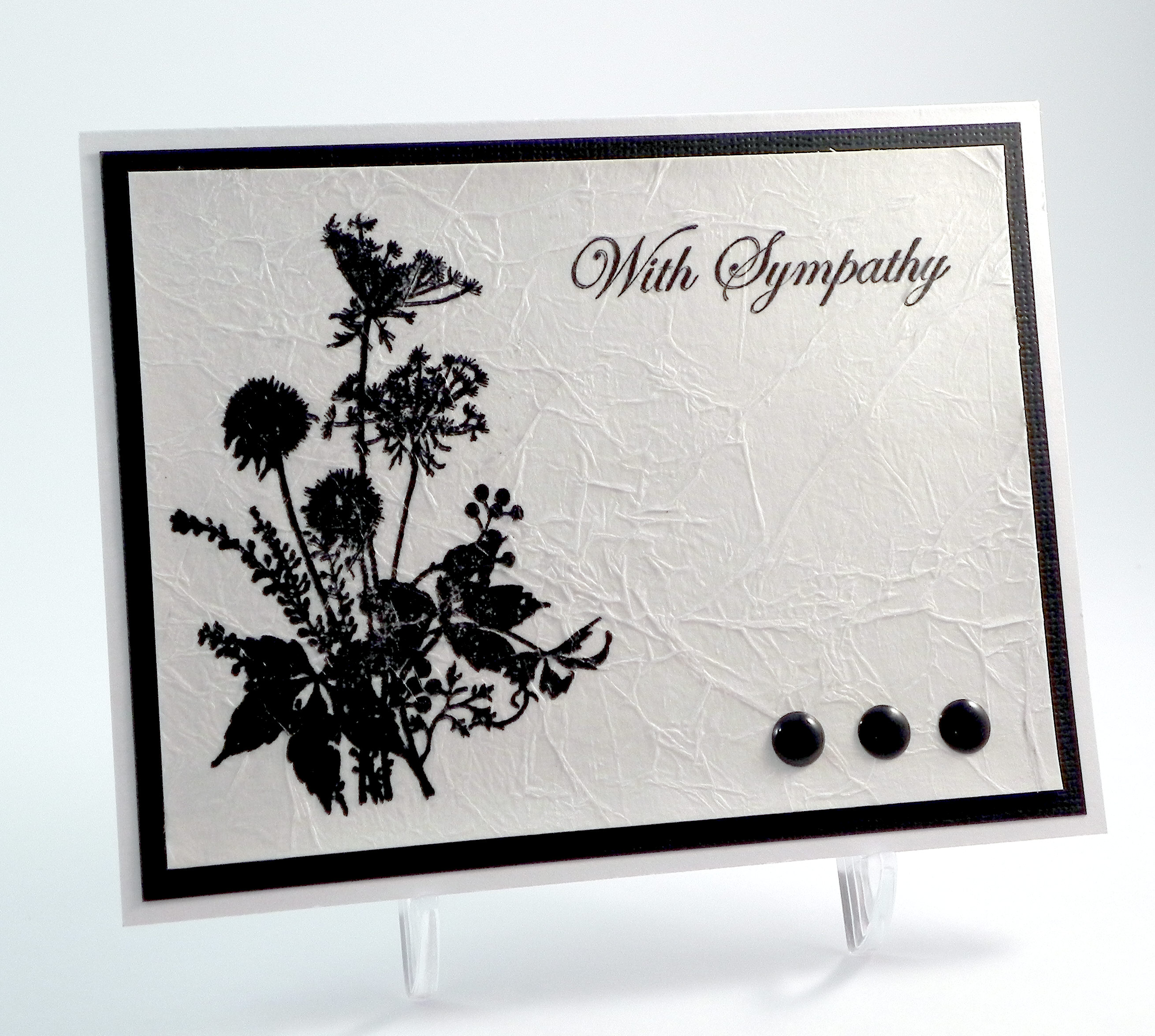
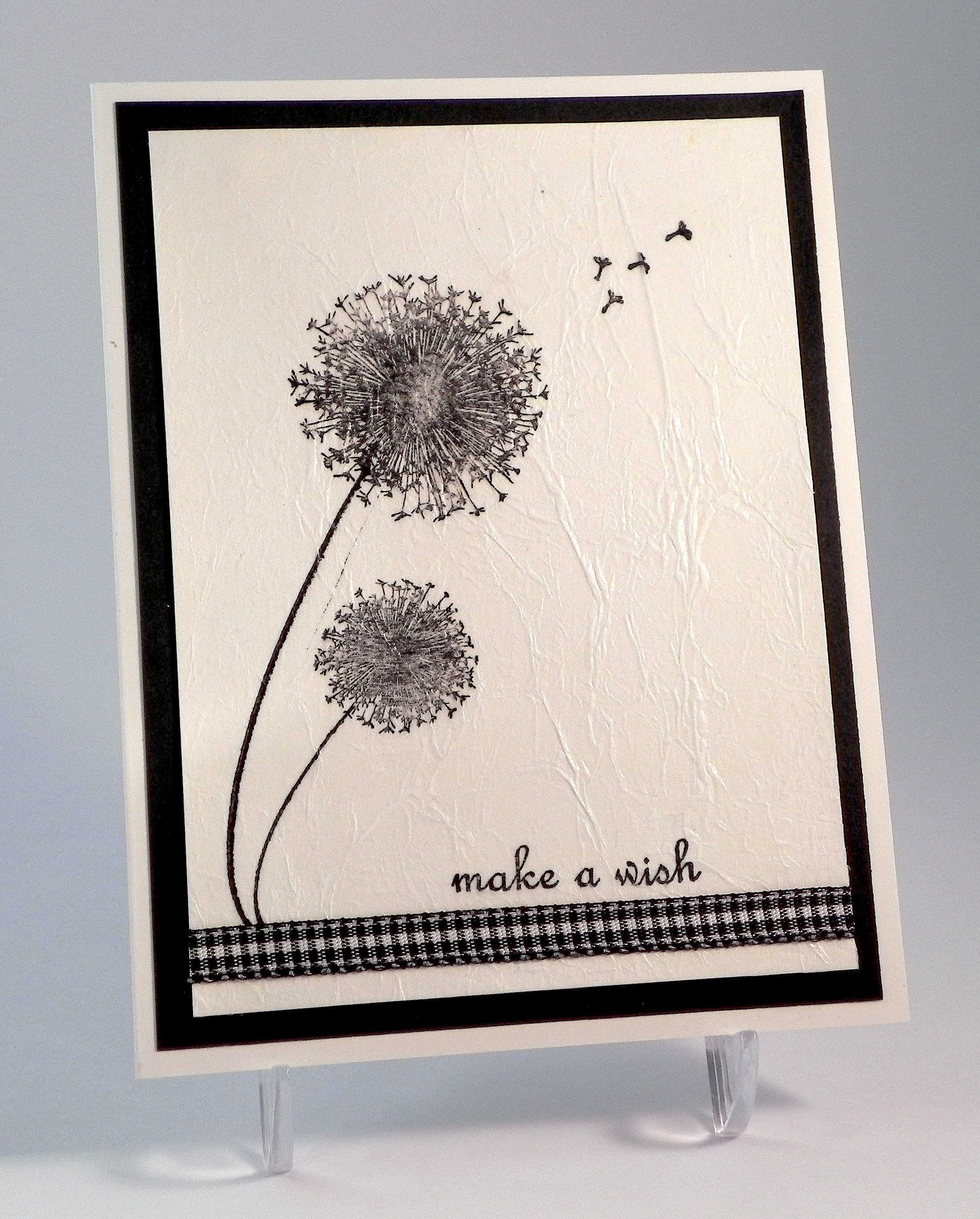
In order to keep the palm tree on the background (my daughter insisted!) and still fit my rather large stamped image, my card needed to be 5×7.  Before making this version, I played around with a number of different background styles which I included here.

yyyyyySCN9364   rrrDSCN9392

xxxDSCN9378

The paper, card stock and copic marker colors are all the same as the ones listed above.  The enamel dots on these cards were by Teresa Collins, and the embossing folder used on the third card sample is Basket Weave by Darice.  Initially, I had stamped the sentiment a little too far away from my image (in my opinion) so I added the enamel dots under it to fill in some of the space.  I’m not sure if I love that or not!  Then I went back and tried one with the sentiment closer.  Much better!

Now it’s your turn!  Create a project using three of something, and share it over at Perfectly Rustics!

Thanks for checking out my card projects!

Oh, and one more thing…

As I’ve mentioned on several occasions, my daughter LOVES palm trees and often pesters me suggests that I include them on my cards.  She just returned home from the International Career Development Conference that was held in Orlando, Florida this year.  (She and her two brothers qualified to attend this international competition by placing first in our region in the Stock Market Simulation game in which they participated with their school/business class.  Hooray Kelly, Kevin and Keith!)  Anyway, here are a few pictures that Kelly’s friends took of her while there:

photo 6  photo 2

I think it’s safe to say that she will continue to “suggest” that I include palm trees on my projects!!  🙂

This content uses referral links as described in the disclosure policy on my sidebar.

Thinking of You

Thinking of You

xDSCN6124

The Mod Squad Challenge this week is to create a card of encouragement.   (Sadly, this site is no longer active.)  I find that knowing friends are thinking of me when I am going through a rough time or am not feeling well is encouraging and helps me to feel better. This card was made for a friend who has not been feeling well, and we are hoping he feels better soon!

I started out this card with a Gina K Edible Eggplant card base and a piece of card stock cut from the Heartfelt Creations Antiquitiy Collection 12×12 paper pad.  The stamps I used are from the Gina K Designs “Little Branches” set (for the sentiment) and the Heartfelt Creations “Recovery Wishes” set (for the floral image).  They were both stamped with Gina K Edible Eggplant ink.  I use Copic Markers YG93 and YG95 and Lavender Flower Soft to add color to the floral image.  The flower soft was a little light for my edible eggplant card base, so I tapped the side of the brush nib of my Copic Marker V99 onto the flower soft (in random places) to make parts of it darker.  Once my images were stamped and colored, I used dies from the Spellbinders A2 Matting Basics A and B sets to cut out the focal image panel and frame. (The focal image panel is smaller than the cut-out frame so you can see some of the card base between the two.)

Seems simple enough, right?  It never is!!  Initially, I thought I’d do this kind of like triple stamping (but with only 2 layers and with the patterned paper instead of stamping by own background paper).  I stamped my images as described above and cut out the image panel with one of the dies.  Then I used the other die to cut out an edible eggplant mat.  I lined up the patterns on the printed paper and adhered the layers.  Then I proceeded to mess up my leaves when I colored them.  I tried it again and again several times and just couldn’t get them right.  (I have no idea what my problem was; they are just simple leaves!!)  Anyway, I kept using different corners of the two sheets of this paper that came in the pad (that was where the pattern was I wanted to use) and eventually ran out of corners/paper.  I ended up using a piece more in the middle of the page which had a lot less detail.  Here is my “double stamped” sample with the plainer paper panel.   (You can see that the pattern lines up on this sample.)

xDSCN6121

I liked this, but when I looked at it next to the messed up versions that had a little more detail in the print, this seemed a little plain to me.  I tried to salvage parts of some of the messed up cards by removing the image panels and was left with the cut-out frame and a lot of the eggplant.  I happened to see a scrap of the paper with the postage image sitting on my desk and tried stamping my images on that. I really liked this, but the scrap was smaller than the original panel so I couldn’t mat it like I had before. I tried centering it in the opening of the frame and ended up with the first card pictured above. Had I started with this idea from the beginning, my patterns would have lined up, but I was using scraps and panels cut separately so the patterns are different.  I’m still really happy with the end result, and I actually like the plain version a lot more as well now that it’s not side by side with the other ones!

Thanks for checking out my card project!

This content uses referral links as described in the disclosure policy on my sidebar.

Vintage Floral Mother’s Day Card

Vintage Floral Mother’s Day Card

wxxDSCN0063

The current challenge over at Perfectly Rustics is the try a new technique. (http://perfectlyrustics.com/2015/04/20/prdc-no-46-new-technique/)

For this card, I tried a new technique for my background panel that I saw on StampTV called “Scrappy Background” which you can see HERE.  Basically, you cut strips of paper, and arrange them in a perpendicular pattern with a thin space between them.  In the tutorial, Gina uses a variety of patterned paper scraps.  My pieces are all the same pattern.  I started with a piece of paper from the Momenta “Songbird” 12×12 inch paper pad (which was white and gray) and sponged Tim Holtz Tea Dye distress ink on the whole surface (to match my focal image panel).  I cut 3/4 inch strips and arranged them on a piece of Gina K Dark Sage card stock.  Once all my strips were attached and the edges trimmed, I matted the panel on another piece of Dark Sage card stock.  I thought this looked kind of cool because it appears that I measured (perfectly!) the edges to leave a border around the outside to match the spaces throughout the pattern.

One of the things that frustrates me is that I have a room full of paper (I am running out of places to put it!!), and yet I can never seem to find paper to match my projects when I am working on them.  That was the case with this project.  I had completed my focal panel, and then I could not figure out what to do with it because nothing seemed to match it!  (Mental note – choose papers first and then color the images! Seems obvious, but I never do that!  The other thing I always forget is that different surfaces and papers take ink differently so even using the same color ink doesn’t always look exactly the same.) Anyway, I found the printed paper that had very little color and inked it to match (or at least complement!) my focal panel.  It was still pretty boring as one whole piece, but the Scrappy Background technique added a bit more interest.  If I had multiple matching papers, I may have tried it with several patterns, but as I said, finding one was a challenge!  I kind of like the single pattern on this card, though.  (Next time, I’ll try several patterns!)

The focal panel was made with an Inkadinkado large background stamp called “Floral Wood Cut” stamped on Strathmore Mixed Media paper with Memento Tuxedo Black ink.  The darker parts of the flowers were first colored with a Tim Holtz Aged Mahogany distress marker, and then they were “water colored” with plain water and a brush to fill in and blend them.  The leaves were colored with a Peeled Paint distress ink marker, and the edges were water colored with peeled paint ink and water.  Once that dried, I sponged over the entire panel with the Tea Dye distress ink.  This panel was mounted on a piece of the Dark Sage card stock.  (I used the mixed media paper because my water color paper is textured, and I was having trouble stamping my image on it.  This image is very subtle with lots of shading and I needed a smooth surface.  Since I planned to water color my images, I wanted a paper that could handle the water.  This was my first time using the mixed media paper, and it worked well!)

For my greeting, I used a scrap of the paper I used for my scrappy background.  The greeting was from the Spellbinders “Matching Clear Stamps – Label Accents” (which matches their Labels 2,4, and 8 die sets) and was heat embossed with Stampendous Garnet embossing powder and versamark ink.  I cut this piece out with an oval die from the Spellbinders “Fancy Frame Tags Two” die set and tucked it behind a metal Tim Holtz idea-ology ornate plate.

To complement the flowers, I cut burgundy mats from the Recollections “Habitat” 12×12 paper pad and inked over them with a bit of the Aged Mahogany ink to get the colors closer.

Finally, I used Tim Holtz Aged Mahogany distress stain to color some “Hug Snug” seam binding to create the crinkle ribbon for my bow.

If you’d like to try a new technique and share your project over at Perfectly Rustics, I’d love to see it!

Thanks for checking out my card project!

Tissue Paper Sympathy Card

Tissue Paper Sympathy Card

Tissue Paper Sympathy Card DSCN9546

Over at Perfectly Rustics, the challenge this fortnight is to try a new technique. (http://perfectlyrustics.com/2015/04/20/prdc-no-46-new-technique/)

As I mentioned in my previous two posts, one of the techniques I recently discovered online was making a tissue paper background.  On my first card, I stamped and then inked my background.  For my second attempt, I used the tissue paper technique on the panel from which I die cut my focal images.  On that project, I used tissue paper that was already colored.

For this project, I started by stamping the “Silhouette Bouquet” stamp by I Brake for Stamps and the sentiment from the Gina K Designs “With Sympathy Duo” stamp set (retired?) with jet black Stazon ink onto a piece of white tissue paper.  I crumpled up the piece of tissue paper, covered a piece of white card stock with Ranger Multi Medium (Matte) using a foam paint brush, placed the flattened, wrinkled tissue paper on the adhesive-covered card stock and patted down.  I cut the edges that extended over the card stock with my paper trimmer and then applied a top coat of the multi medium to seal it. (HERE is one of the video tutorials I watched before creating my project.)

I added black enamel dots by Teresa Collins to the panel once it was dry.  Then, I mounted the finished panel on black card stock and then a white card base.

Using the same procedure but different stamps, I created a second black and white card.

Make A Wish Tissue Paper Card wDSCN9524

The stamp sets I used for this one were Gina K “Many Wishes” (retired?) and “Sweet Tweets” (retired?) for the sentiment. The ribbon is by Offray.

(I’d like to try this again at some point using multiple colors for my images as was demonstrated in the video I referenced above.  Also, she used dye inks which I’d also like to try.  They are so much easier to clean up and I have many more color options.  I’m just not sure if the ink will run with the multi medium that I used instead of the glue stick.)

Now it’s your turn!  Create a project using a technique you haven’t tried before and show it to us over at Perfectly Rustics!  I can’t wait to see what technique you use and what you create!

Thanks for checking out my card project!

This content uses referral links as described in the disclosure policy on my sidebar.