Matchbox Card for Father’s Day

Matchbox Card for Father’s Day

Matchbox Card for Father's Day wDSCN6464.jpg

I am extremely excited and honored to have been asked to be a guest designer for the month of August over at Die Cut Divas!  (Thanks, Cathie, for asking me!!)  They have monthly challenges where all cards/projects must be made using at least one die cut or embossing folder.  (Click  HERE to see all the challenge rules.)

“Your Favourite Holiday” is the theme for the month of August so I thought I’d share this matchbox card project I made for Father’s Day.

A matchbox card has decorated, pop-up panels inside a sliding tray like a matchbox.  I used my We R Memory Keepers Envelope Punch Board to create the box.  I had never made a card like this before; this is the Matchbox Card Tutorial that I used make my card.

The elements I used to decorate the top and inside panels of my box are adapted from the Silhouette file by Lori Whitlock called Golf Box Card (Design #60656).

I designed the top of my box to fold and stand up; the underside of this panel is the “inside” of the card with the sentiment and signatures.

wDSCN6446 wDSCN6449

As you pull the tray out of the box, the panels inside pop up one by one.

wDSCN6453

My first panel has a golf cart on it…

  wwDSCN6455 wDSCN6473

Then a putting green…

wDSCN6457  wDSCN6472

And then a star with a golf ball and tee and a stamped image.

wDSCN6458  wDSCN6470

Here is a side view of the panels.

wDSCN6480

Behind the last panel is a space to include a gift card if desired.

 wDSCN6482

The unique shape of this “card” requires a special envelope!  I used the envelope punch board again to create a box-like envelope for my matchbox card.

wDSCN6484

 wDSCN6486  wDSCN6489

This will definitely require a trip to the post office to mail!

The two-sided, patterned paper was called “Steady” from the Loyal Collection by Authentique .  I also used Gina K kraft, cranberry tart, fresh asparagus, sandy beach and charcoal brown card stock.  Both stamped images were from  the “On the Links” stamp set by Papertrey Ink and were stamped with Gina K charcoal brown ink.

wDSCN6492

Matchbox Card for Father's Day wDSCN6464

Now it’s your turn!  Create a card for Your Favourite Holiday using a die or embossing folder and share it over at Die Cut Divas.  I can’t wait to see what you create!

Thanks for checking out my card project!

This content uses referral links as described in the disclosure policy on my sidebar.

Happy 29th Birthday

Happy 29th Birthday

Happy 29th Birthday.jpg

A friend recently commented that his 29th birthday was fast approaching.  I saw this as the perfect opportunity to use two new stamps I had recently added to my collection. (He is not 29….. and I am not 110 pounds!)  The image on the front is an Art Impressions wood mount stamp (distributed by Hampton Art) that I purchased at AC Moore.  There is no name on the stamp, but the item number is PS0919. (Over at the Ai blog, it is referred to as “Ai Girlfriend Birthday Celebrate!”)   The inside stamp is another Ai stamp from the “Girlfriends” collection (UMF3572).

I created a cut file with my Silhouette software and stamped the images on the die cuts I created.

AI PS0919 image of cut file

Click (HERE) for a tutorial on how to line the stamp up perfectly on the die cut.

Copic Markers were used to color the image (skin: E00, E31, E57, E04 (mouth); hair: E57; Cake: E57, E59, E40, B34; Clothes: B39, B34)  along with a Sakura clear glitter pen for a little touch of sparkle.

xDSCN7894

(Click on photo to see the sparkle.)

Once cut and colored, she was mounted on an Action Wobble spring.

Happy Birthday Friend

The white panel was embossed with a Cuttlebug Swiss Dot embossing folder.  The solid blue card stock is Gina K Blue Denim.  The striped panel is digital paper from a set called “Yankee Fan” that I purchased from a store called happyheartstudios on Etsy (HERE).

Thanks for checking out my card project!

This content uses referral links as described in the disclosure policy on my sidebar.

Wobble Head Santa

Wobble Head Santa

Wobble Head Santa zDSCN7362

An earlier version of this card was originally posted in my StampTV Gallery.  (Sadly, this site is no longer active.)

The Santa I used is from an svg set called “Mr. and Mrs. Country Claus” which I have had in my file for a while. My records show it was purchased and downloaded from “Treasure Box Designs” although it was either discontinued or I am mistaken in the artist/company since it is no longer there on their site. (If I am giving credit to the wrong artist/company, I am sorry.)

I cut the pieces with my Silhouette, inked all the edges with Tim Holtz Walnut Stain distress ink, and pieced him together.  To create a bobble-head effect, I mounted Santa’s head on a spring.  (Excuse the poor quality of the GIF file below.  I cannot include videos here in my blog post but wanted to show the movement.)

Wobble Head Santa

The spring is called an “Action Wobble Spring” and is a plastic spring with adhesive on both sides so it sticks to your card project and to the element you want to wobble.  (I got these on Amazon.com HERE.) I really love using these springs, but as you can see in the photo below, the adhesive panels are fairly large so your element needs to be big enough to cover the spring.  (They now have mini ones for smaller elements.)

wDSCN7839  wDSCN7842

The background paper is Pine Green Plaid by Paper Pizazz mounted on a Gina K Cranberry Tart card base.  The red for Santa’s clothes is Burgundy & Gold Crackle Paper by Colorbok.  His sack was made with Recollections burlap scrapbook paper.  Recollections gold paper was used for the gold elements.  (My original card had gold glitter paper, but I it was difficult to cut, so I switched to a flat gold paper for this card.)  The other pieces were cut from a piece of a manilla file folder and scraps of green, black and white from my scrap box.

Thanks for checking out my card project!

This content uses referral links as described in the disclosure policy on my sidebar.

Tropical Penguins – Penny Slider Card

Tropical Penguins – Penny Slider Card

Penguin Vacation Penny Slider Card wc DSCN9852

Join us this fortnight for the Perfectly Rustics Design Challenge #51 “Something That Moves” where we are to make a card or project with something that moves (like a shaker or slider card).  I created a penny slider card. (http://perfectlyrustics.com/2015/06/30/prdc-51-something-that-moves/)

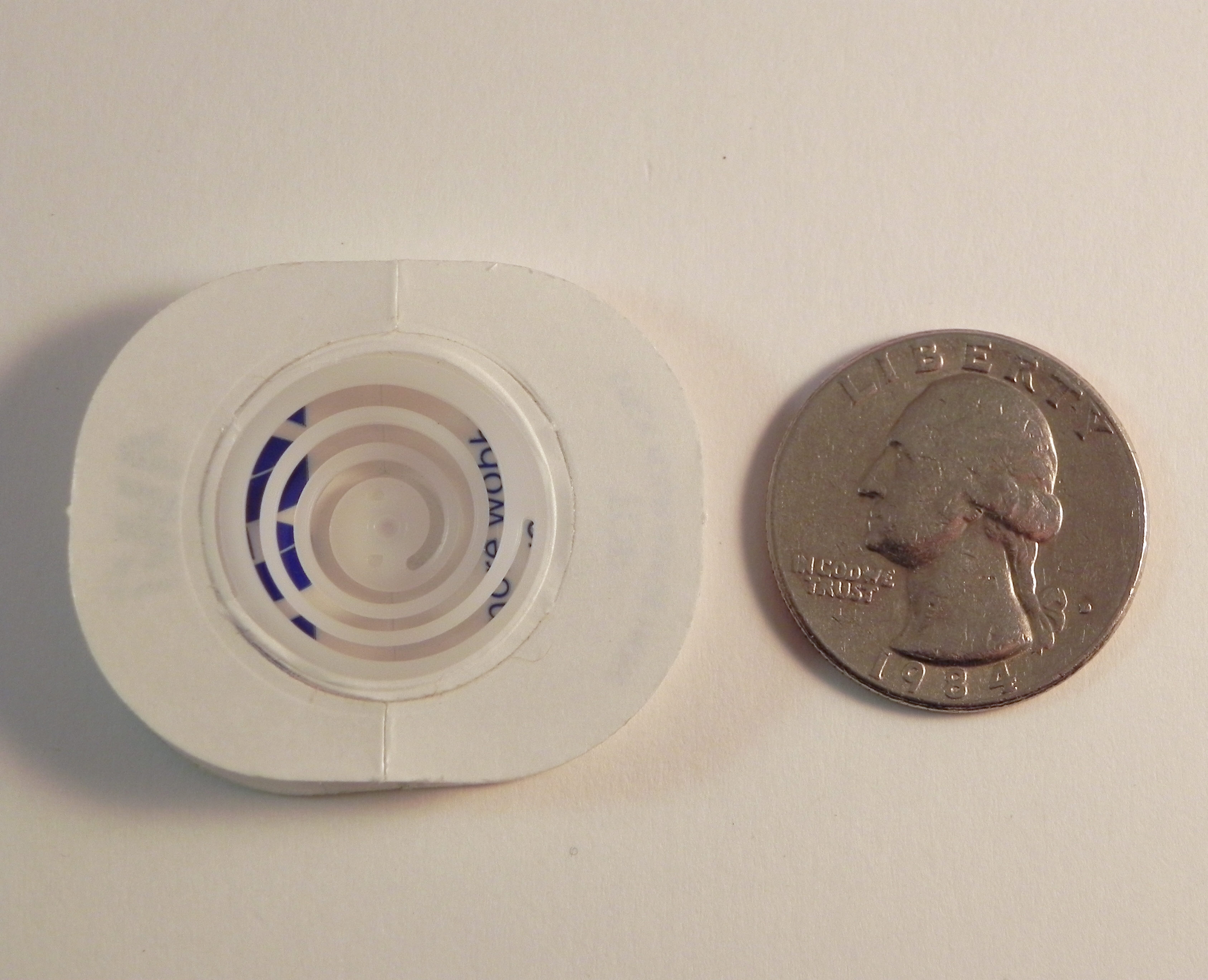
A penny slider card has an element on the card that spins as it travels across the card.  It’s called a penny slider card because the spinning element is mounted on a “sandwich” of two pennies with a pop dot in the center which rolls across the card in a slot or channel that you create on the front of your card.  (Click HERE to see a tutorial on how to create a penny slider or spinner card.)

My daughter LOVES palm trees and penguins, and even though these don’t usually go together, she has been asking me to create a card with both.  Luckily, I had these adorable “beachy” penguin stamps so I was able to honor her request!

The penguin images are from the Stampin’ Up “Penguin Paradise” set.  I created cut files of these stamped images with my Silhouette, cut the die cuts from white card stock, and stamped the images on my die cuts with Memento Tuxedo Black ink.  The stamps in this set are mounted on wood, so I used my stamp-a-ma-jig for perfect placement and for stamping each image multiple times to get them nice and dark.  Then I colored the images with Copic Markers (Straw, E31, YR23; Beaks/Feet, Y17; Clothes, B29, YR09, YG07) and a white Sakura gel pen.  There was a tiny white border around parts of each of the stamped images, so I filled that in on the top half (the parts that would be in front of the water when on the card) with Copic B97 and the bottom portions with the black copic marker.  The penguins were adhered with very thin pop dots so they stood ahead of the trees but behind the beach ball on the card.

For my beach scene background, I used digital paper I purchased on Etsy from a set called “Beach Party Collection” by Cherry Clipart (seen HERE).  I originally started sponging my own background scene, but I wanted the image on the area behind the slit to be the same and line up exactly with the image on my front panel.  For this reason, it made more sense to use a paper that I could make multiple, identical copies of instead of trying to hand ink identical duplicates. The slit for my penny to roll through was created with the smaller skinny rectangle die from the Spellbinders A2 Matting Basics B set.  The blue mat is from the Recollections “Cape Cod” Card stock Paper Pack (5 shades of blue), and I used a piece of Gina K “Kraft” card stock for the card base.  (This card is 5×7.)

The beach ball is from a coloring page I found on google HERE.  I created a Silhouette “print and cut” file for this image, cut it out, and colored it with Copic Markers (YR68, Y15, B29, R46, G05).  Once colored, it was adhered to the penny spinner with a glue dot.  The beach ball spins as it rolls back and forth when the card is tipped slightly from side to side.  ((Excuse the poor quality of the GIF file below.  I cannot include videos here in my blog post but wanted to show the movement.)

Tropical Penguins Penny Slider Card Video Clip

The palm trees are from the “Mindy’s Zoo” stamp set by Autumn Leaves.  I created a cut file and stamped the image onto the die cuts with Memento Tuxedo Black ink.  Copic Markers (G94, E44 and E71) were used to color them. 

The greeting is from the Gina K Designs “Botanicals” set (retired?) and was stamped with Gina K charcoal brown ink.  I have to confess that I did something INCREDIBLY stupid.  Originally, I had not included a greeting but then felt like it was “missing something” when it was done.  My first thought was to stamp the greeting on a duplicate panel, cut it out, and line it up on the card.  It looked ok, but I wasn’t happy with the lines around the panel.  Then I matted it which was better… but still not great.  Now here is the stupid part.  I decided to try to stamp it directly onto my finished card.  (I can hear my daughter in my head screaming, “JUST WALK AWAY!” which she often says when she realizes that I am about to go one step too far.  Usually when I try something like this, I end up having to start over – and this card took me ALL DAY to make!)  I wanted to use my MISTI because I wanted it to be lined up perfectly, but I was really afraid that all the layers and the thickness of the card and the extra, uneven thickness from the beach ball would prevent the MISTI from stamping properly.  (The lid came down on an angle.) Here’s what I ended up doing – I positioned the card in the MISTI, placed a piece of acetate over the card, and stamped on the acetate (barely pushing down so I wouldn’t break the lid).  You can see through the acetate so the stamped image looked like it was on the card, and I could see how it would look (but if it didn’t come out, it wouldn’t actually be on the card). I got a very nice stamped image, and it looked so much better than the panel I had stamped and cut before.  SO….. I removed the acetate, took a deep breath, and stamped directly onto my card.  PERFECT IMAGE!   PHEW!!!!!!!  All’s well that ends well, but it was very stressful, and I don’t think I have the nerve left to try that again!!

I love the penguin images in this set and really enjoyed making this card!  Kelly really liked it, too!

Now it’s your turn!  Make a project with something that moves, and share it in the “Something That Moves” Challenge over at Perfectly Rustics.  I can’t wait to see what you create!

Thanks for checking out my card project!

This content uses referral links as described in the disclosure policy on my sidebar.

WOW Graduation Shaker Card

WOW Graduation Shaker Card

WOW Graduation Shaker Card (embossed version)zDSCN9829.jpg

Join us this fortnight for a new challenge over at Perfectly Rustics.  The challenge is “Letters or Symbols” where you are to make a letter or symbol the hero of your project.   For example, if you were making a card with the word love on it, make the letters big, emboss them, have them in patterned paper etc. (http://perfectlyrustics.com/2015/06/01/prdc-no-49-letters-or-symbols/)

I created a graduation card featuring the word WOW.  Each of the letters is its own shaker window filled with small, glass beads.  I added a small graduation cap and sentiment to show it is a graduation card, but the main focus of the card is the word WOW.

The first version I did was a clean and simple design with a plain gold front.

wwDSCN9763

Here is another view of the individual shaker window letters:

xDSCN9786

I used a Silhouette file called “wow! word art cog wheel, star tail, stencil” (Design ID #53295), and used just the letters from the stencil image. I closed up the w’s so they would only have one part for their shaker windows.

To create my shaker windows, I cut the letters out of white card stock (centered on a rectangular panel) with my Silhouette – 10 times.  I stacked (and glued) these 10 panels on top of each other, lining them up perfectly.  This created a very thick panel.  I glued a solid panel on the back, added the beads, and glued a piece of acetate over the letters.  I cut one more panel with the letters cut out from a piece of black card stock and another (slightly smaller) from gold paper to create my card front and mat.  Since the cardstock I stacked was white, I used a black Copic marker to color the edges black to match the black mat and the black card base I used.

Then I created the outline letters (using the Silhouette software and the same file) to place on the card front to further highlight the letters.

The graduation cap is from an svg file called Graduation Cards and Tags from svgcuts.com (HERE).

I purchased the stamp from Ebay; it is unmarked so I have no idea what company makes it.  The stamp actually says, “Congratulations, You did it!” but I masked the “congratulations” part and just stamped the rest using versamark ink and black embossing powder.

I really like the clean and simple design of the first card, but I was curious to see how it would look if I embossed the front panel so I made this second version (pictured at the top of this post also).

WOW Graduation Shaker Card (embossed version)zDSCN9829

The embossing folder I used is the Sizzix Stars & Swirls.  I covered the WOW outline and graduation cap with black embossing powder to make them more vivid on this version.  Since I embossed the panel before I added the stamped greeting (I was waiting for the stamp to arrive in the mail!), I needed to stamp it on a separate panel so I created the matted banner.  I’m wondering how it would have looked if I had stamped it first directly on the card front and then embossed it since I am not crazy about the banner (I REALLY like the stamped image directly on the card on my first version!), but I like the stars and swirls.

Now it’s your turn!  Create a project making the letters or symbols the star of your card and share it over at Perfectly Rustics.  I can’t wait to see what you create!

Over at the Mod Squad Challenge Blog, the challenge this week is “Masculine” where we are encouraged to make a Masculine card/project.  This card was made for my (male) neighbor who is graduating this year, so I decided to enter.   (Sadly, this site is no longer active.)

Thanks for checking out my card project!

This content uses referral links as described in the disclosure policy on my sidebar.