Easter Shaker Card

Easter Shaker Card

044 Easter Shaker Card position adjusted

Over at Perfectly Rustics this fortnight, the challenge is “Eggs” (challenge #44 ) where we are to make a creation with an egg or eggs on it.  For this project, I made an Easter-themed shaker card with an egg-shaped (oval) window.  (http://perfectlyrustics.com/2015/03/23/prdc-no-44-eggs/)

cDSCN8042

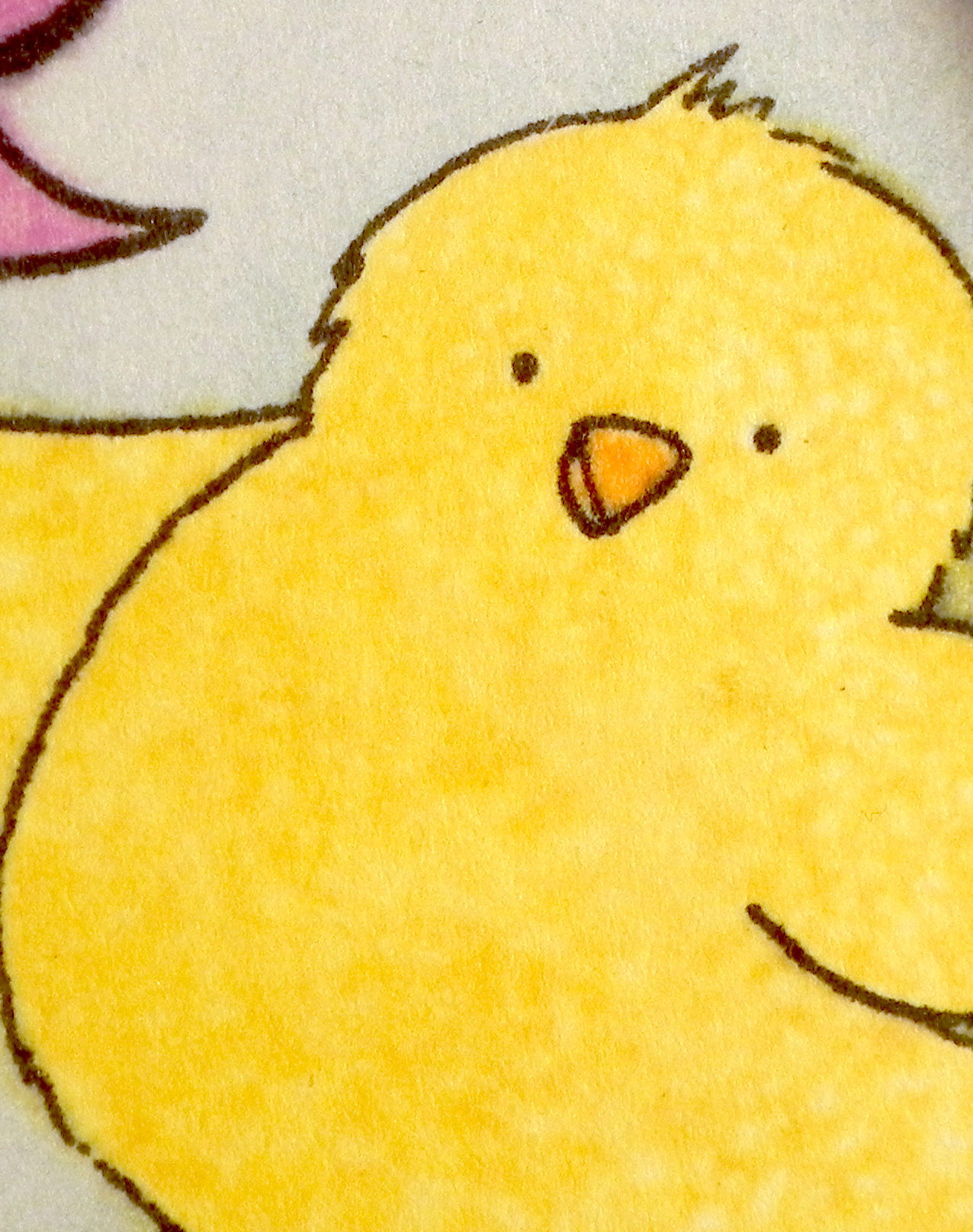
The cute chick, egg and greeting stamps are from the Inky Antics “Easter Chick” set (from the Honey Pop Collection).  The speech bubble is from the Gina K Designs “Let’s Talk” set.  I stamped all the images with Memento Tuxedo Black ink.  I then masked them and inked the background with Tim Holtz Broken China and Mowed Lawn distress inks.  The images were colored with Copic Markers (Y13, V12, B04, YR15, and YG25).  I used a Wink of Stella clear glitter brush pen on the egg, and I added texture to the chick with a piece of terry cloth towel and colorless blender solution.  (I did a tutorial on this technique a bit ago which you can see HERE.)  The card stock I used is Gina K heavy base weight pure white and sweet corn, and the printed purple paper is from the Recollections “All Girl” 6″x6″ paper pack.

  wDSCN7955   wDSCN8013

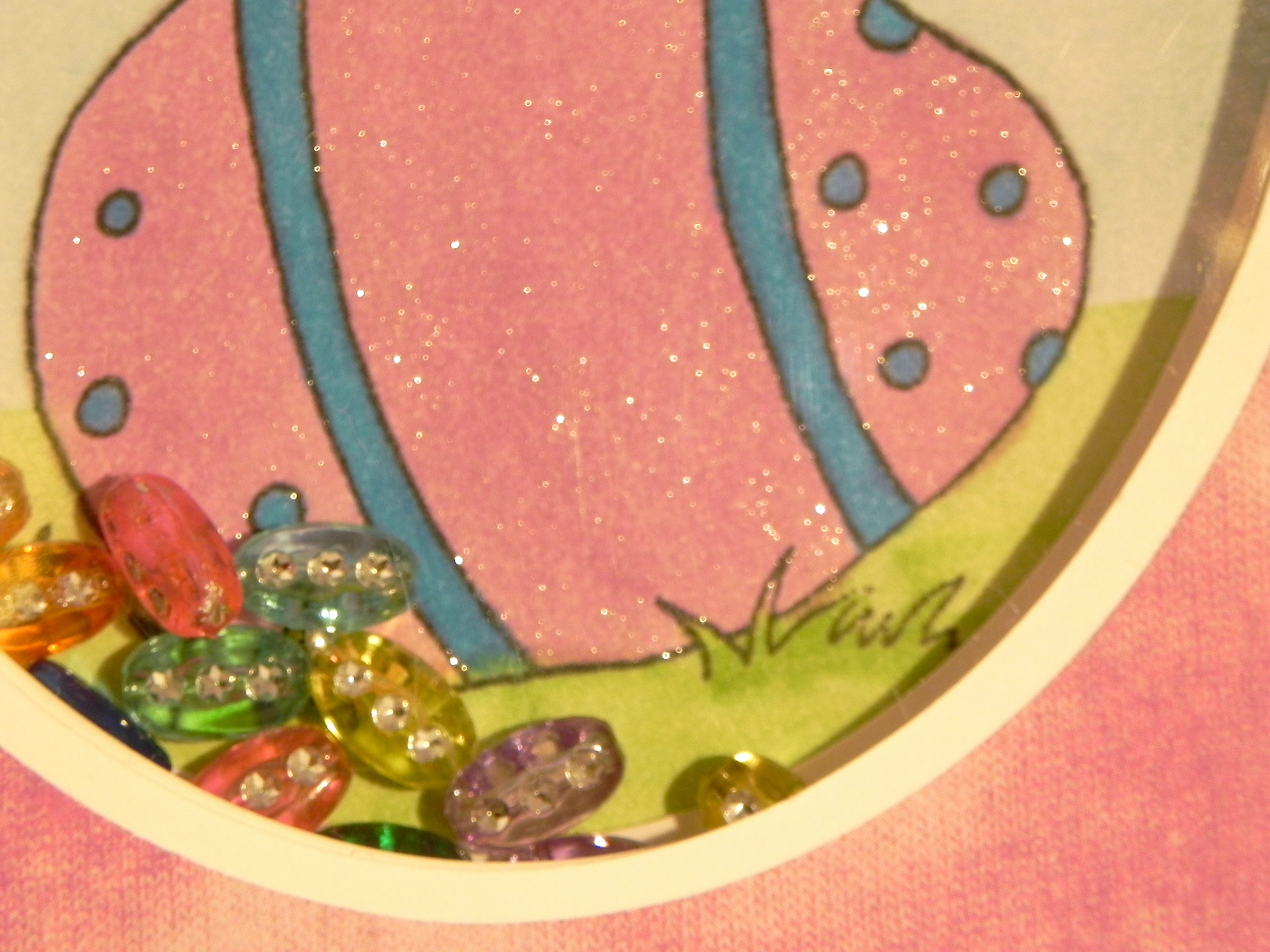
Acetate, and thick fun foam were used to create the recessed window, and I filled it with a few Bead Girl Assorted Diamond Beads (by Cousin).  There were different shapes in the pack, but I used the ones that looked like eggs!  (In the past, I’ve created the edges of my window with pop dots, foam tape, and even a recessed window made with card stock (see StampTV tutorial HERE.)  I’ve never used fun foam before to create my window, but it seemed the easiest material to use since the window didn’t have straight edges.   Originally, I used 2 thinner pieces of fun foam that I glued together to make it thick enough and sequins and micro-beads for my shakers, but they kept getting stuck in the edges and between the two layers of foam.  The thicker foam and larger shakers worked much better.)

I also used “an oldie but goodie” from my tool stash – my Creative Memories Oval Cutting Patterns from their Custom Cutting System.  I usually reach for my Spellbinders dies, but the ovals  just weren’t big enough to fit around my stamped images.

Join us over at Perfectly Rustics, and create something with EGGS!

Thanks for checking out my card project!

This content uses referral links as described in the disclosure policy on my sidebar.

“Save The Date” Card

“Save The Date” Card

Save The Date Card DSCN9286

The Mod Squad Challenge this week is “Magazine Madness” where we are encouraged to use something on our card project from a magazine, gift catalog, or any other periodical we may have lying around. We can use it as a background, we can do a little fussy cutting, or we can get really creative and fussy cut a whole bunch of different shapes and make a collage or scene. We can do anything as long as something from a magazine is somewhere on our card.  (Sadly, this site is no longer active.)

This is my second card for this challenge, and if you saw my last post, you know that I had only one magazine in my house (SJ Magazine March 2013) so this card is from there as well!  Here is the page:

dancing on the stars

This card practically made itself!  The panel and greeting were matted on black card stock and then purple glitter paper from Michaels. The greeting was from the Gina K Designs “Folk Filigree” set (retired?) and was stamped with Memento tuxedo black ink on Gina K sweet corn card stock.  The sweet corn was also used for the card base.  A piece of gold cording was tucked behind the greeting to add a little more sparkle since you can never have too much sparkle on a “fancy party” card!

DSCN9273

Thanks for checking out my card post!

This content uses referral links as described in the disclosure policy on my sidebar.

Fine Wine and Friendship

Fine Wine and Friendship

Fine Wine and Friendship Card final DSCN9316.jpg

The Mod Squad Challenge this week is “Magazine Madness” where we are encouraged to use something on our card project from a magazine, gift catalog, or any other periodical we may have lying around.  We can use it as a background, we can do a little fussy cutting,  or we can get really creative and fussy cut a whole bunch of different shapes and make a collage or scene.  We can do anything as long as something from a magazine is somewhere on our card.  (Sadly, this site is no longer active.)

The magazine I used for this card was SJ Magazine (March 2015) which happened to be the only magazine I had lying around here when I saw the challenge!  (I don’t read magazines, and I no longer get the number of catalogs that I used to.)  This is a free magazine that usually goes right into the recylcle bucket when it arrives, but I realized I needed it before I pitched it.  Phew!!  Here is the page I used for my card.

mag page for Fine Wine and Friendship Card 4

I really liked the two image groupings in the bottom corners, but the words got in the way, so I layered the panels to strategically hide the words.

The image panels were matted on Gina K Dark Chocolate card stock.  The patterned card stock I used for the background was from a pad by Momenta which didn’t seem to have a name on the pad itself, but the price tag said “Songbird” and the Momenta label said Lot 20468 R4.  These background panels were also matted on the dark chocolate.  The sentiment along the bottom of the card (“Like a fine wine, our friendship gets better with age.”) is from the Gina K Designs “Better With Age” duo (retired?) and was stamped with the Gina K dark chocolate ink.  Because the printed card stock was textured and a bit dark, I used my MISTI and was able to stamp the greeting multiple times to get it dark enough to see it better.  A bit of raffia finished off my card.

I had a hard time photographing this card because of the glare off the glossy paper from the magazine. When I positioned the lights to prevent the glare, the photo came out darker than I would have liked. Hopefully, you get the idea, though!

Thanks for checking out my card project!

This content uses referral links as described in the disclosure policy on my sidebar.

Wine Diva Thank You

Wine Diva Thank You

Wine Diva Thank You DSCN9190.jpg

A very kind and generous friend of my husband (I’ve not had the pleasure of meeting her yet) left a case of wine for us on our porch yesterday – just because!  So naturally, I thought of this stamp from an AI stamp set I recently purchased to make a thank you note for her.  Frankie is an alumna of the University of Pennsylvania and is involved with setting up interviews for prospective students with alumni in the area like my husband, which is how they met.  I wanted the card to be fun and to reflect the gift, but I also wanted it to have a Penn “feel” to it.  The Wine Diva image along with the red and blue color theme (did you notice her outfit and wine choice?) covered it all!

The stamp used on this card is from an Art Impressions set which I purchased at Michaels. There is no name on the set, but “Aged to Perfection” or “Wine Diva” seem to work when I searched the set on google.  Michaels now carries several Art Impressions stamp sets that Hampton Arts distributes, and if I understand correctly, these exact sets are made exclusively for Michaels and are not sold on the AI website.  Here is what is in this set:

 AI Wine Diva Stamp Set (SC0677)  ai wine diva stamp set clear image

This was the only set my store had when I was there last.  I will keep my eyes open for others as I think these stamp designs are a hoot!! (And using a 40% off coupon makes the price really attractive!)

The set comes with some very cute sentiments, but since this was to be a thank you note, I went with the “Thanks” stamp from the Gina K Designs “Vertical Greetings” stamp set instead.  I stamped it with Versamark ink and heat embossed it with Recollections snow embossing powder.

I used dies from the Spellbinders Standard Circles (large and small) sets for my focal image.  The embossing folders I used were Darice Dot and Sizzix (Stampin’ Up) Stripes (retired?).

The card stock colors I used were Gina K Cranberry Tart and In The Navy, and Express It white.

The image was stamped with Memento tuxedo black ink and colored with Copic Markers:  (Skin: E50, E31, E33; Lips: E04; Cheeks: R21; Shadow: W4; Hair: E25, E27; Clothes: B39, R89; Chair: E31, E55; Earrings & Wine Glass: C1 with a Clear Wink of Stella Glitter Brush Pen)

In addition to the Wink of Stella for a little shimmer, I also added texture to her dress with some Copic blending solution and a scrap of towel.  You can see how I did it HERE.

Wine Diva close-up DSCN9201

 (click on the photo to see the shimmer)

This was a fun card to make.  The AI images always make me smile!!

Thanks for checking out my card post!

This content uses referral links as described in the disclosure policy on my sidebar.

Celebrate In Style

Celebrate In Style

Celebrate in Style DSCN9237

The Mod Squad Challenge this week is “Magazine Madness” where we are encouraged to use something on our card project from a magazine, gift catalog, or any other periodical we may have lying around. We can use it as a background, we can do a little fussy cutting, or we can get really creative and fussy cut a whole bunch of different shapes and make a collage or scene. We can do anything as long as something from a magazine is somewhere on our card.  (Sadly, this site is no longer active.)

As I mentioned earlier, I don’t really have magazines here and get very few catalogs.  This card was the first one I made for this challenge before I got the free SJ Magazine in the mail that I used for my other 2 cards for this challenge.  The image for this card was actually on an ad pamphlet that came in the mail earlier in the week.  I’m not sure if this qualifies for the challenge, but since the card is done, I figured I’d link it.  (If it isn’t eligible, please let me know, and I’ll remove it.)

This Maserati photo screamed masculine birthday card when I saw it, so I whipped up this “stylish” card using Gina K Cherry Red and black card stock and a stamp from the Gina K Designs “Celebrate in Style” duo (retired?).  The stamp was inked with Memento tuxedo black, and then the banner was sprayed with Tattered Angels Pearl Glimmer Mist to make it shiny like the car.  Unfortunately, the shimmer doesn’t show up too well in the photo.  I tried adding ribbon, different card stock panels and die cuts, etc., but everything just took away from the beautiful photo.  Sometimes, less is better!

I’m not really a car person, but even I have to admit that this car is sweet!!  (Even the advertisement was gorgeous!)  Well, I’m off to run errands in my minivan!! 🙂

Thanks for checking out my card project!

This content uses referral links as described in the disclosure policy on my sidebar.