Baseball Note Cards

Baseball Note Cards

Baseball Note Card.jpg

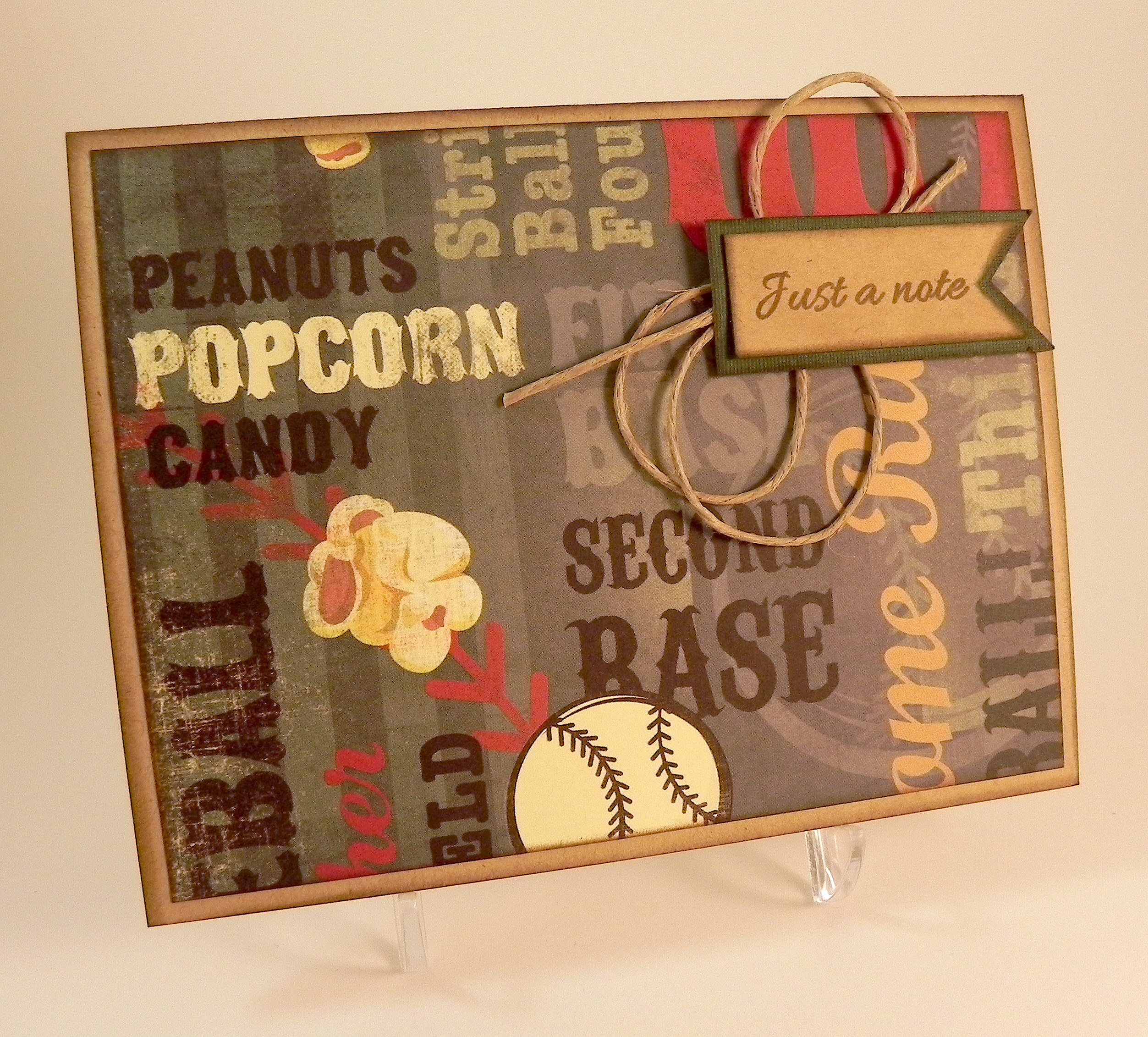
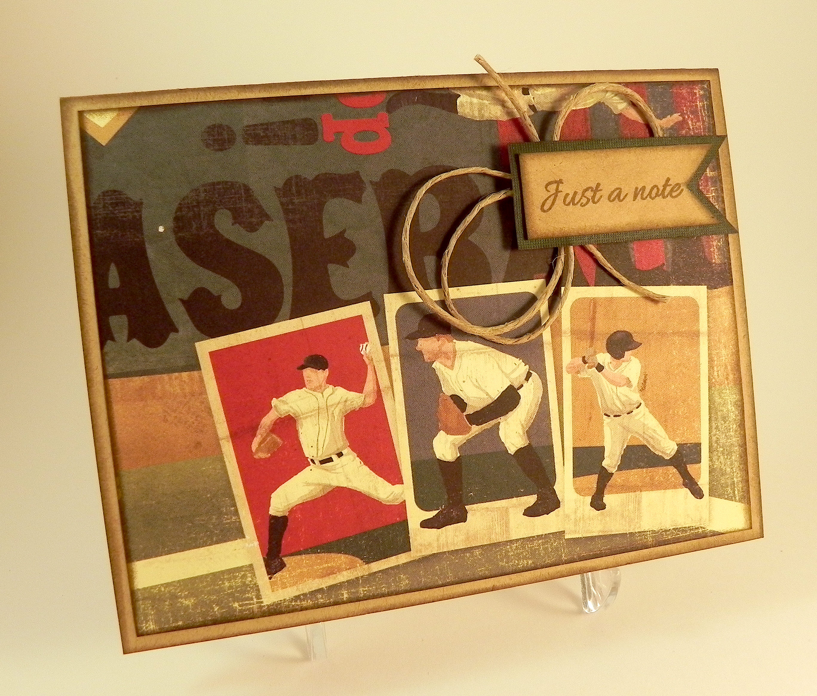
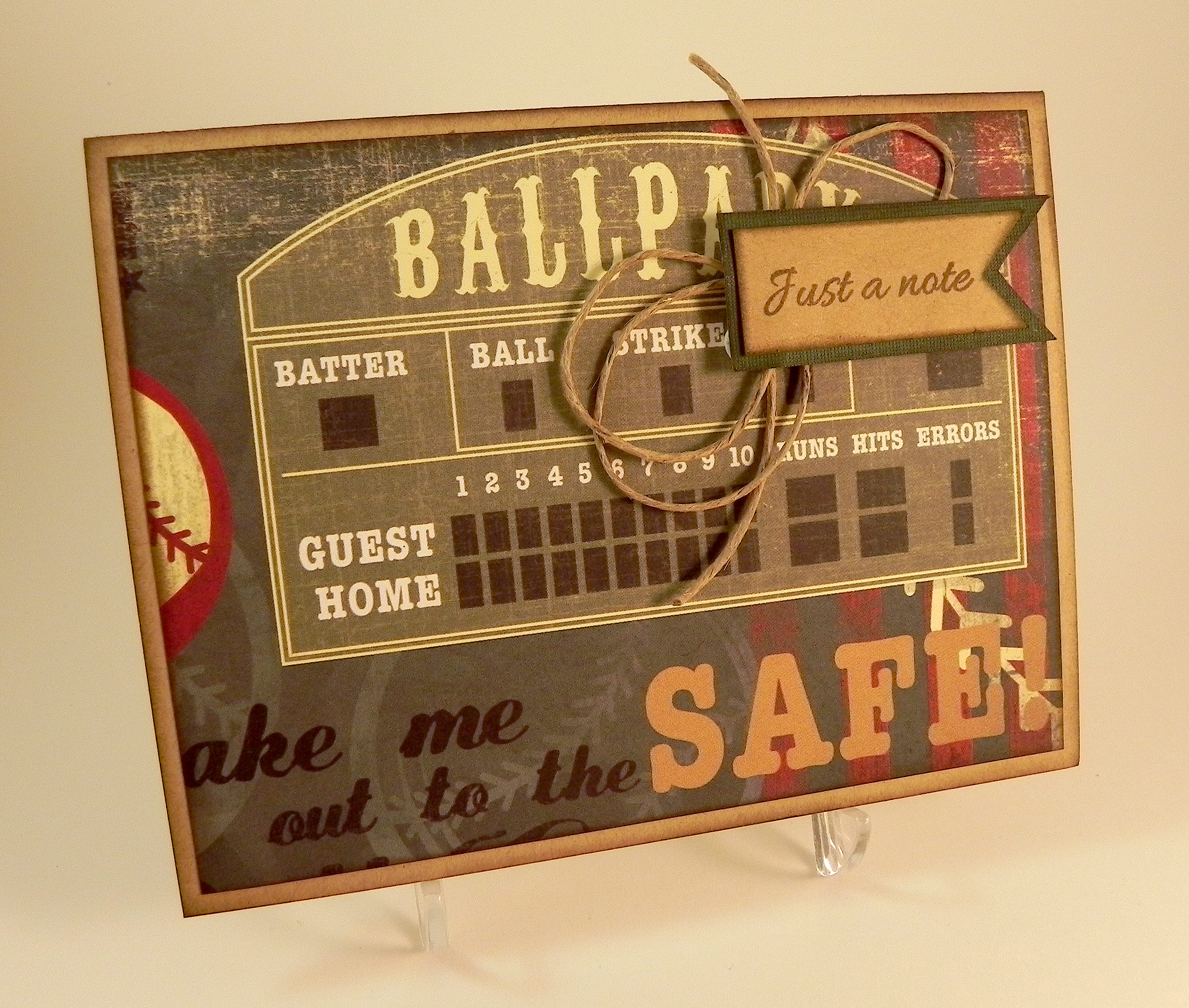
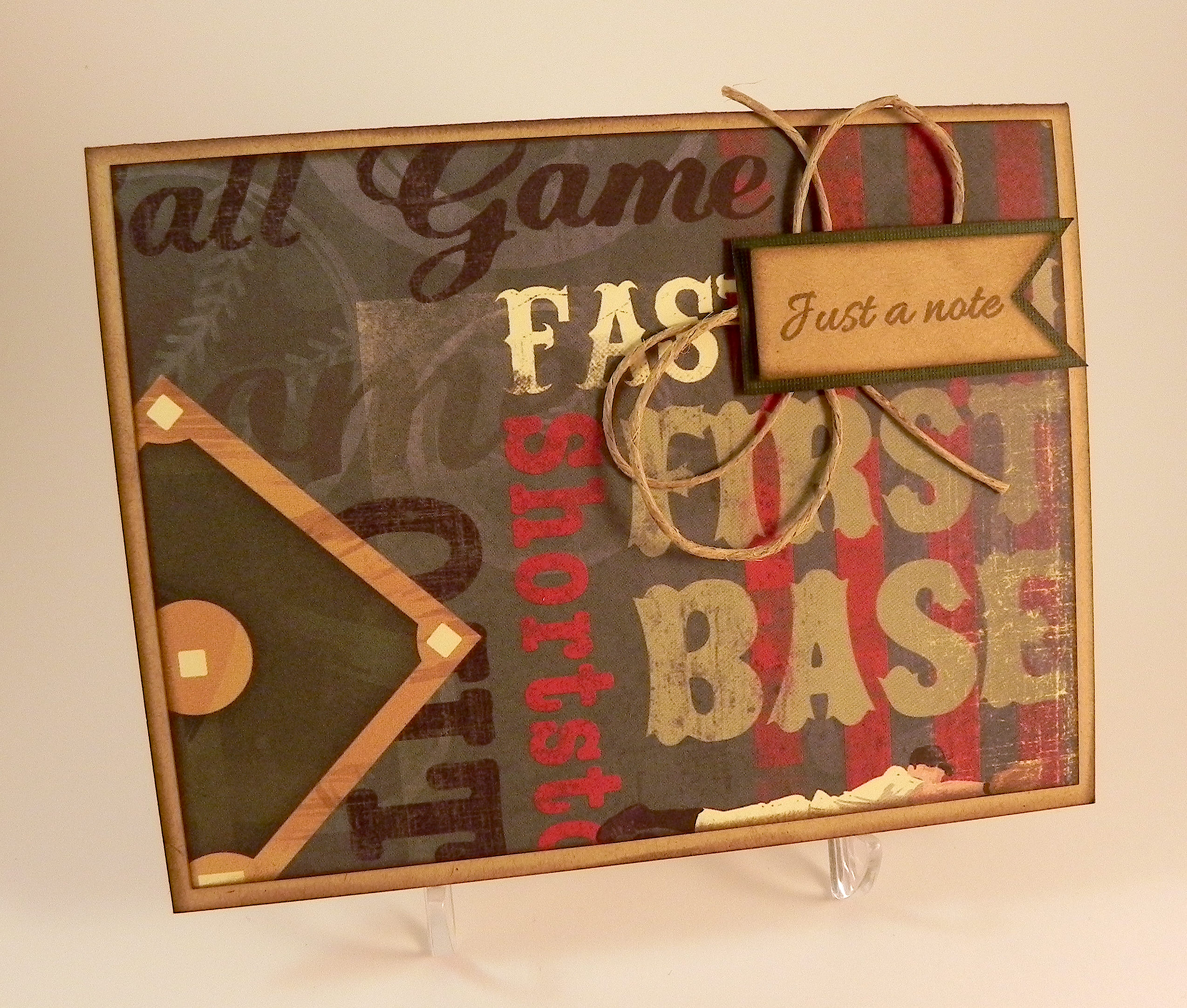
My son needed to send a note to someone who works in baseball, and I asked him if he wanted me to make him a card.  He said, “Yes, if you can but something simple/basic that can be sent in the next day or two.”  (He’s away at college so this included time for me to get it to him!)  My initial reaction was OH NO!!!  Simple/basic and quick aren’t words that usually describe my crafting process, especially since I don’t really have any baseball related supplies!!  Then I calmed down and got to thinking.  I ordered a few baseball stamps for which I am anxiously awaiting, although I knew when I ordered them that I wouldn’t have them in time for this project and look forward to using them in the future.  Then, I decided to go to a scrapbook supply store that is kind of near me (I wish it were closer!) to see what paper she had.  I have to say, her store is amazing!  She has a lot of gorgeous stuff that you don’t see in the big box stores near me.   I found this amazing sheet of vintage baseball paper by Karen Foster Design called Batter Up Collage, and the cards basically made themselves!  Here is the whole sheet of paper, from which I was able to make 6 note cards.

 wwDSCN7474

I cut the sheet into panels, inked the edges with Tim Holtz walnut stain distress ink, and adhered them to Gina K kraft card bases (which I also inked). Honestly, the cards could have been done at that point! But I felt guilty making something that required so little effort (I need to get over that!!!) and made a banner tag with a greeting from the Gina K Designs “Just A Note” stamp set (retired?) on kraft card stock and stamped with the Gina K charcoal brown ink. I matted the tag on a piece of green cardstock that I distressed with a bit of the charcoal brown ink, inked the edges and added a bit of twine behind it to help it stand out against the busy background.  Done!

Here is the whole set of cards:

Baseball Note Card   xDSCN7490   xDSCN7493

   xDSCN7495   xDSCN7498   xDSCN7502

I’m not sure if I like the twine behind the greeting, but the greeting was lost without it.  Now that there is no time pressure, I may go back and try something different with the greeting.  We’ll see…

Thanks for checking out my card project!

And if you happen to be in my neck of the woods and are looking for a paper crafting supply store, it is called “Scrap and Beads” and is located in the Burlington Center Mall in Burlington, NJ (right off of Route 295 – exit 47A) .  Half her store is set up with tables to work, and half is set up to shop.  Check out her great inventory or her crop schedule!  (I am not affiliated with this company in any way; I’m just a happy customer!  Check it out for yourself, and decide if it would be good for you.)  Unfortunately, this store is no longer there.

This content uses referral links as described in the disclosure policy on my sidebar.

“With Love” Tulip Card

“With Love” Tulip Card

aaaaaaDSCN7655

This card was made for the Mod Squad Challenge – Teal and Purple.  In addition to using teal and purple on our card, we are also encouraged to use stamps designed by Melanie Muenchinger who is the sponsor for this week.   (Sadly, this site is no longer active.)

First of all, I always find color challenges to be extremely challenging, and it occurred to me that I was not even exactly sure what teal was when it came time to select ink and paper!  (I don’t have anything actually called teal.)  It is defined as “a dark greenish-blue color,” and when I googled “teal” images, some of the pictures coming up looked more on the blue side and others appeared to be more greenish.  Hmmm…  I realize that part of the problem may be my computer, but this is what I decided to use as my guide:

Teal (1)       teal

My tulip card (above) is a little more on the green side, and my other card (next post) is a little more blue.  Hopefully, I’m close enough!

And then, of course, the next challenge is photographing the finished card so the photo on the computer looks true to life.  Sigh…..

Anyway…

The stamp set I chose for this project is the Gina K Designs “A Year of Flowers 2” set which was designed by Melanie Muenchinger.  I placed my greeting by the stem as if it were one of the leaves and then masked the words and stamped a leaf over it to give it the look of a sketchy leaf shape.  I lightly sponged the tulip and leaves with Gina K wild lilac and turquoise sea inks.  I used a Spellbinders die from the “Fleur de Lis Rectangles” set and cut it twice from both Gina K wild lilac card stock and a piece of Recollections card stock that didn’t have a color name on the label.  (The name was on the display in the store, but I don’t remember what it was – teal, perhaps?!)  The background paper is Recollections blue floral matted with the wild lilac.

Because I sponged color onto the flower and leaves with a sponge dauber, I am also entering this card in the StampTV Release Party Challenge where we are to color with a sponge.   (Sadly, this site is no longer active.).

Thanks for checking out my card project!

This content uses referral links as described in the disclosure policy on my sidebar.

Winter Chocolate

Winter Chocolate

vwDSCN6506 (2)

This card is being entered in the StampTV MIUM Challenge – Winter Chocolate – where we are to combine Winter and Chocolate….however we are inspired to do that! (Sadly, this site is no longer active.)

For this card, I used hot cocoa, pink and a touch of bling on the mugs – it is Lee’s challenge after all!  I used Gina K warm cocoa, pure ivory, and innocent pink card stock along with the pink plaid digital paper (Freezin Season by happyheartstudios) I ordered HERE on Etsy.  The stamps are from the Gina K Designs “Season’s Greetings” and “Warm Woolen Mittens” (retired?) stamp sets and were stamped on ivory card stock with Gina K warm cocoa ink. The mugs and greeting panels were adhered with pop dots.  I didn’t have tiny brown rhinestones, so I colored some with Copic Marker E59.  I also used the warm cocoa ink to ink all the edges.

Thanks for checking out my card project!

This content uses referral links as described in the disclosure policy on my sidebar.

Winter Chocolate…and other good stuff!

Winter Chocolate…and other good stuff!

 aDSCN6398.jpg

This card is being entered in the StampTV MIUM Challenge – Winter Chocolate – where we are to combine Winter and Chocolate….however we are inspired to do that!  I had this stamp set for a while and hadn’t used it yet, so I thought I’d use the chocolate sentiment from it and combine it with this patterned paper covered in snowflakes.   (Sadly, this site is no longer active.)

The stamps used on this card are from the Gina K Designs “Girl Talk” stamp set and were stamped with Memento tuxedo black ink on white card stock.  I also stamped the girl stamp on the patterned paper and cut out the shirt and flower to paper piece onto the black and white panel for a pop of color.  The snowflake paper is from the Gina K “Winter Cheer” patterned paper pack.  I also used Gina K turquoise sea , black and white card stock. The white background panel was embossed using the Cuttlebug Swiss Dots embossing folder, and some white ribbon finished it off.

A cute, girly note card that was easy to make – can’t beat that!

Thanks for checking out my card project!

This content uses referral links as described in the disclosure policy on my sidebar.

Thinking of You with Shaving Cream Background

Thinking of You with Shaving Cream Background

aDSCN9224.jpg

My daughter doesn’t really love paper crafting  😦  , but she LOVES doing the shaving cream technique and asks me to do it almost daily!!  I decided to use this technique on the background panel for this card.  I have to admit, the results are pretty cool!  And it was fun crafting with Kelly!


This card is being entered in the Perfectly Rustics Design Challenge No. 33 – Colour Combo.  For this challenge, we were to use three Stampin’ Up! colours (shown below) to create our project. Equivalent colours in different products are allowed! (http://perfectlyrustics.com/2014/10/06/prdc-no-33-colour-combo/)

color challenge 2

It is also being entered in the Mod Squad Challenge “Who’s Got the Button?” where we were create a card with a button on it.  A real button, not just a paper one, or one in the image.  (Sadly, this site is no longer active.)


The Stampin’ Up re-inkers (Early Espresso, Pistachio Pudding, and Soft Suede) and foam shaving cream were used to create the marbleized effect on the background panel.  First, a large blob of shaving cream was sprayed on a paper plate.  Then, several drops of each of the three inks were added to the shaving cream.  The colors were swirled (not mixed) around with a craft stick.  A piece of glossy card stock was placed, face down, on the shaving cream and ink.  Once the whole panel had made contact with the shaving cream, it was removed from the plate and placed on my craft mat.  Then the shaving cream was scraped (or “shaved”) off with a metal ruler.  What was left behind once the shaving cream was removed were the swirls of ink.  Kelly’s favorite part of the whole process is  “shaving” the shaving cream off the card stock!  What is cool about this technique is that you never know what you will end up with after the shaving cream is removed.  You can make several panels with the same pile of shaving cream and ink, and they will all be different!

Even though pistachio pudding ink was added to the shaving cream, there wasn’t much of this color on the panel used on this card.  (If you look closely, you may be able to see a hint of it!)  There ended up being a bit of white on the panel where just shaving cream with no ink came in contact with the card stock.  In order to keep the colors consistent with the required colors, I ended up airbrushing over the whole panel (lightly) with Copic Marker (E44) which is a close match for the soft suede.

The flower was made using the Heartfelt Creations “Sun Kissed Fleur” die and the “Sun Kissed Fleur PreCut Stamp” for detail.  It was stamped and sponged with the soft suede ink on pistachio pudding card stock.  The greeting came from the Gina K Designs “By The Sea 2” set and was stamped with the early espresso ink on pistachio pudding card stock and mounted on soft suede.

The card base and center strip are Stampin’ Up soft suede card stock.  The striped panel was from the BasicGrey “Little Black Dress” paper pad.

The soft suede strip in the center of the card was crimped to add texture.


Thanks for checking out my card project!

This content uses referral links as described in the disclosure policy on my sidebar.