Autumn Tree Birthday Card (and other “Positively Negative” cards)

Autumn Tree Birthday Card (and other “Positively Negative” cards)

Autumn Tree Birthday Card wDSCN8814.jpg

I was asked to be the guest hostess for this week’s Mod Squad Challenge, and my challenge, called Positively Negative, is to create a project using the negative of a die (manual or electronically cut), punch, or hand-cut shape.  (Sadly, this site is no longer active.)

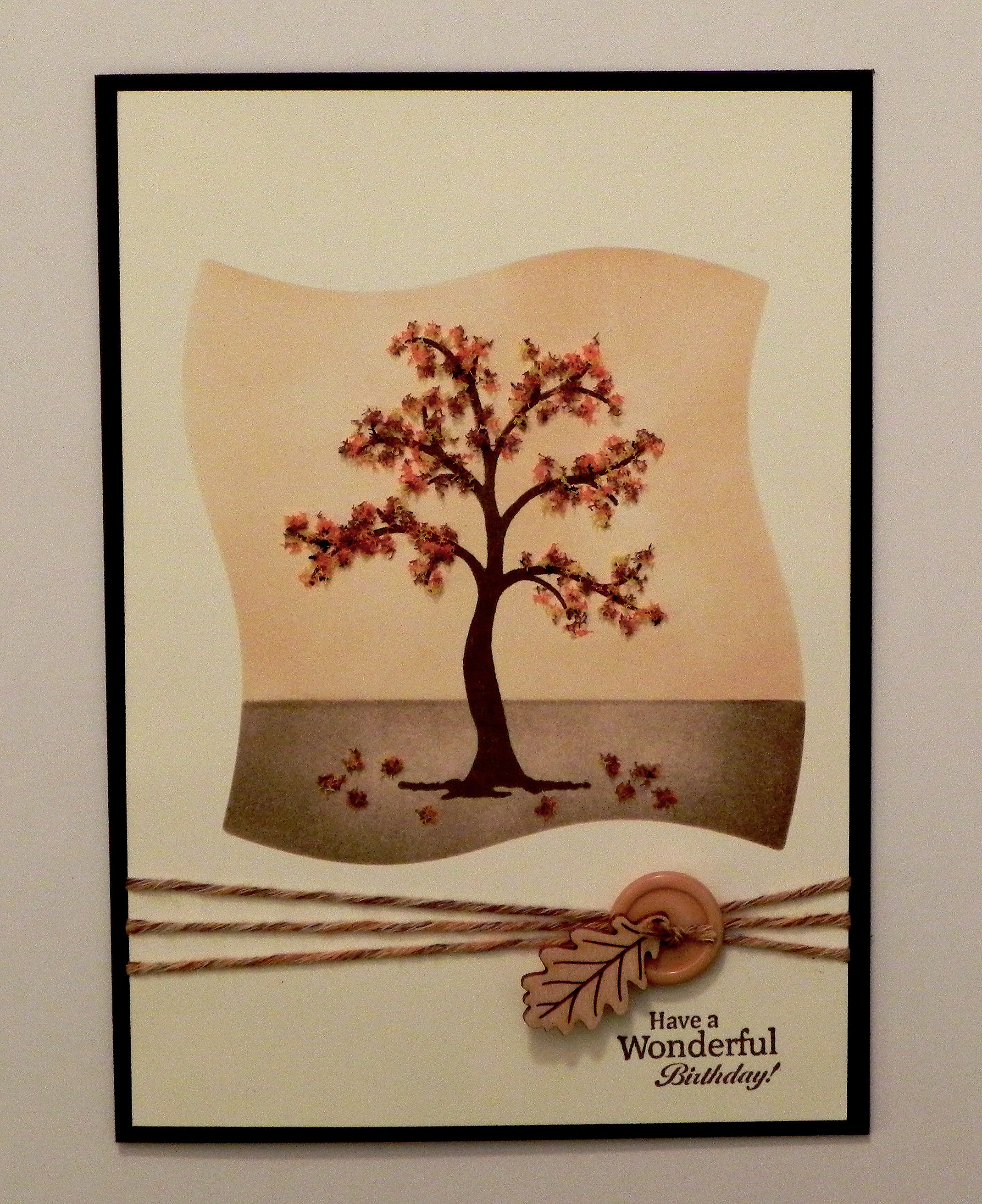
This card was originally posted in my stamptv gallery   (Sadly, this site is no longer active.), but I’m posting it here to show an example of a card where I did reverse masking (using the negative of a die) to create the sponged background for my tree image.

I used the Gina K Designs “The Giving Tree” set. Card stock used was gina k ivory and dark chocolate, and ink was gina k dark chocolate and memento desert sand. I used Flower Soft (autumn and nut brown) for the leaves. As mentioned above, a mat was made with the Spellbinders Wonky Squares die (discontinued?) to create the background for the tree. Yarn, a button and a gina k wood leaf finished it off.

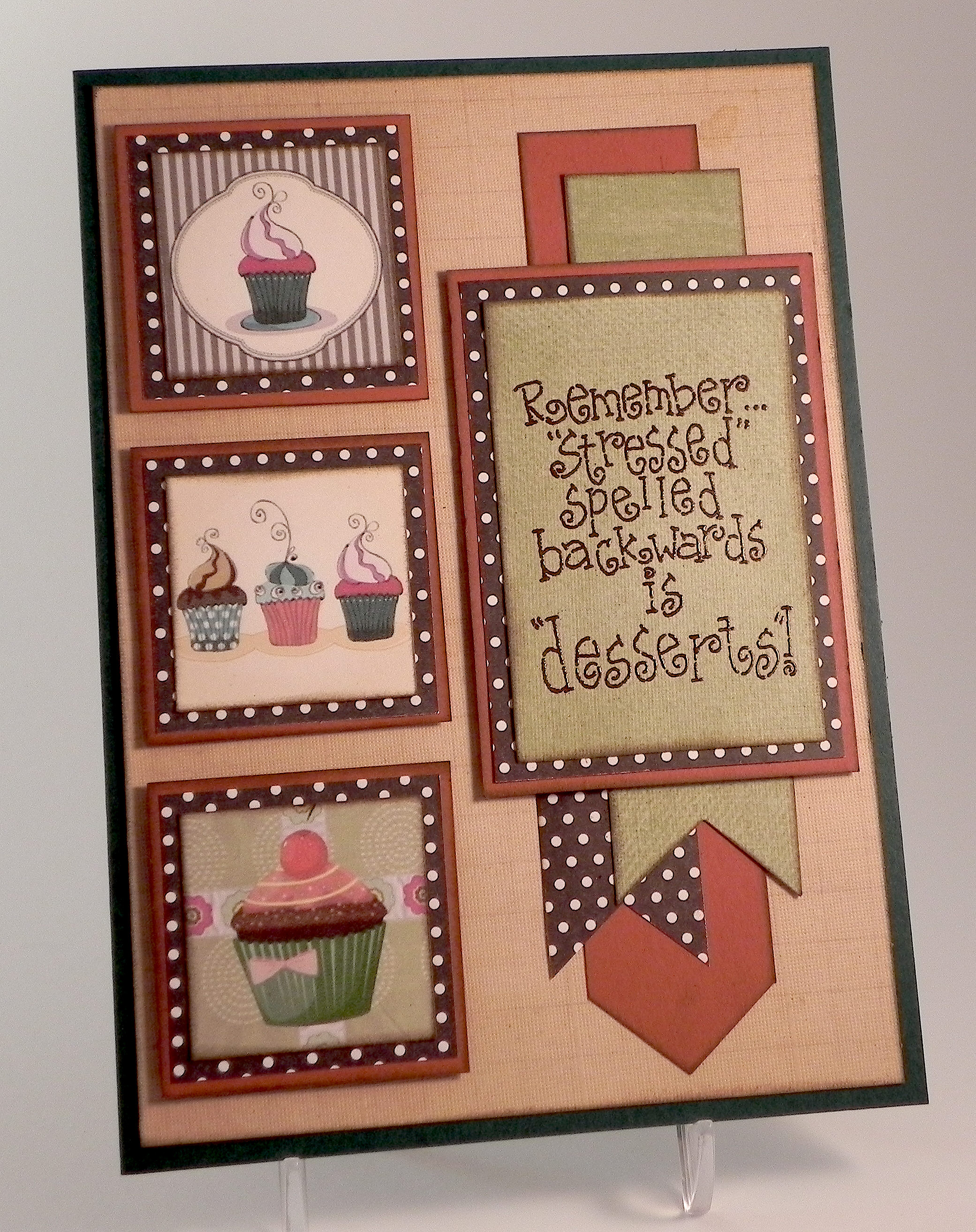
Two more cards using the negative to sponge the background for my stamped images are below:

Floral Get Well cDSCN7706.jpg

You can see the original post in my stamp tv gallery.   (Sadly, this site is no longer active.)

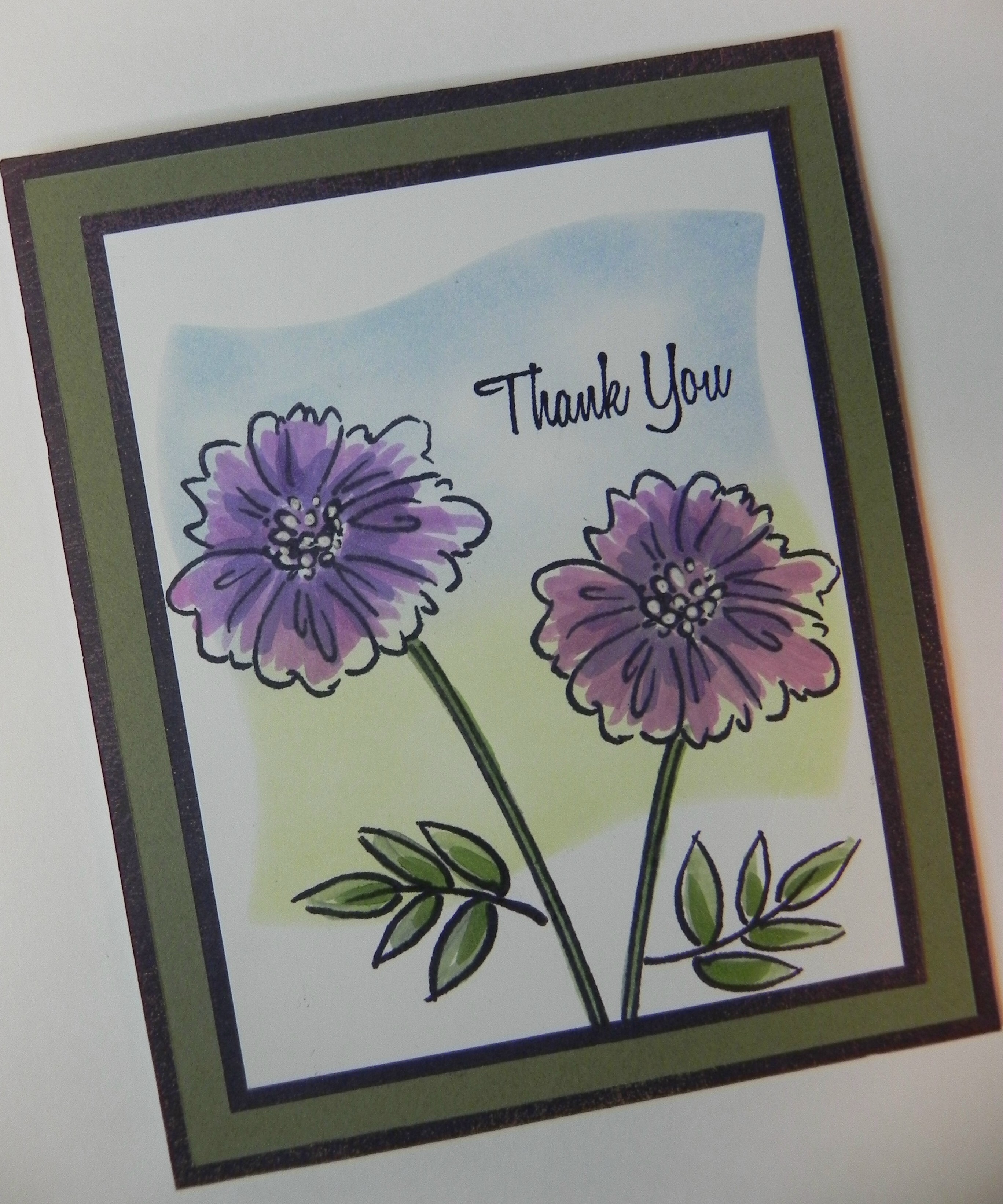
The sentiment and floral image on this card are from the “With Love & Prayers” set by GKD. Gina K Wild Lilac and Moonlit Fog inks with a square mask were used to create the background. The image and sentiment were stamped with Gina K’s Edible Eggplant ink.

and

Thank You Challenge card DSCN5976c

 My card was originally posted in my stamp tv gallery.   (Sadly, this site is no longer active.)

This is a card I CASED after watching Melanie Muenchinger’s tutorial (HERE).   The stamp sets I used are Gina K Designs “A Year of Flowers 2” and “All Occasion Tags” (retired?) for the sentiment.  I used the Spellbinders Wonky Square die for this reverse mask as well.


I also did a card a few weeks ago where I used the negative of a flower die cut to create the template for my image using the Confetti Cluster Stamping technique.

Confetti Cluster FLower Card DSCN9112

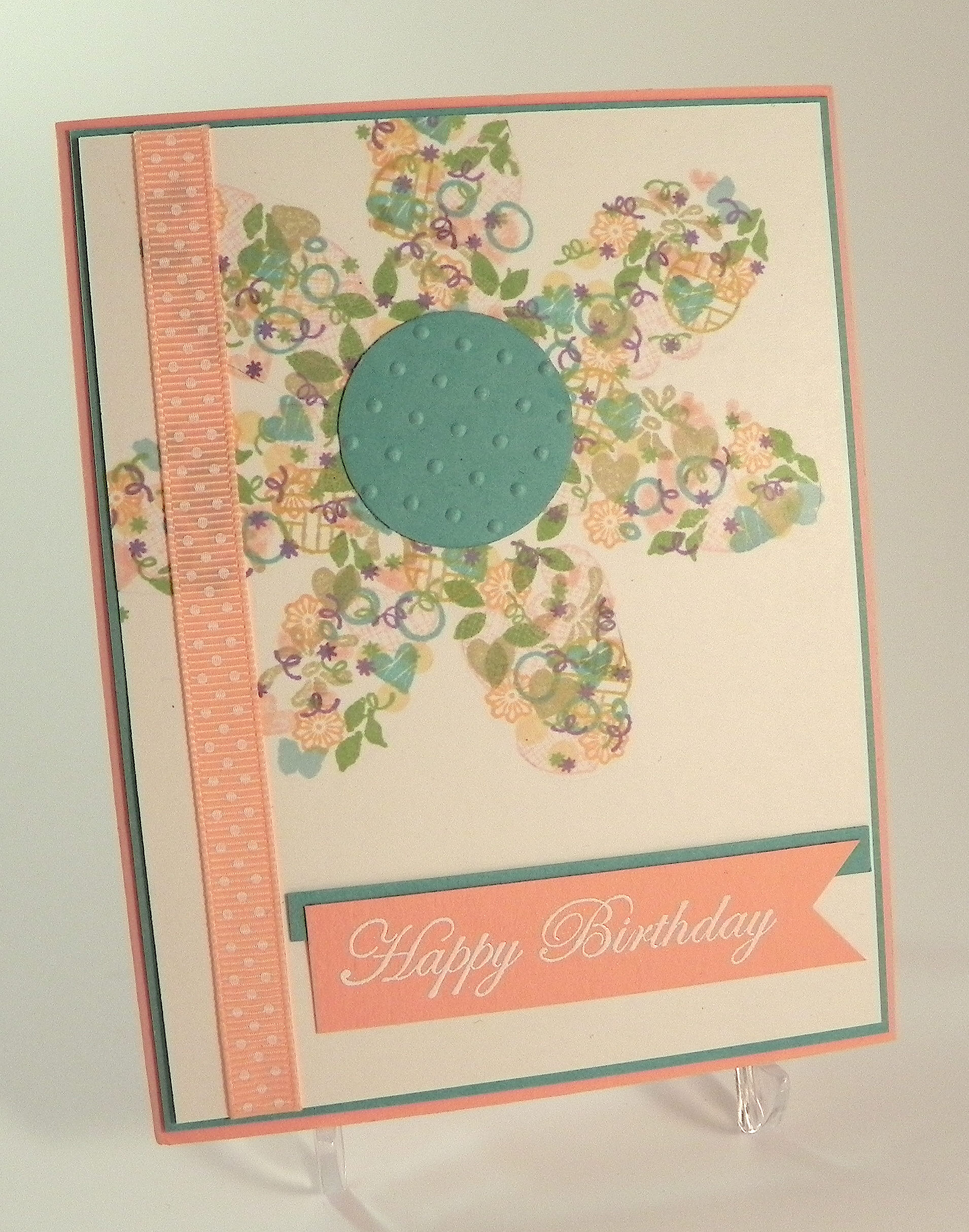
You can see my original post (HERE).


And finally, here is a sample of where I used the actual negative on my card of a heart I created and cut with my Silhouette.

With Love Anniversary Card DSCN5803

You can see the original post in my stamptv gallery.   (Sadly, this site is no longer active.)


I can’t wait to see your “Positively Negative” creations over at the Mod Squad Challenge Blog this week!

Thanks for checking out my post!

This content uses referral links as described in the disclosure policy on my sidebar.

Three Beach Babes

Three Beach Babes

Three Beach Babes xDSCN9354.jpg

They ARE fabulous, aren’t they?!

This fortnight, the challenge over at Perfectly Rustics is to use three of something on your project. (http://perfectlyrustics.com/2015/05/04/prdc-no-47-three-of-something/)

For this card project, I used the three beach babes image from the Art Impressions (Hampton Art) “Beach Babes” stamp set.  Here is what is included in this set:

BEACH BABES SC0653 (ART IMPRESSIONS)

I stamped the image and sentiment on white card stock with Memento Tuxedo Black ink.  Then I masked the image using a mask I made with my Silhouette and stamped my background swipes using a stamp from the Stampin’ Up “Work of Art” stamp set.  I used Memento Desert Sand ink for the sand, and I used Gina K Turquois Sea ink (which I “stamped off”) for the sea/sky.  (I LOVE this stamp set and can see myself using it a lot.  However, I am embarrassed to tell you how many times I tried to get my background swipes “just right” for this card!  You’d think it would be random and quick (and it may be for most people!), but I’m not really a random stamper, and I experimented with a lot of different combinations before coming up with the design I ended up using.)  Once I was FINALLY happy with the background,  I colored the image with Copic Markers (Skin – E50, E31, E33, E04, R21; Clothes – B29, B04, YR68, Y15, B66, E47; Chairs – C1, B04; Drinks – Y15, E50, and E55, E57, YR68).

The card stock I used was Gina K Turquoise Sea, Sweet Mango, and white.  The background paper is from a digital pack called “Beach Holiday Fun” from Digital Potpourri.   (You can see the listing HERE.)

Since this card was made for a challenge to use three of something, I decided to create 3 coconut embellishments to add to the palm tree.  I made these with my Epiphany Crafts Shape Studio Bubble Cap maker , Clear Round (14) epoxy shapes, and a scrap of orange swirly paper from my stash.  This tool is pretty cool because you can use whatever paper you want to create custom embellishments for your projects.  You can check out this tool HERE on amazon.com.

In order to keep the palm tree on the background (my daughter insisted!) and still fit my rather large stamped image, my card needed to be 5×7.  Before making this version, I played around with a number of different background styles which I included here.

yyyyyySCN9364   rrrDSCN9392

xxxDSCN9378

The paper, card stock and copic marker colors are all the same as the ones listed above.  The enamel dots on these cards were by Teresa Collins, and the embossing folder used on the third card sample is Basket Weave by Darice.  Initially, I had stamped the sentiment a little too far away from my image (in my opinion) so I added the enamel dots under it to fill in some of the space.  I’m not sure if I love that or not!  Then I went back and tried one with the sentiment closer.  Much better!

Now it’s your turn!  Create a project using three of something, and share it over at Perfectly Rustics!

Thanks for checking out my card projects!

Oh, and one more thing…

As I’ve mentioned on several occasions, my daughter LOVES palm trees and often pesters me suggests that I include them on my cards.  She just returned home from the International Career Development Conference that was held in Orlando, Florida this year.  (She and her two brothers qualified to attend this international competition by placing first in our region in the Stock Market Simulation game in which they participated with their school/business class.  Hooray Kelly, Kevin and Keith!)  Anyway, here are a few pictures that Kelly’s friends took of her while there:

photo 6  photo 2

I think it’s safe to say that she will continue to “suggest” that I include palm trees on my projects!!  🙂

This content uses referral links as described in the disclosure policy on my sidebar.

Technique – Tissue Paper Background Card

Technique – Tissue Paper Background Card

045 Technique - Tissue Paper Background ww DSCN8788.jpg

One of my favorite things to do is to check out other crafters’ blogs and You Tube videos for inspiration and to learn new techniques I haven’t seen or tried before.  Over at Perfectly Rustics, the challenge this fortnight is to try a new technique! (http://perfectlyrustics.com/2015/04/20/prdc-no-46-new-technique/)

One of the techniques I recently discovered online was making a tissue paper background. (Thanks for the idea, Barb!)  Interestingly, there are quite a few variations on this technique, but the common step in all of them was to adhere a crumpled piece or pieces of tissue paper to your project to add texture and interest.  Some methods started with a stamped image while others did not.  Some methods used stains, paints, and sprays while others used alcohol inks.  And some added no color at all!  Making the background shiny and glittery was another variation.  With so many possibilities, this technique could be used over and over again with very different results!

For my background, I started by stamping a large background stamp by Hero Arts called Musical Collage with jet black Stazon ink onto a piece of tissue paper.  (The tissue paper needs to be slightly larger than the card stock panel to which you plan to adhere it.)  I then applied alcohol inks and blending solution to the tissue paper.  The colors I used were latte, butterscotch, and a touch of lettuce. After the alcohol inks, I added gold Inka Gold Metallic Rub.  Then I topped it off with a thin layer of Viva 3D Stamp Paint in walnut brown metallic.  Once I was happy with how it looked, I carefully rolled the tissue paper up into a ball.  While that sat for a minute or two to allow it to get well wrinkled, I covered a piece of card stock with Ranger Multi Medium (Matte) using a foam paint brush.  (You could also use something like Mod Podge or a glue stick.  Just make sure the entire piece of card stock is covered with the adhesive.) Then, I very carefully opened up the tissue paper (trying not to tear it), but not flattening it out completely since the wrinkles give the background the texture.  The wrinkled tissue paper was then placed on the glue-covered card stock and patted down.  (You could dry the panel if desired with a heat tool, but it dries pretty quickly on its own.)  I cut my edges that extended over the card stock with my paper trimmer.  If I were to do it again, I would probably apply a top coat of the multi medium to seal it. (HERE is one of the video tutorials I watched before making this card project.)

I will admit that once I finished making the background, I was stumped as to what else to do with it because I didn’t want to cover it up!   I opted to keep it fairly simple.  I mounted it on some Gina K dark chocolate heavy base weight card stock.  I stamped my sentiment on a scrap of Gina k honey mustard card stock which was also used for the card base.  The stamp is from the Tim Holtz Stampers Anonymous “Phrases 2” set and was stamped with Gina K dark chocolate ink.  The three metallic circles on the bottom left corner were a different color from the metallic butterfly, so I applied currant alcohol ink to make them match a little better.

w DSCN8798

I love the rich, monochromatic look of this card.  It has great shine, too!

w DSCN8796

I had fun making this card and will definitely use this technique again!

Now it’s your turn!  Create a project using a technique you haven’t tried before and share it over at Perfectly Rustics!  I can’t wait to see what technique you use and what you create!

Thanks for checking out my card project!

This content uses referral links as described in the disclosure policy on my sidebar.

Chess Inspiration

Chess Inspiration

Chess Inspiration wwwDSCN9481.jpg

Join us for a new challenge over at Perfectly Rustics!  This fortnight, the challenge is to include the word “remember” or “remembrance” on your project (http://perfectlyrustics.com/2015/04/06/prdc-no-45-remember/).

The sentiment I used on my card project is “remember every pawn is a potential queen” and is based on the promotion rule in chess:  if a pawn reaches the other side of the board, it can become any other chess piece (called promotion) and is usually promoted to a queen.  The pawn is the piece that is assigned the lowest point value of all the pieces on the board, but it has the potential to become one of the most valuable.  I think this reference is great to remind us that anything is possible if we work hard and put our minds to it!  I thought this inspirational card would be good for a graduate, someone starting a new job, or for anyone who needs to be reminded that we are all valuable and capable of great things.

This is one of those cards that just kept evolving; it is nothing like my original idea!  The stamps I used are from the Chocolate Baroque “The Art of Chess” set.  I started with a piece of ivory card stock and sponged some Gina K honey mustard and warm cocoa ink on it.  Then I stamped the sentiment repeatedly with Gina K dark chocolate ink to create a background.  Then I stamped the queen and some pawns with versamark ink and heat embossed them with clear embossing powder.  Finally, I sponged some dark chocolate ink over the whole thing.  I was going for an emboss-resist panel – and ended up hating it! There was just too much space between my chess pieces, and it was so dark and dull.  So, I ended up cutting this panel apart and using just the queen and one pawn.

Now I needed a panel for my chess pieces.  I used another piece of ivory card stock and stamped my sentiment again.  The sentiment didn’t have the word “remember” in it, so I used the stamp “Always Remember” by Woodware Craft Collection – Clear Magic Singles and masked everything except the word remember.  I originally had left this panel plain ivory, but I added a piece of a digital paper image called “Antique Game Board Papers” that I purchased on Etsy from a shop called MarysMontage (HERE) which was distressed so I decided to distress the ivory panel a bit by lightly sponging some warm cocoa and honey mustard ink on it.  To distress it a bit more, I sprinkled on a bit of clear embossing powder in random spots, heat set it, and inked a bit more over those areas.  And of course it started getting dark and dull again!!

I thought I’d try to brighten it up a bit by working with the cranberry that was in the checker/chess board.  I used a piece of patterned paper from the Heartfelt Creations Classic Sunflower Collection paper pad, and some Gina K honey mustard card stock.    (Note to self – cranberry and honey mustard are NOT bright!!)  And I couldn’t figure out what to do with these two panels!  I ended up playing around with a bunch of scraps that were piling up on my desk.  A few of the scraps were from card stock that was embossed with the Darice 5×7 damask embossing folder (which was originally the whole card base).  A few of the scraps have parts of the stamped images and sentiment I had been using.  One scrap was from my original emboss-resist panel.  And I tucked some of the cranberry patterned paper scraps in there as well.  Well, now my A2 card is 5×7!

All of the edges were inked with Gina K charcoal brown ink, and a piece of raffia ribbon and three metal sticker embellishments finished it off.

Another card in brown tones.  Hmmmm…..

I don’t usually add so many “scraps”  to my projects; usually I plan out what I need and cut panels. It was kind of fun to just keep throwing these scrap strips on my card!  And then I notice the email I received today from the “Use Your Stuff” blog where their challenge this week is to use paper strips on our project! Thin strips or thick strips, a lot of strips or just a few – it’s up to us.  Because we all have lots of paper scraps laying around just begging to be used, they are challenging us to put those scraps to use on our projects!  Well that worked out well!! (http://useyourstuff.blogspot.com/2015/04/challenge-179-paper-strips.html)

Over at the Mod Squad Challenge blog, the challenge for this week is Tick Tack Toe where we are to select a line of 3 techniques from the tick tack toe board to create a project.  Here is the board:

Mod Squad Challenge Tic Tac Toe

This card used techniques from the first vertical column on the left.   (Sadly, this site is no longer active.)

Thanks for checking out my card project!

This content uses referral links as described in the disclosure policy on my sidebar.

Dessert Therapy

Dessert Therapy

Dessert Therapy in green, brick and brown wwwDSCN9319

Join us for a new challenge over at Perfectly Rustics!  This fortnight, the challenge is to include the word “remember” or “remembrance” on your project (http://perfectlyrustics.com/2015/04/06/prdc-no-45-remember/).

The stamp I used on my card project that contains the word “remember” is from the Stampin’ Up “Hang in There” stamp set.  For my desserts, I used parts of a digital paper called “32 Desserts Digital Collage Sheet” by boxesbybrkr that I purchased on Etsy (see listing HERE). Card stock used was Gina K Faded Brick, Christmas Pine, a piece of brown polka dot scrap from my stash, and a few two-sided sheets from the Momenta “Euro” pad (lot 20472 R4).  I used Gina K dark chocolate ink for all the edges and versamark and Gina K dark chocolate embossing powder to stamp the sentiment.  I used a die from the Spellbinders Artist Trading Cards set to cut out the sentiment panel.  (This card is 5″ x 7″ which allowed me to use many layers without getting too crowded.)

I did three versions of this card before deciding on my “final” one above.  The first one I did is here:

Dessert Therapy in browns wwwwDSCN9456

(It’s an A2 sized card.)  For this version, the desserts I chose were from a digital paper called “32 collage from a set of  “Vintage Old Paper French Patisserie” by Needful Things Shop on Etsy (see listing HERE) which I cut using a Creative Memories circle punch.  Card stock used was Gina K Dark Chocolate and a few two-sided sheets from the Momenta “Euro” pad (lot 20472 R4).  The print is actually vintage postage stamps, but I really liked the colors and pattern, and with most of it covered up, you can’t really see the actual images!  I used Gina K dark chocolate ink for all the edges and versamark and Gina K dark chocolate embossing powder to stamp the sentiment.  I really liked the vintage dessert images and the colors on this one, but I was not so sure the sentiment’s font really went with the rest of the card!  Hmmm…

The problem was that the font was too whimsical for such a vintage look (I thought) so I looked at several more “dessert” choices and found the cartoon-like ones that I ultimately used.  My second attempt is the one is the one pictured above.

In addition to better dessert images, I also thought the polka dots gave it a whimsical feel, but I wasn’t sure if the dark colors were the best choice so I tried making a third version with a completely different color scheme.  (This third card is another A2 sized card.)  Here’s my third version:

Dessert Therapy in pink and blue wwwwDSCN9408

For this card, I used  Tim Holtz Stormy Sky and Spun Sugar distress inks for the edges and Gina K Blue Denim ink for the sentiment.  The blue card stock is from the DCWV Neutrals 12 x 12 stack, and the solid pink is Core’dinations April Lovely.  The striped paper is from the Recollections 6 x 6  All Girl paper pack, and I used Copic Marker R81 to color my pearls pink to match my project.  The desserts are from the same digital sheet by boxesbybrkr mentioned above.

I like this pink and blue version also, but I think I like the larger version with the polka dots the best! What do you think?

Now it’s your turn!  Create a project that includes the word “remember” or “remembrance” and enter it in the Perfectly Rustics “Remember” challenge.  I can’t wait to see your creation!

Over at the Mod Squad Challenge blog, the challenge for this week is Tick Tack Toe where we are to select a line of 3 techniques from the tick tack toe board to create a project.  Here is the board:

Mod Squad Challenge Tic Tac Toe

For my card, I used techniques from the first vertical column on the left.  I sponged the edges of my panels with Gina K dark chocolate ink, I heat embossed the sentiment with Gina K dark chocolate embossing powder, and I used polka dotted patterned paper for my mats and one of the banners.  The sponsor this week is Gina K Designs so I get a bonus entry since I used Gina K ink, card stock and embossing powder.    (Sadly, this site is no longer active.)

Over at Use Your Stuff, the challenge is to use paper strips on our project. Thin strips or thick strips, a lot of strips or just a few – it’s up to us.  Because we all have lots of paper scraps laying around just begging to be used, they are challenging us to put those scraps to use on our projects!  For this challenge, I entered the pink and blue version! (http://useyourstuff.blogspot.com/2015/04/challenge-179-paper-strips.html)

Thanks for checking out my card project!

This content uses referral links as described in the disclosure policy on my sidebar.