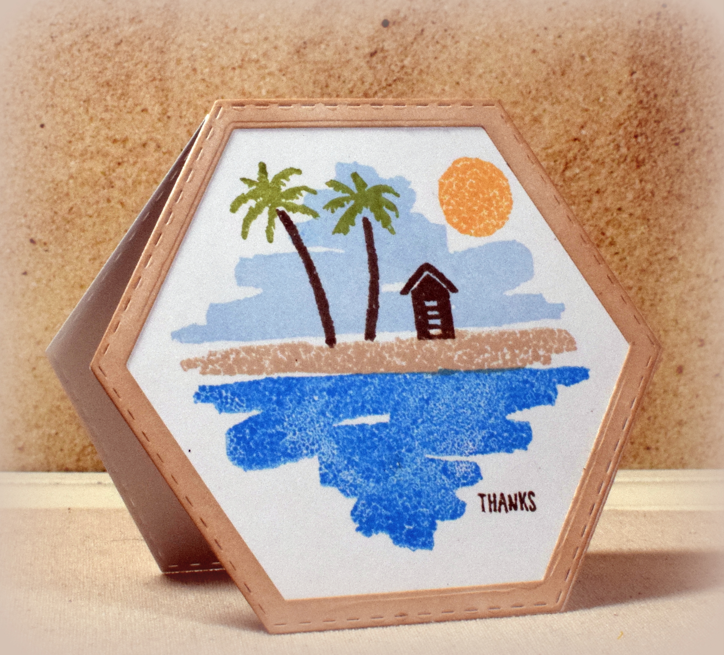
Shaped Cards

Shaped Cards

wwDSC_9929.jpg

I was playing with some dies and the Stampin’ Up “Waterfront” set and came up with a few cards that were not the typical rectangle shape.  (We ended up making “shape cards” in my class last week.)

Here’s another sample:

DSC_2064w

This is a fun stamp set that has a bunch of elements to create different outdoor scenes.  The solid image stamps don’t need to be colored; the inks do all the work.

Once I was done stamping, I sponged a coordinating color onto the frame I created with two of the nesting dies from the same set used to cut the card base.

Thanks for checking out my card projects!

Faux Water Colored Flowers in Pink

Faux Water Colored Flowers in Pink

DSC_2051w.JPG

I love the look of water coloring, but sadly, I am not really very good at it.  So I fake it!

For my faux water coloring, I took a few solid image floral stamps (from a set of stamps I found in a “ms. sparkle & co.” bin at Joann Fabrics a while back), inked them up with Memento Lilac Posies ink, spritzed them with water, and then stamped them on water color paper.  (I didn’t use much water so the effect on my finished card is subtle.)

After the images dried, I stamped over them with some line art images (from “Sunshine Daisy Flowers” set by Forever in Time) which added definition without covering up the water colored effect.  These two sets do not really match up at all, but I was really pleased with the outcome when they were layered.

I didn’t have a stem stamp (this is a card/lesson I prepared for my class, and I was limited to the stamp sets I had available for class use), so I painted those by hand with Memento Bamboo Leaves ink, some water, and a brush.

The leaves were from a multi-step stamp set (unbranded?), and I chose to stamp just the “middle step” stamp.  No water was used to stamp the leaves, but I thought the sketchy look of that stamp seemed to fit with the rest of the card.

As I mentioned, I didn’t use much water for my sample above.  Here is a look at what the flower stamp looks like (without the layered scribble stamp) with water and without.

faux water color comparison sample

Thanks for checking out my card project!

This content uses referral links as described in the disclosure policy on my sidebar.

Love Is…

Love Is…

DSC_2609wx.JPG

Here’s another wedding card design – simple, but elegant.

I have several stamps with this beautiful verse, but none are big enough for a 5″ x 7″ card, so I used a digital image I purchased from a shop called Chickadee Art and Co on Etsy.  (I love the combination of fonts used here!)

The card stock is from the Recollections Shimmer Silver & Champagne pack, my go-to paper for wedding cards.  It has a beautiful, subtle shimmer which makes it perfect for “elegant” card designs.  (Difficult to photograph, though!!)  I chose a grayish taupe color on my computer for printing the verse.  The shimmer paper was mounted on Stampin’ Up Tip Top Taupe (retired?).

The embossing folder is called “5 in x 7 in Corner Scroll Background” by Darice.

Thanks for checking out my card project!

This content uses referral links as described in the disclosure policy on my sidebar.

Diagonal Split Panel Wedding Card

Diagonal Split Panel Wedding Card

DSC_2032ww

I came across this fun technique that features offset angles and some patterned paper to create an interesting, layered background panel.

Here is a video tutorial on how to do this technique, although I changed mine up a bit by matting my finished panel and changing the angle/measurements of my cuts.  I’ve also seen variations where the solid panels are popped up with foam tape and where the center portion is hand-stamped.

I used Bazzill “Whirlpool” along with black and heavy weight white card stock.  The patterned paper is called “B&W Wedding Words” by the Paper Studio.  I just love the dies from the “Shadow Box Collection – Mr. & Mrs.” set by Creative Expressions!

Here are two more cards I made using this technique:

DSC_2045ww

DSC_2036ww

Thanks for checking out my card projects!

CAS Thinking of You Note Card

CAS Thinking of You Note Card

DSC_2614ww.JPG

This “Clean and Simple” card features a stamp from the “Water Color Trio” set from Stampin’ Up (retired) and a greeting from the “Banners” set from Joy! Crafts.

I originally purchased a used, incomplete set of these stamps on ebay (specifically for this stamp), but the greetings (and one of the other images) were not included.  I saw the complete set on ebay when doing this post and immediately ordered the complete set!  I just love those greeting stamps!!  (I guess the seller did too – lol!!!)

su water color trio

The stamps in this set were designed to look like the images were water colored, so just stamping them makes it look like water was added.  Although not the correct colors for cherry blossoms (which I think these are supposed to be – lol!), I went with GKD Moonlit Fog and Wild Lilac ink on water color paper.  The base is Bazzill Buttermints, and the mats are Wild Lilac.

Back to basics…  just a few stamps and inks!

Thanks for checking out my card project!